TYPOLOGY: Residential
COUNTRY: Albania
CITY: Tirana
YEAR: 2009
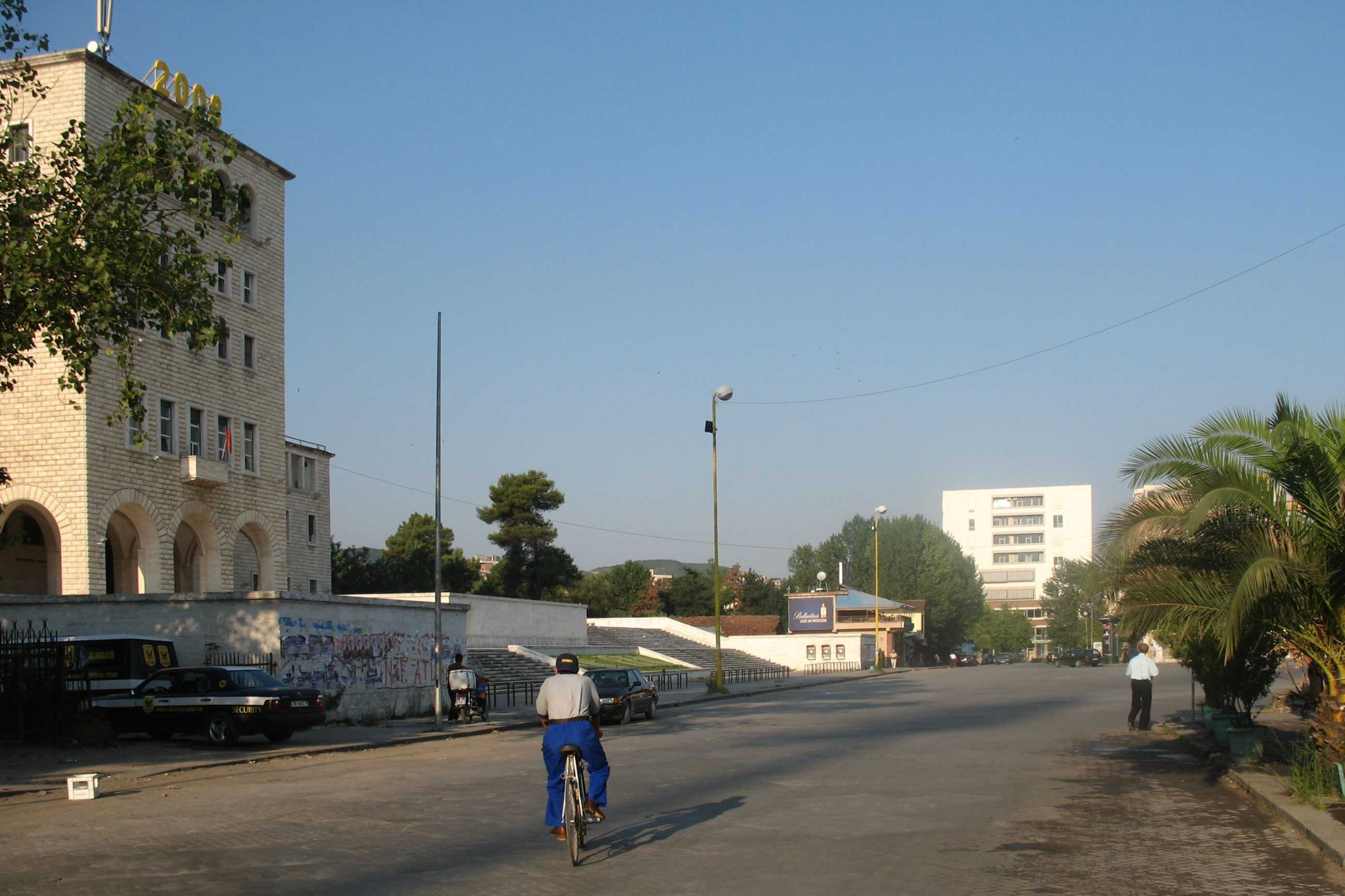
An eight floor building axially adjacent to the University ensemble – the axial focus of Tirana’s 1930’s Italian Masterplan.
Mass is emphasized, balconies internalized as loggias. Materials are reduced to those fitting historical precedent and the current possibilities of construction in Tirana. The particular ‘haptic’ of the base is achieved with wide mortar joints and intentionally irregular layers of broken (reject) tile fragments.


TYPOLOGY: Masterplan
COUNTRY: Albania
CITY: Korça
YEAR: 2009
COMPETITION: 1rst Prize
CLIENT: Municipality of Korça
PHOTOS: © Roman Mensing, © BOLLES+WILSON
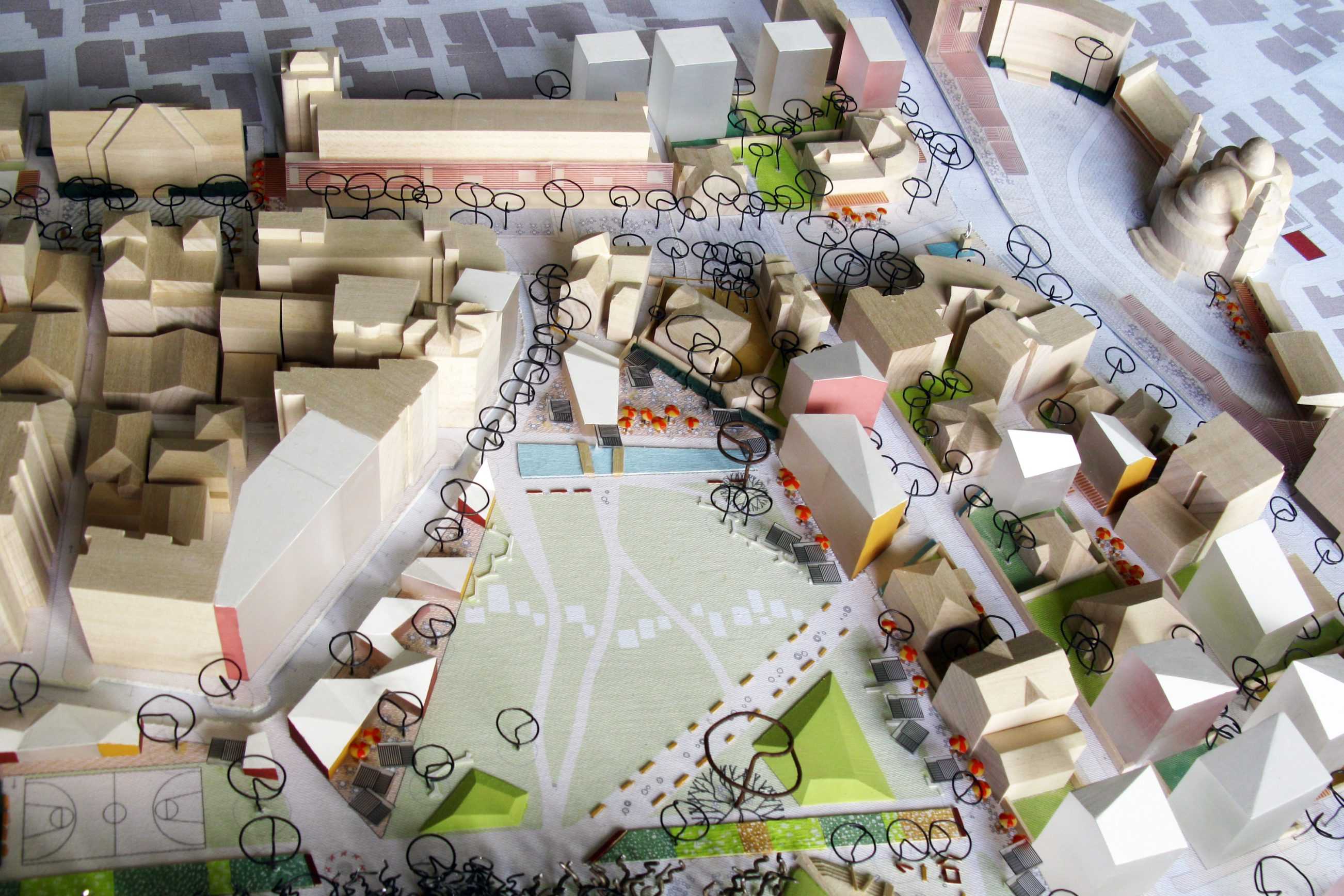
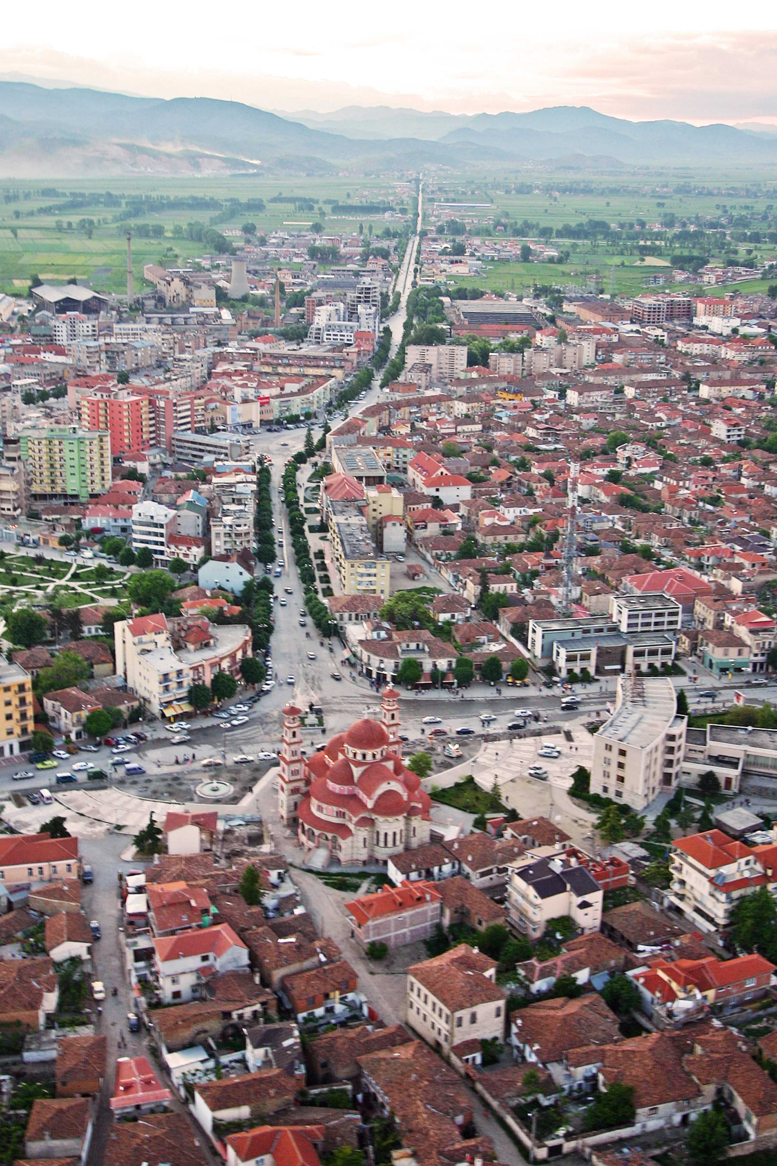
On Thursday 16 July 2009 the mayor and international jury pronounced BOLLES+WILSON winner of the competition for the new Korça City Centre Masterplan. The international two-stage competition was decided in favour of the Muenster based office for its concept of “Scenographic Urbanism”, a choreographing of new buildings and public spaces which pays close attention to the existing grains and potentials of this small but spatially complex city.
Surrounded by dramatic mountains and a wide arcadian valley Korça focuses a region of 360,000 inhabitants. Its urbane morphology reflects the wealth and ambitions of returning emigrants as well as historically strong trade relations with central Europe. Many Novecento and Art Nouveau villas are now restored, many are still crumbling. The aim of the competition was to find a clear concept, which integrates a traffic and pedestrian rational with the qualitative and development needs of the city – a commercial strategy, administrative facilities and residential development. The competition brief also emphasised that the scale of the new Korça should be respectful and appropriate to the historic scale.
_
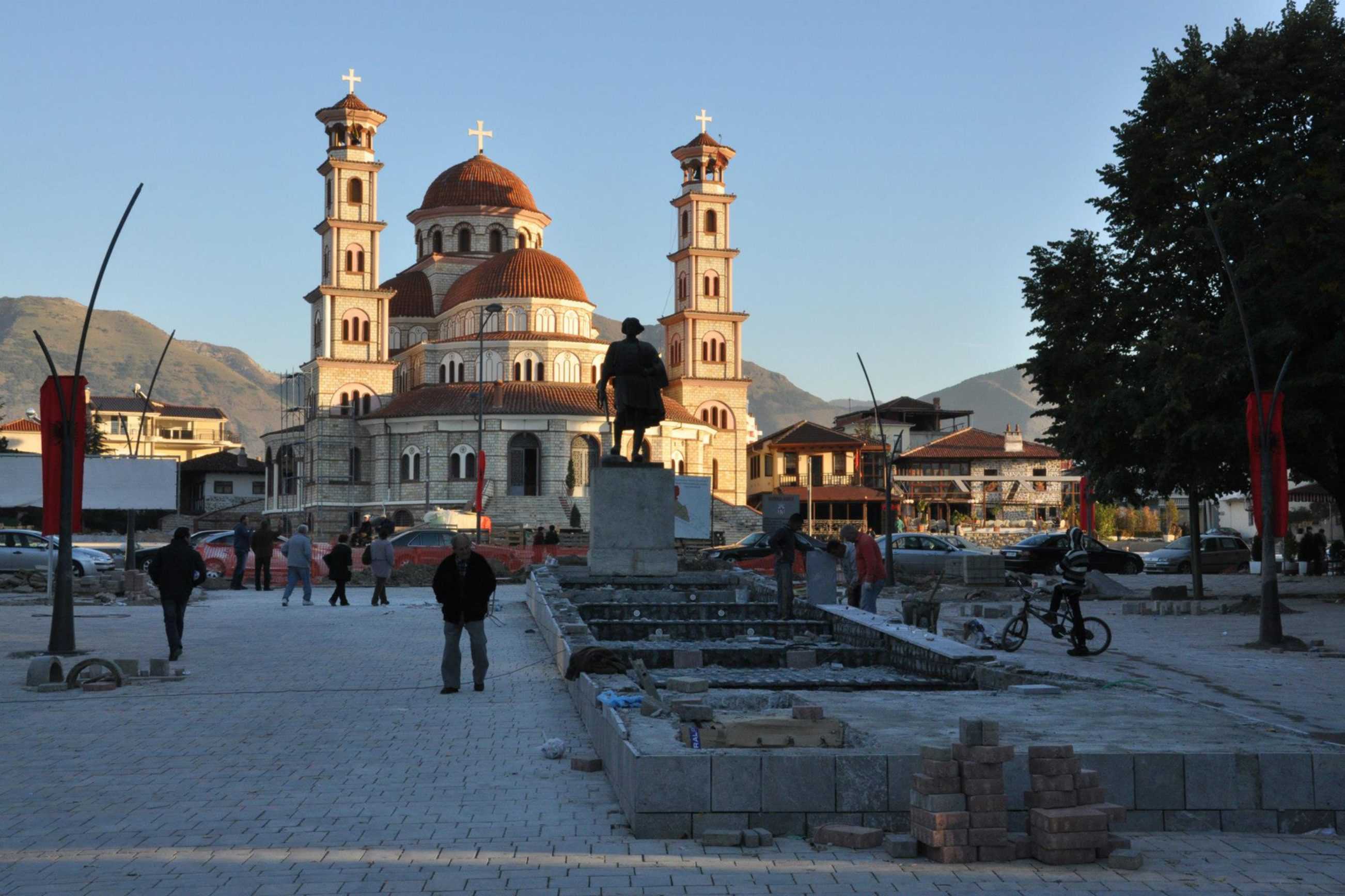
BOLLES+WILSON identified five zones for the revitalisation of the 197,000 sqm city centre. Each zone possessing its own unique character, together they add up to a network of urbane public spaces. At one end of the centre the Cathedral of ‘Christus Resurrection’ anchors, at the other end a Commercial Anchor is added. These are connected by the Boulevard Shen Gjergji – now transformed into a ‘Cultural Promenade’. Reduction in expansive communist road widths allows an extension of the Cathedral Square. This square is planned three steps above the street and framed by café pergolas, an optical filter between traffic and event space. A large stage left of the cathedral and a smaller stage to the right facilitate a wide variety of events. Curved paving stripes echo the Cathedral geometry and serve to discipline market stands.
New figure on the Korça skyline and counterpoint to the Cathedral, a “Vertical Mall” occupies and marshals the parade-ground scaled Theatre Square. A new commercial strip extends from here to the Bazaar via new shopping/housing blocks and a new Bus Station Roof – a Farmers-market platform.
This – the second of the five zones – creates a new commercial hub in downtown Korça.
The third zone is rescripted as a ‘Cultural promenade’, a semi-pedestrian connection between Cathedral and downtown Mall. Here a number of significant buildings such as the ‘Education Museum’ are extended out into the tree-lined, shady and café-filled Promenade as a carpet-like patterned paving, a choreographed sequence of ‘Patterned Squares – Urban Living Rooms’.
The fourth zone revitalises a villa zone with carefully placed new development. In order not to overwhelm the delicate historic scale of Korça a ‘Patchwork Strategy’ is invented – new buildings are paired with restored existing villas to form ‘Development Islands’ (shared economic benefit) and thereby create a network of active block-internal passages.
The final zone of the Masterplan is the ‘Enlarged Park’ (‘green heart’). Here a new triangular-block frames the park edge and by the sale of public land for private development finances the upgrading of the park itself.
_
Related project:
Red Bar in the Sky, Theatre Square, Korça, 2014




TYPOLOGY: Office, shopping, gastronomy
COUNTRY: Albania
CITY: Tirana
YEAR: 2008
ARCHITECTS: BOLLES+WILSON with Studio Comi
PHOTOS: © BOLLES+WILSON, © Ernest Ferizi
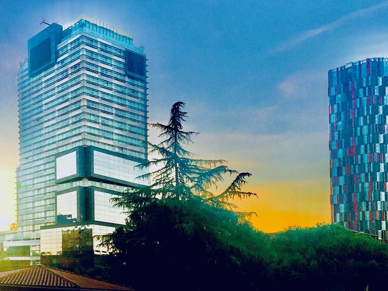
What is now known as the COIN Tower originally had the working title Polychromic Tower during planning. It was completed in 2008, in the final years of then-mayor Edi Rama’s façade-coloring program, which aimed to give a new face to the grey, post-communist city. BOLLES+WILSON were asked by the mayor to find an acceptable façade design for the already-under-construction tower. It was built without a crane, with concrete carried up on the workers’ backs. It features a Coat of Many Colours of sun louvers wrapping its somewhat irregular silhouette – unfortunately, only half of these arrived from the Turkish supplier. As the first post-communist tower, it soon became Tirana’s hub of luxury shopping.


Raakspoort – City Hall and Bioscoop
TYPOLOGY: Office / Leisure
COUNTRY: The Netherlands
CITY: Haarlem
YEAR: 2011
GFA: 18.500 sqm
CLIENT: MAB Development Nederland B.V.
AWARDS: NRW Jaarprijs, Best Retail Development, NL, 2013
Brick Award, Worldwide Brick, GB, 2012
PHOTOS: © Christian Richters
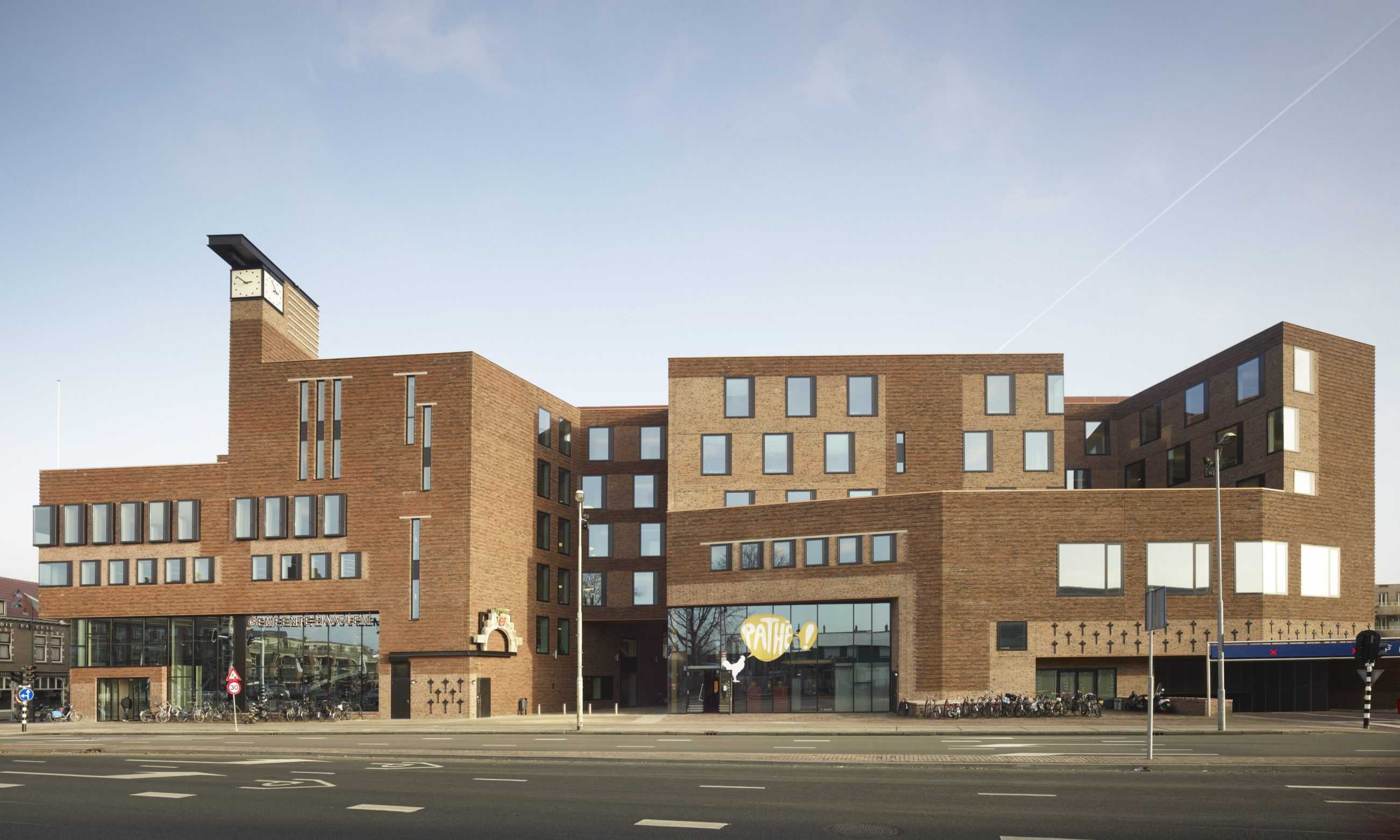
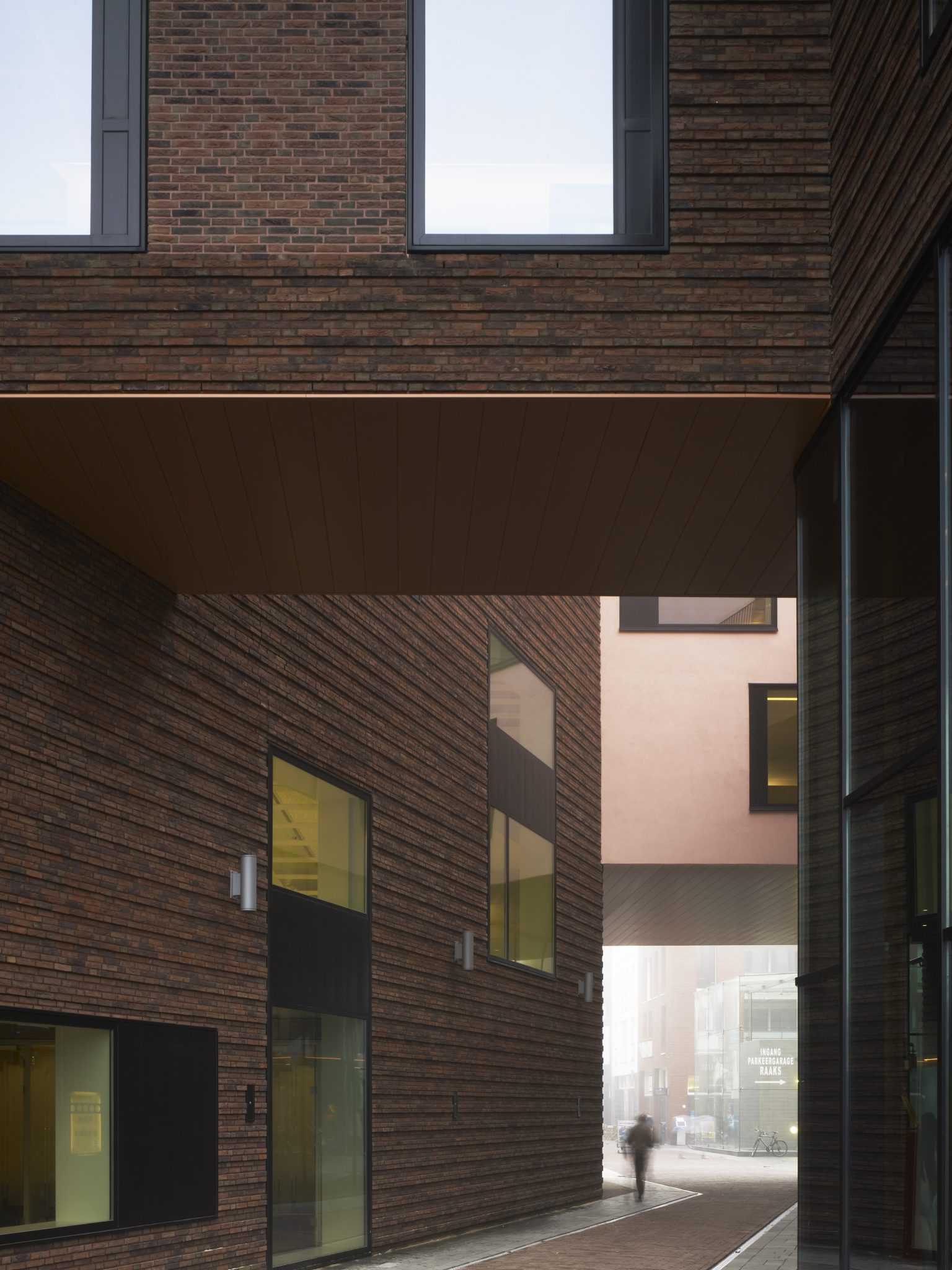
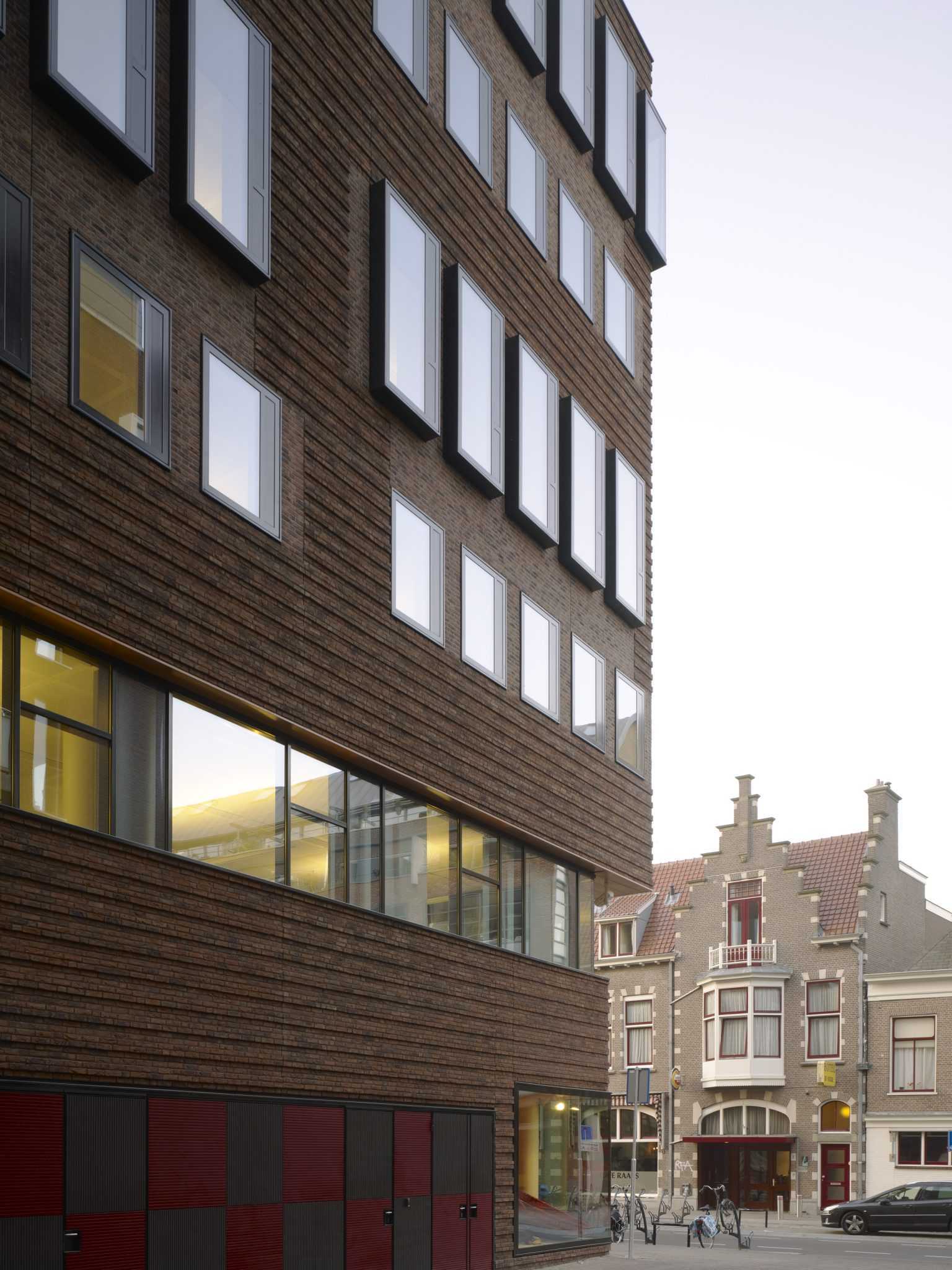
Transformative processes, particularly those relating to delicate fine-grained historic cities like Haarlem are complex and protracted. In the case of the Raaks project it took more than ten years to evolve from the considered Urban Masterplan (Donald Lambert – Kraaijvanger Urbis) through a sequence of workshops and program rethinks to the final ensemble, which opened in October 2011.
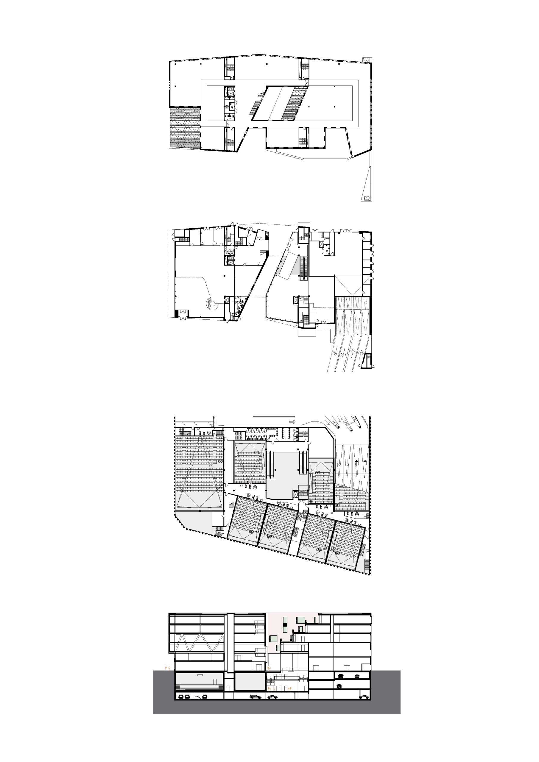
At the outset BOLLES+WILSON were given responsibility for the outermost block of this close packed, highly urban redevelopment precinct – which as it turns out (and as the masterplan prescribed) intertwines almost seamlessly with the adjacent small-scale urban fabric – a neighbourhood. The edge block must both shield (traffic) and invite (pedestrians), it must signal and respectfully take its place in the sequence of facades that define the historic limit of the medieval city. Initiating site workshops brought together neighbourhood representatives, city representatives, developers and architects – BOLLES+WILSON, Claus en Kaan, Jo Crepain and Kraaijvanger Urbis (who also had responsibility for the large format carpark below).
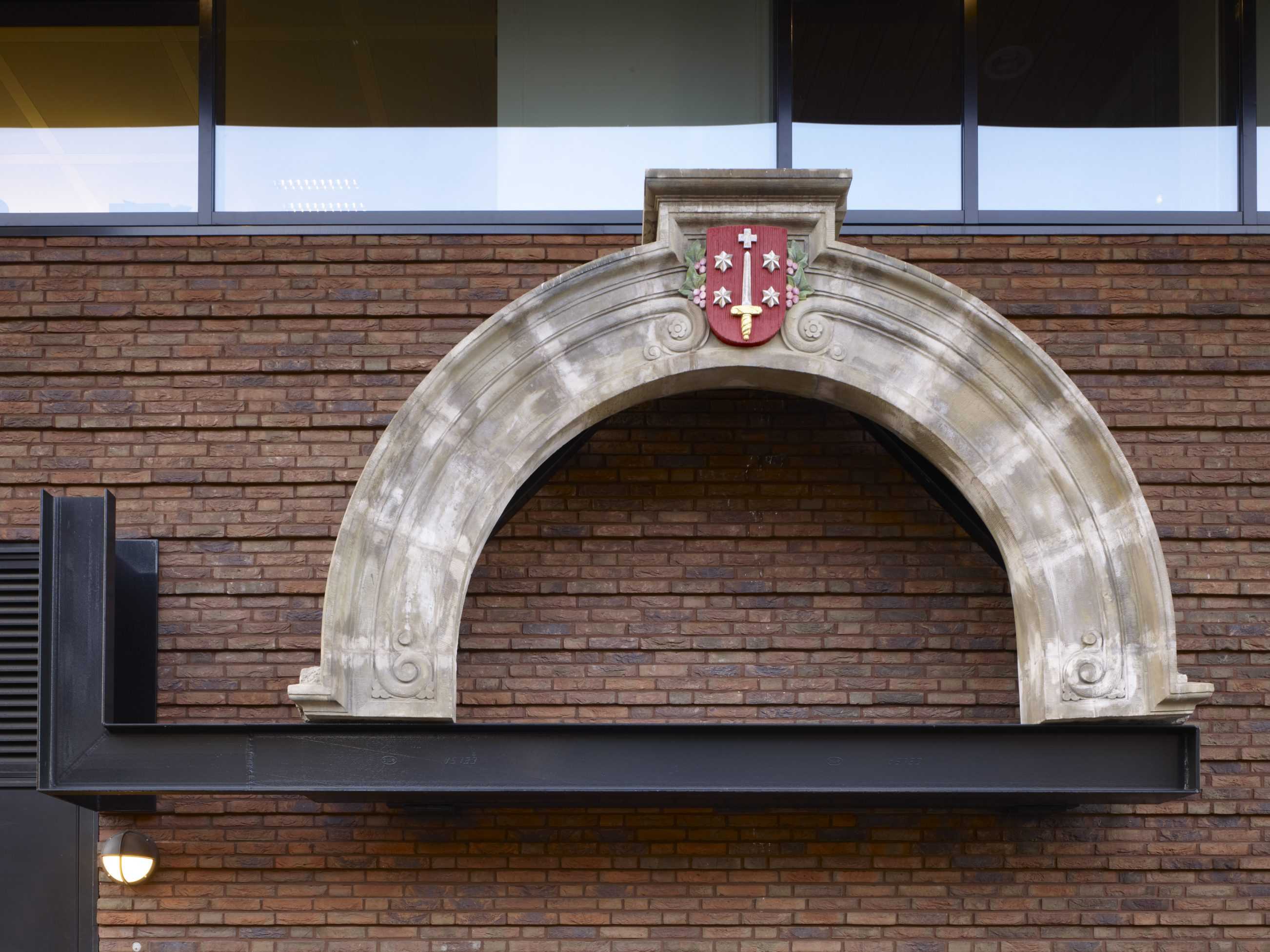
The complex functional mix began with one large and seven smaller Cinemas on the upper levels, a subterranean Casino and below that a parking deck (for croupiers and gamblers). Even at this stage the two functions were divided by a bisecting passage leading from the visible and representative outside facade to the networked block interior. The question of scale and historic referencing of the windowless





TYPOLOGY: Cultural
COUNTRY: The Netherlands
CITY: Helmond
YEAR: 2010
COMPETITION: 2006, First Prize
GFA: 5.630 sqm
CKIENT: City of Helmond
COLLABORATOR: Vrencken Hoen Architecten
AWARD: Fritz Hoeger Preis 2014, Winner Special Mention
PHOTOS: © Christian Richters
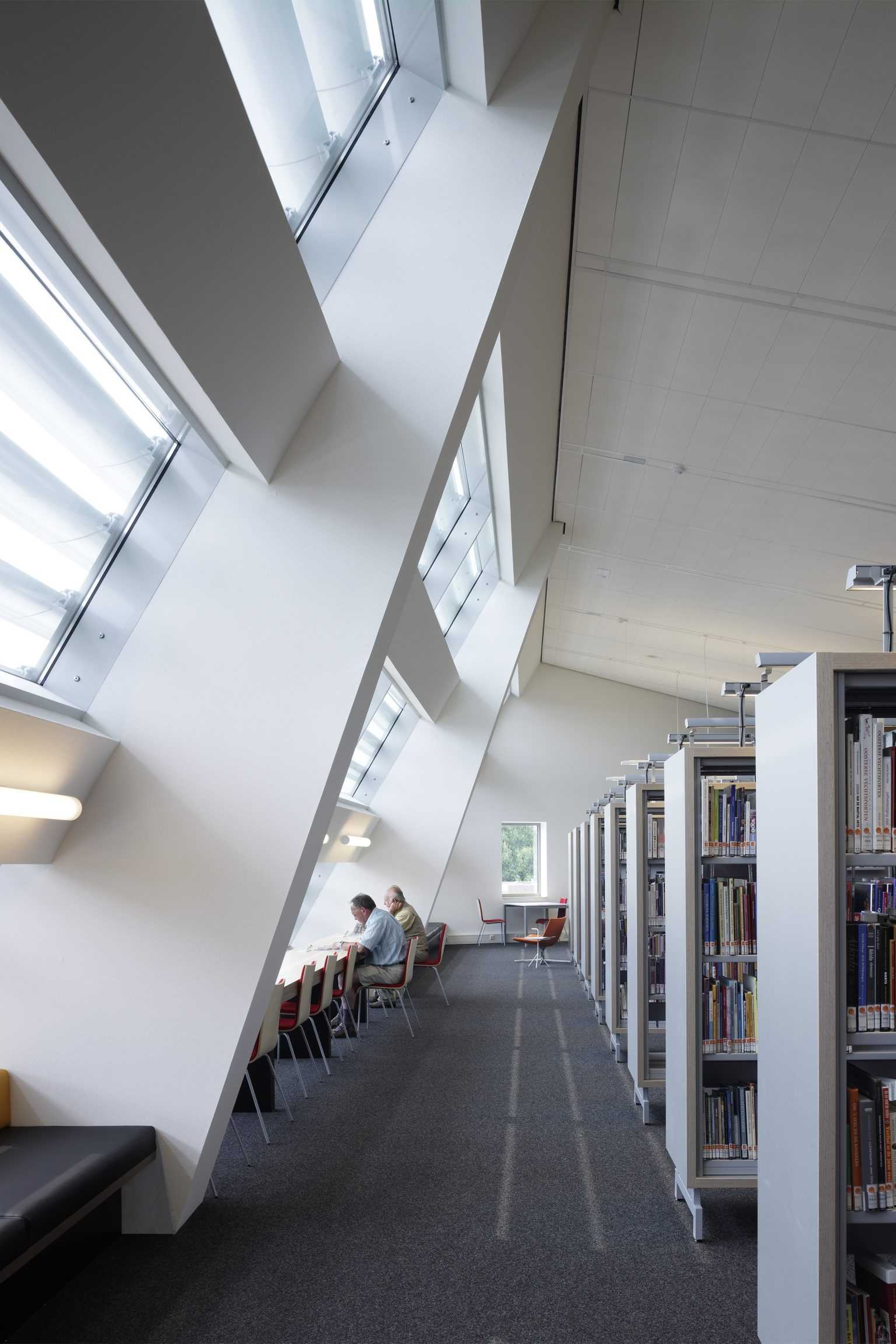
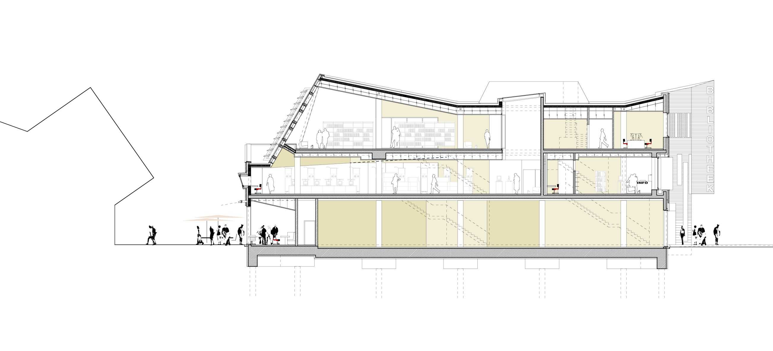
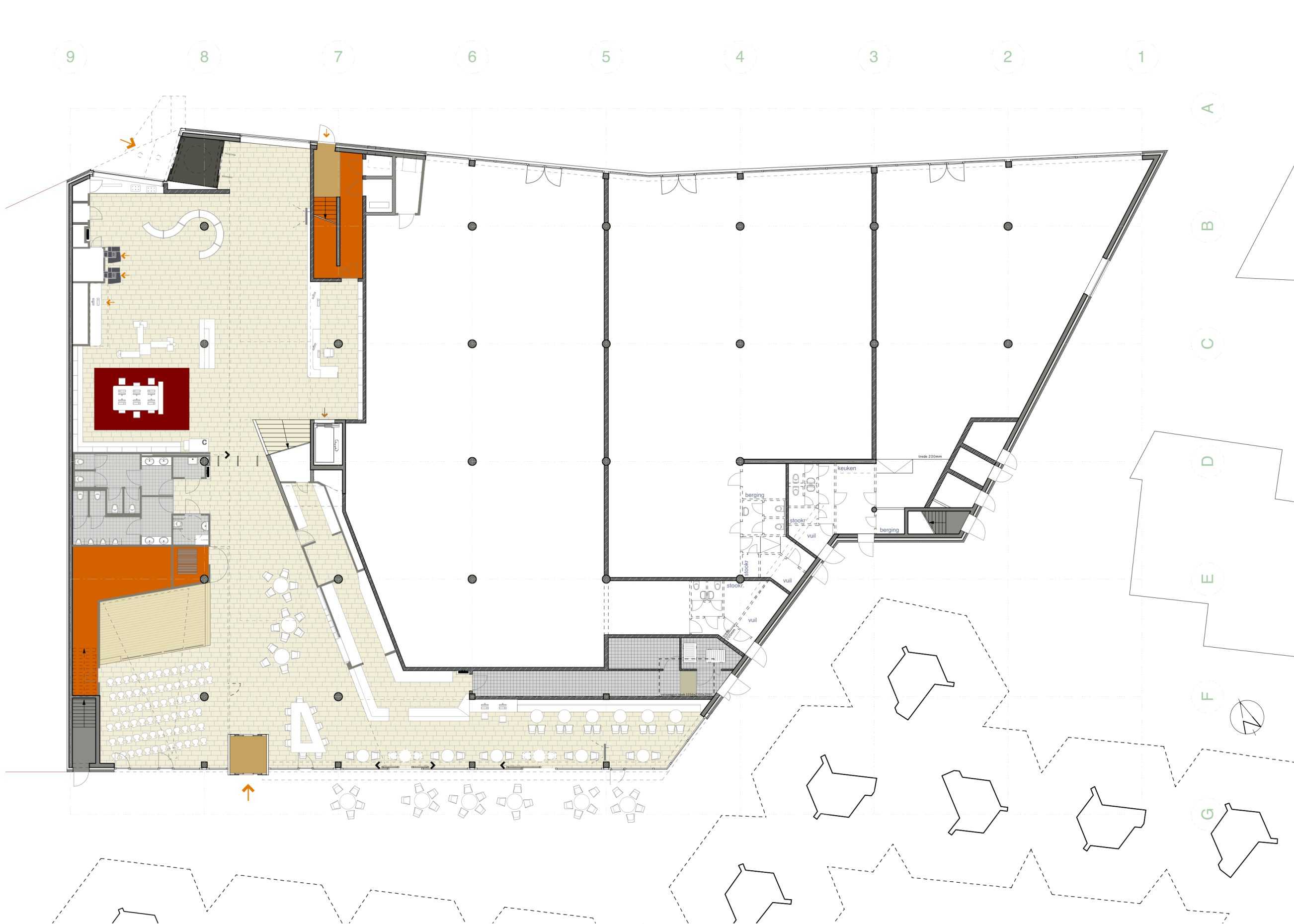
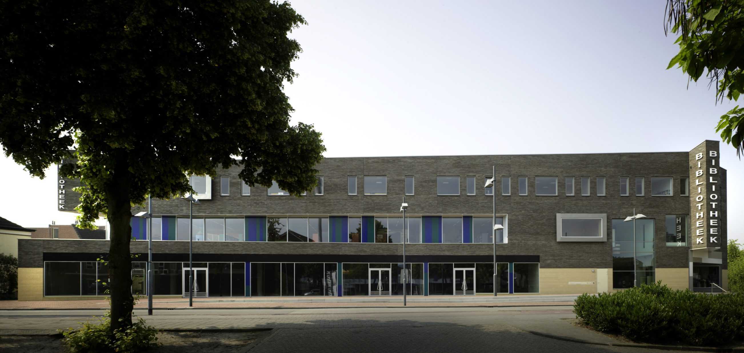
Like most Dutch cities Helmond is busy reinventing itself. The new City Library, which officially opens in October 2010, is the first component of a comprehensive new inner city shopping zone (masterplan: Prof. Joan Busquets). Directly adjacent to the new library are the 1970’s Tree Houses and Theatre by Piet Blom. Here the new library facade is moulded and sloped in dialogue with its dramatic neighbour. A between space, a block internal café terrace, a comfortable and dramatic extension of the existing enclosed Theatre Square is the result of this spatial symbiosis.
The outer, street-facing facade is the representative face and entrance of the new library. Upper level projections mark the extremities, brackets (ears) carrying large-format ‘Bibliotheek’ letters. A horizontal facade articulation differentiates ground level shops from glazed and setback first floor (Children’s Library) and the brick surface of the upper office level.
A careful detailing and material choice for external surfaces provides a ‘tactility’ fitting to the historic Helmond city centre. Rough dark brown and unusually horizontal bricks (Hilversum format 50 x 290 mm) on upper levels have open vertical joints and a beige horizontal mortar joint, stressing the layered grain of the brickwork. In contrast the base is in a flat beige brick (in 3 different heights – 50, 100, 140 mm). These are not laid in mortar, but glued together – resulting in a stone-like solidity and homogeneity.
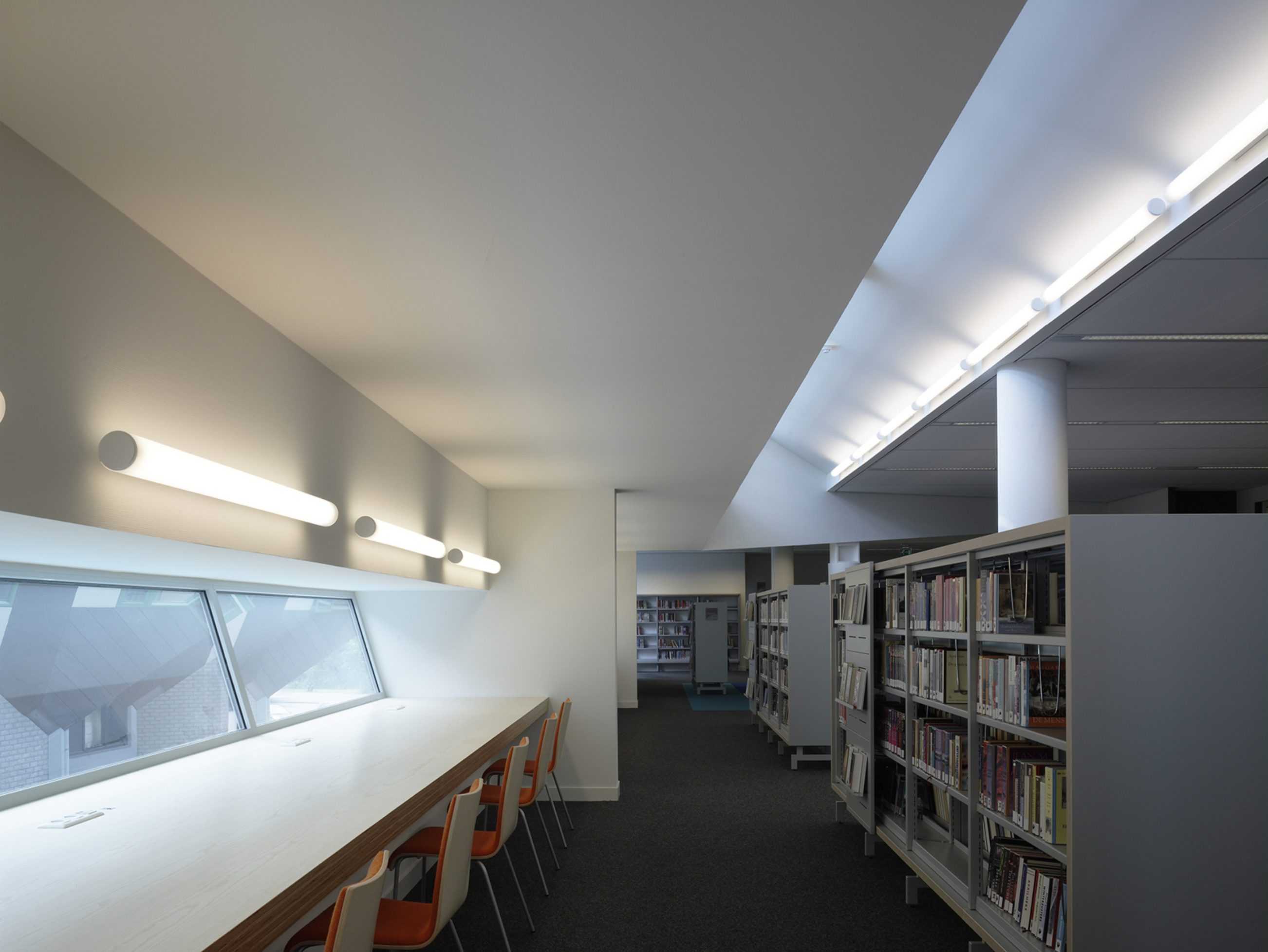
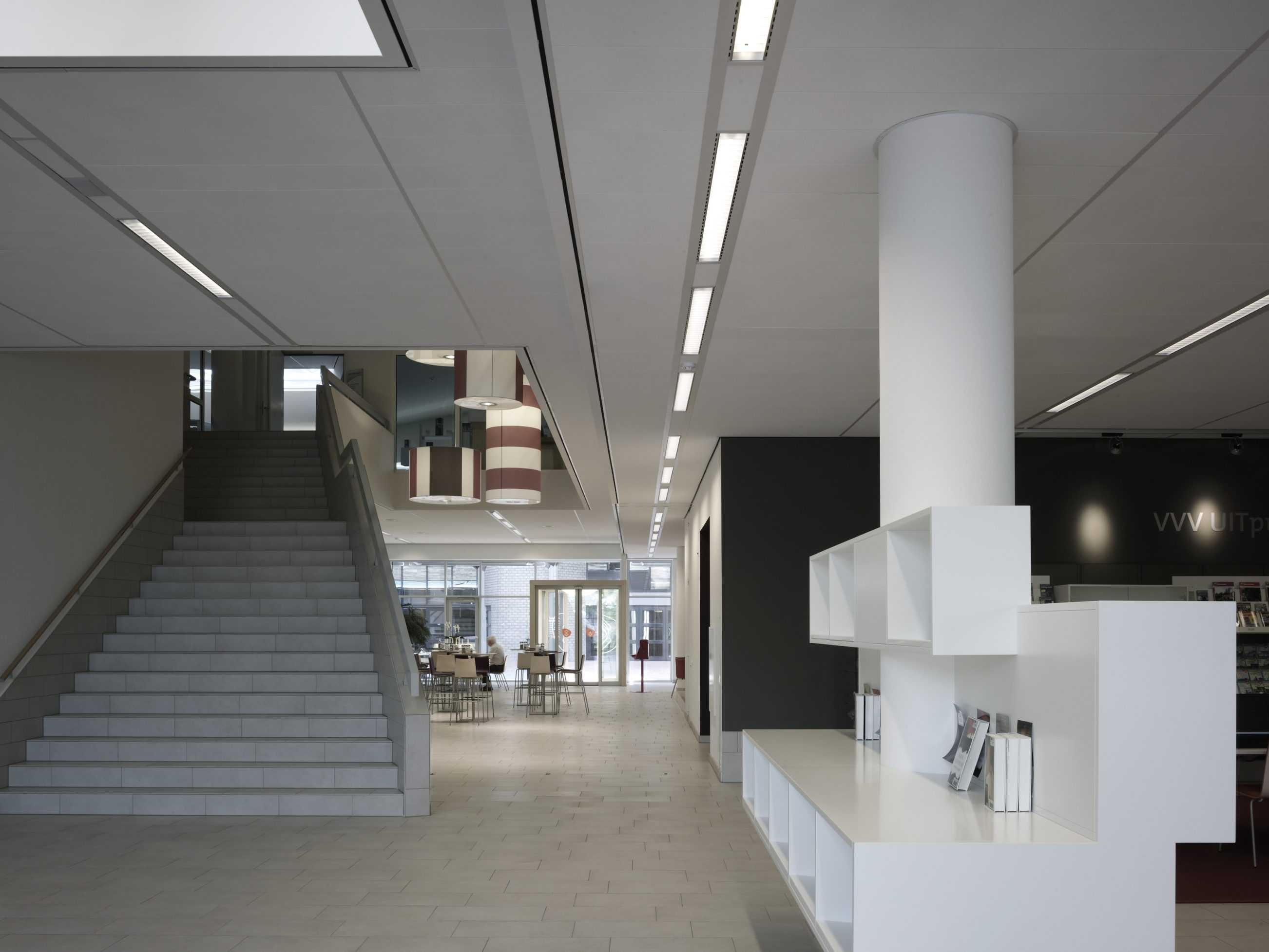
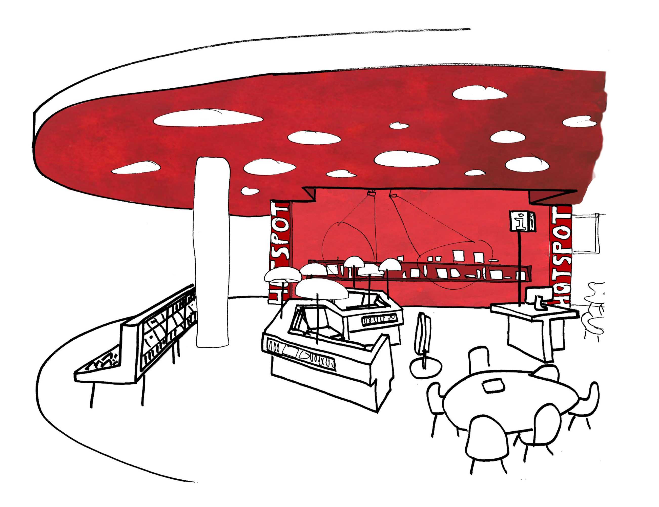
The internal spaces of the library are developed as an unfolding spatial sequence. Much of the ground floor is given over to retail. Entry is from both sides – via a generous double height entrance hall to the street side and via the more intimate café and event corner facing the Theatre Court. The upward sequence is announced by a grand stair, which arrives at a first floor exhibition deck and the ‘piano nobile’ of the library. Here information stations, bookshelves and children / teenager zones are arranged around a central media Hot Spot: precisely circular, a Chinese-red sandwich. The Hot Spot offers the digital latest. The route continues upward concluding in the light-filled upper level with a long working bench integrated in the long ‘tree house-facing’ window.
BOLLES+WILSON’s commission also included furniture and lighting elements, the choreographing of atmosphere and character. Lanterns in the foyer, a newspaper reading table, a striped and upholstered café bench seat with Scandinavian lighting, information counters and a group study room with fragments of a 1950’s mural mounted on the wall, are among the long list of localised detail. The philosophy is one of multiplicity, a user-friendly comfort already much appreciated by librarians and reading Helmonders.