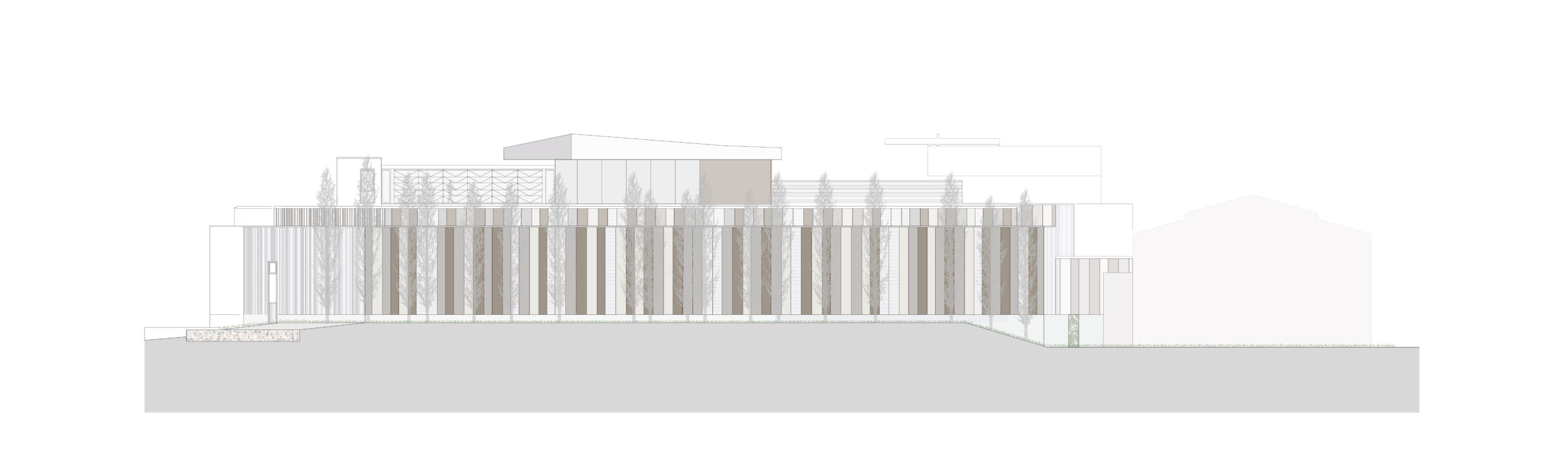
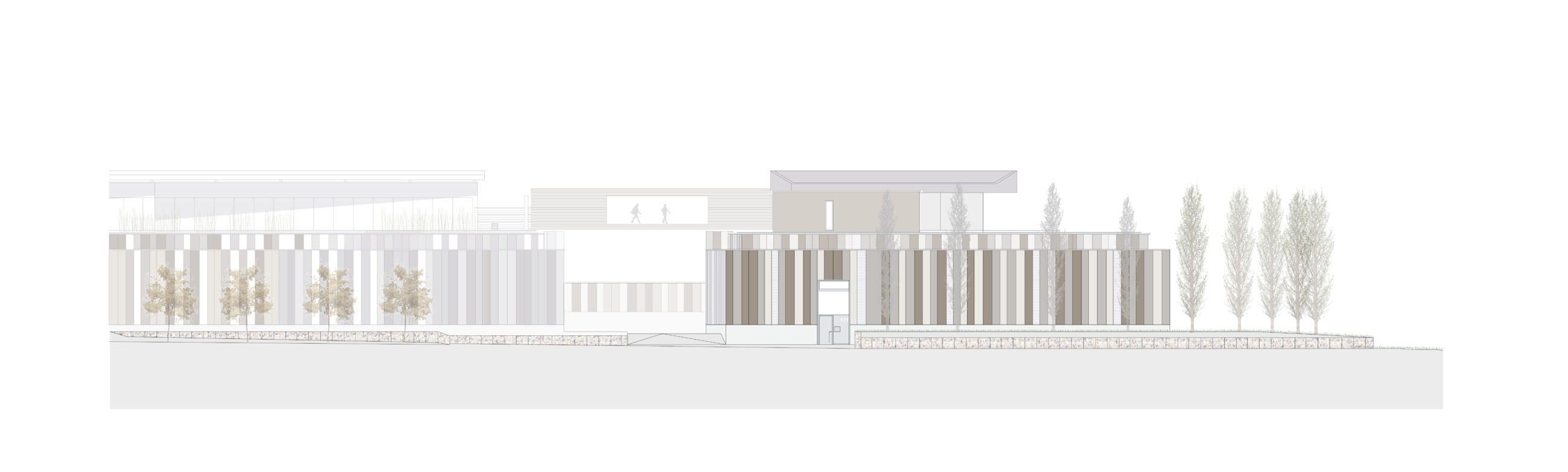
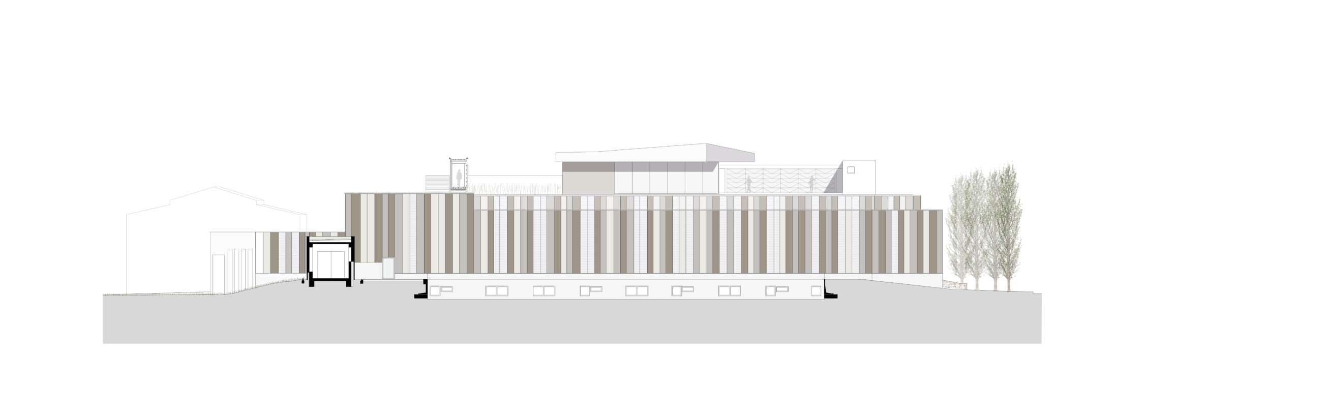
RS+Yellow Distribution – Phase 3
TYPOLOGY: Office, Residential
COUNTRY: German
CITY: Münster
YEAR: 2018
GFA: 2.600 sqm
CLIENT: Rainer Scholze
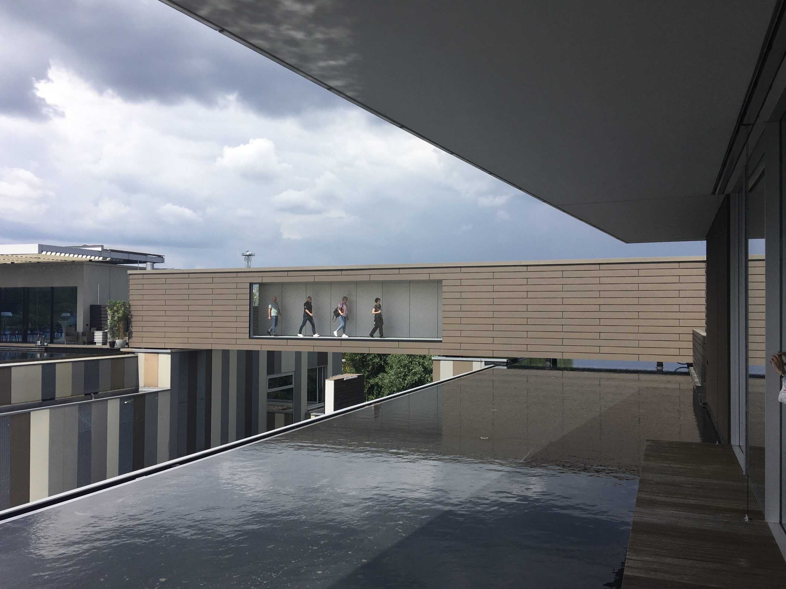
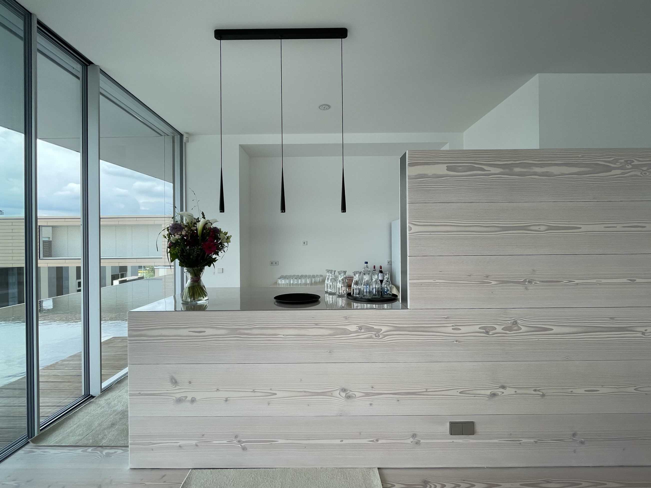
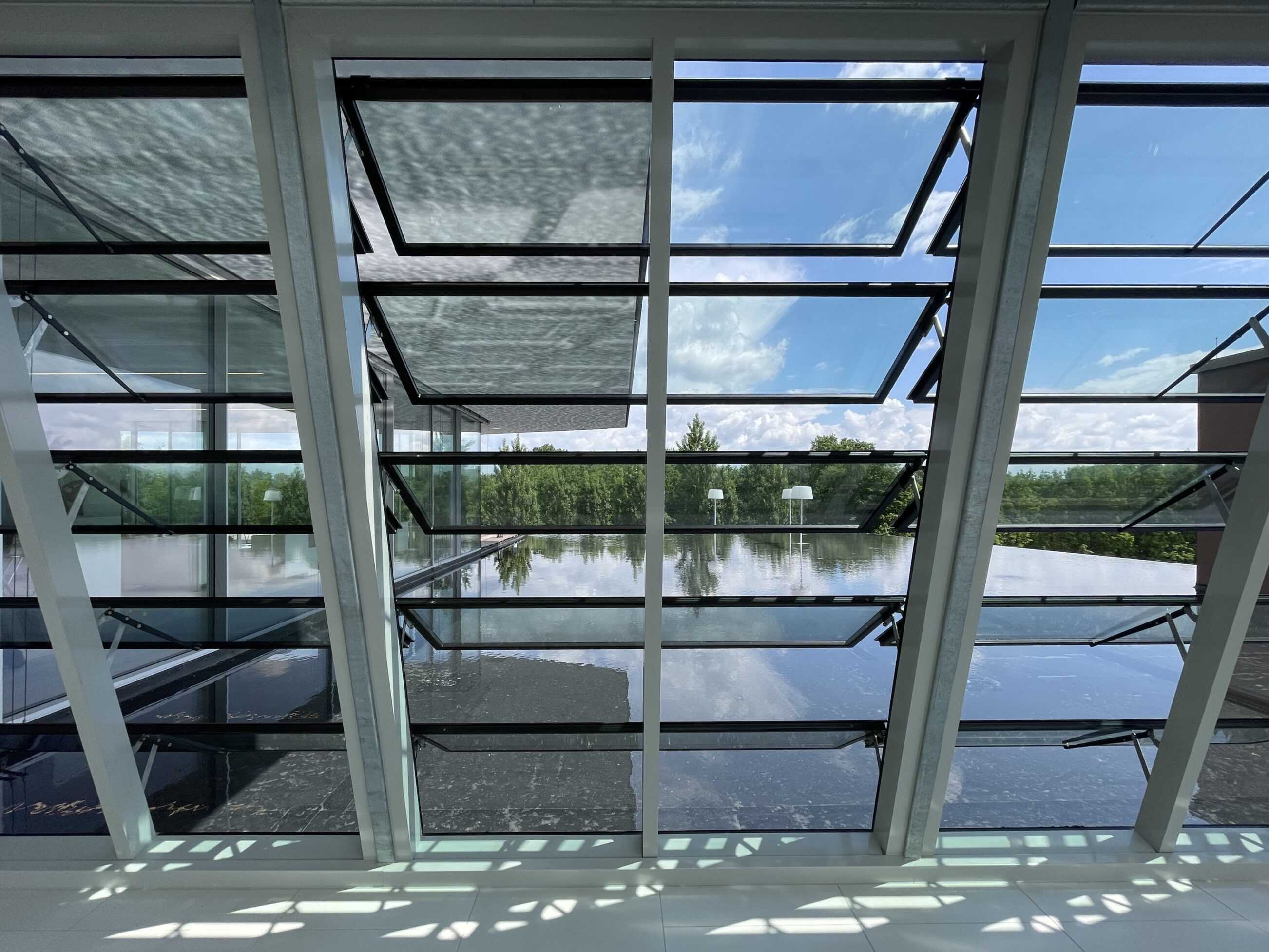
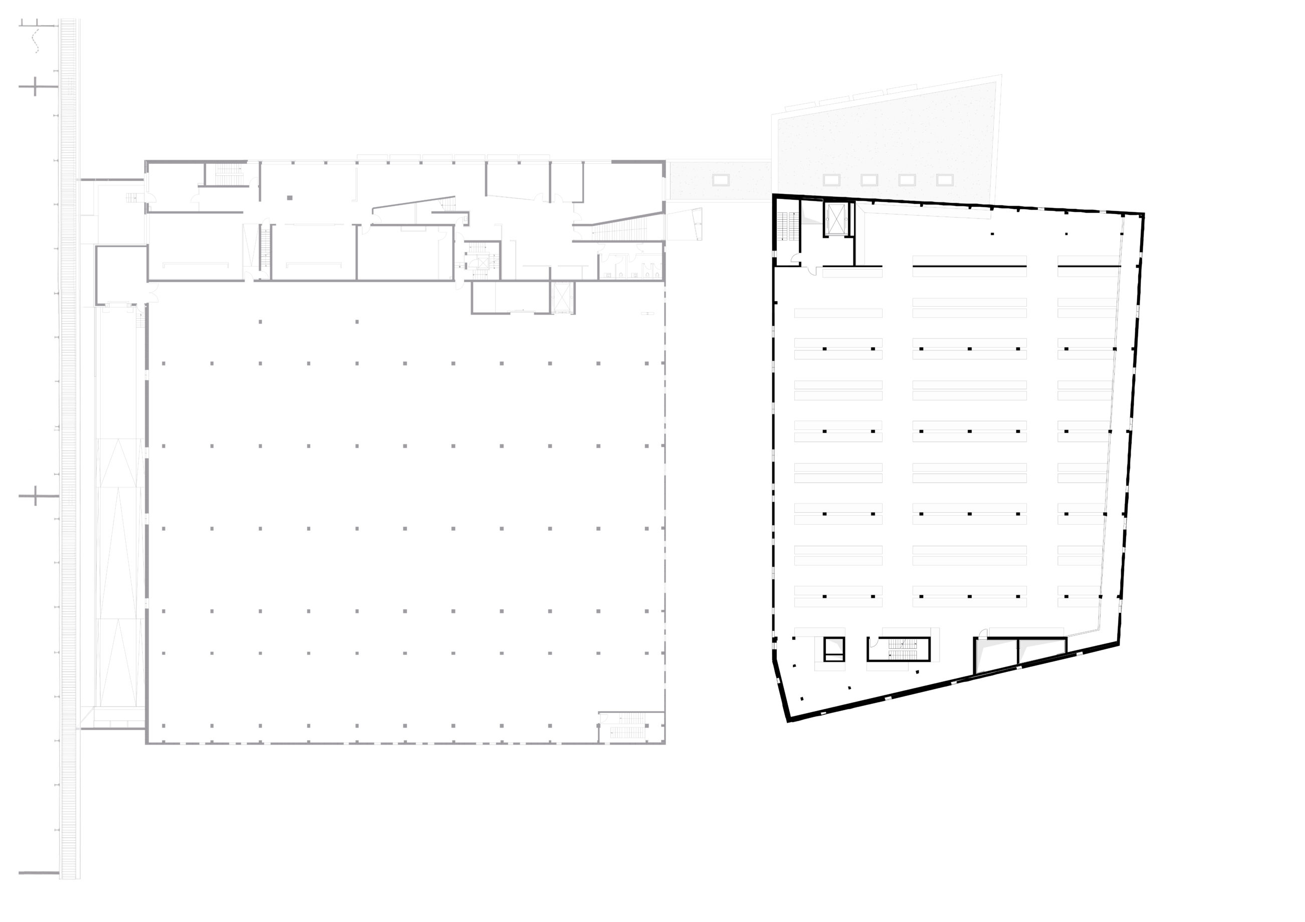
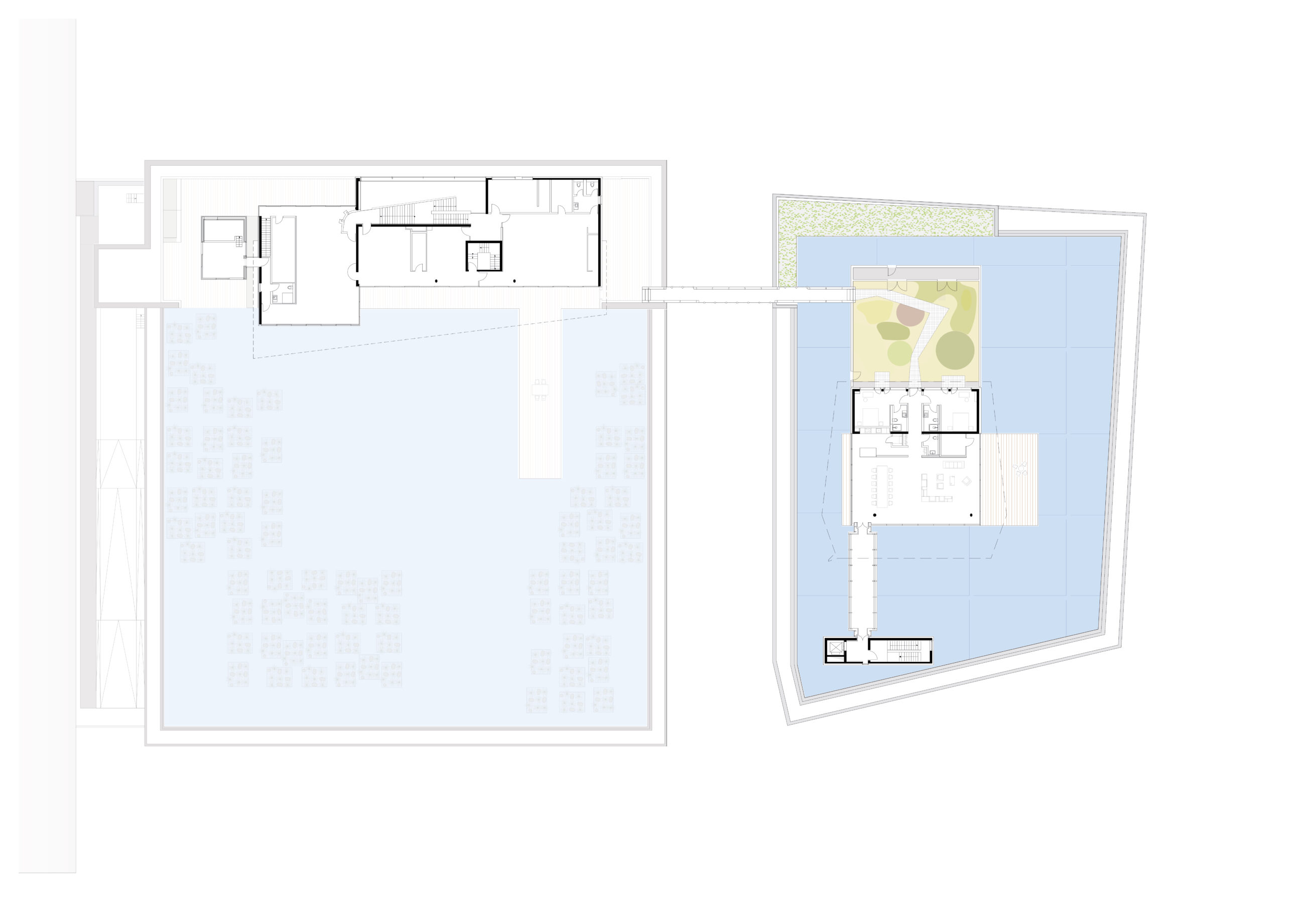
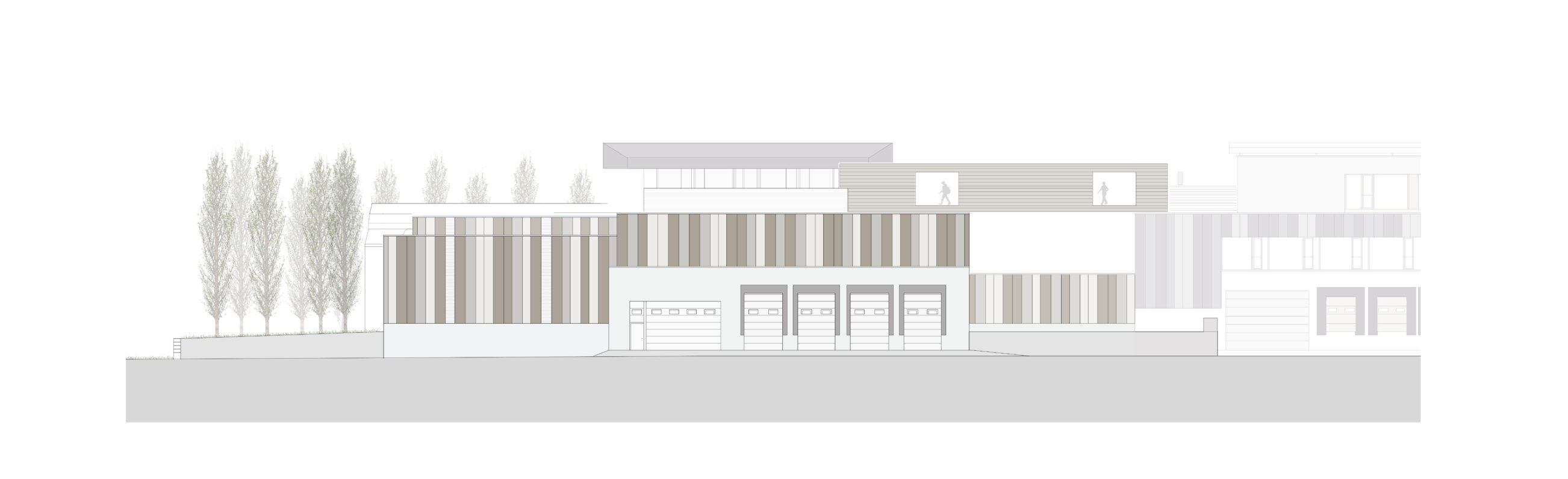
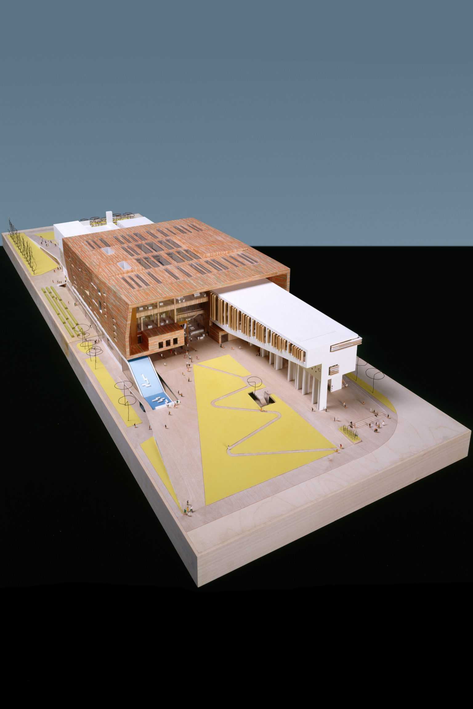
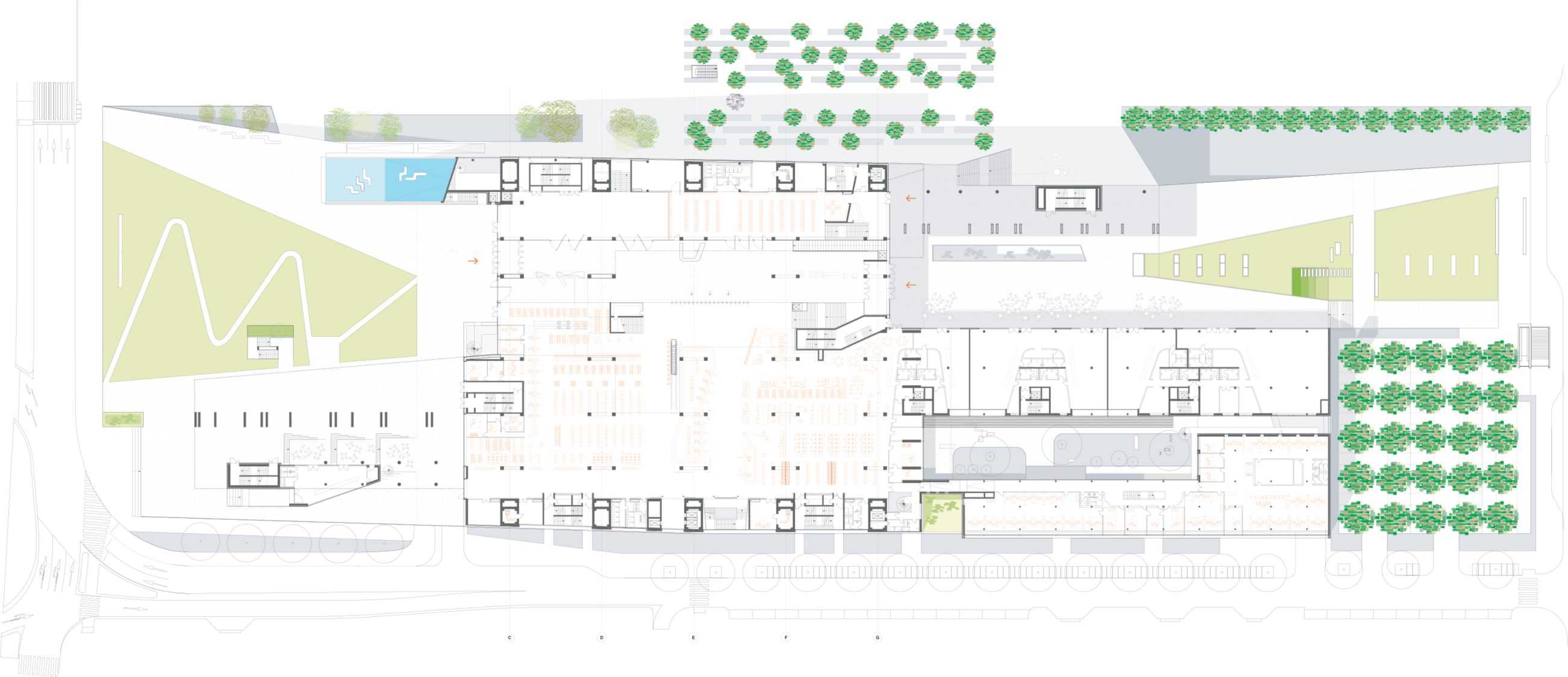
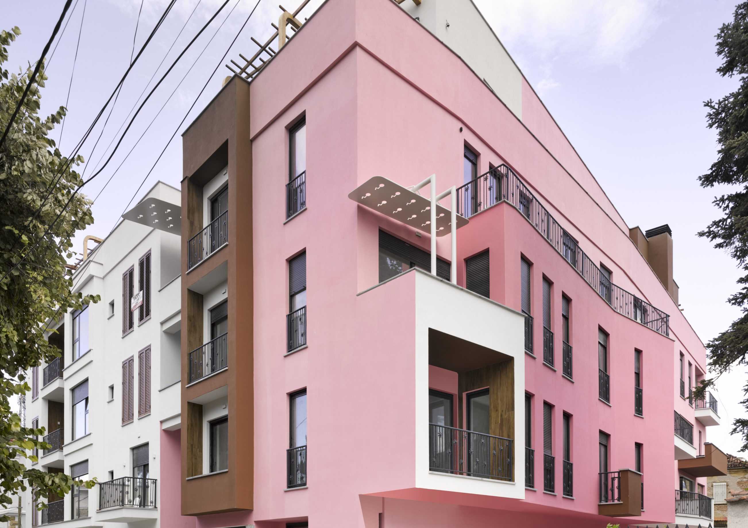
The big box warehouse provides a monumental podium for an enigmatic folded form hovering above the (unseen from the street) water roof.The primary function is obviously storage, three levels of furniture to be distributed to the Germany wide network of RS+Yellow outlets. Pajama striped aerated-concrete façade panels are interspersed with vertical smoke vents. Such vents are usually found on the roof of this pragmatic typology but here the roof (like in RS+Yellow Distribution – Phase 2) is flooded – an infinity pool, based on those seen by the client in South East Asia where he regularly travelled buying furniture. His plan was not only to work every day gazing out across his dreamlike waterscape, but also to spend his nights hovering above the rooftops of an unsuspecting Münster, Villa and Office Pavilion are thus connected by a bridge-box. Tragically Rainer Scholze did not live to see his vision complete. His private suite was not constructed and the living spaces now function as meeting and conference rooms for the co-operative he set up for his employees.


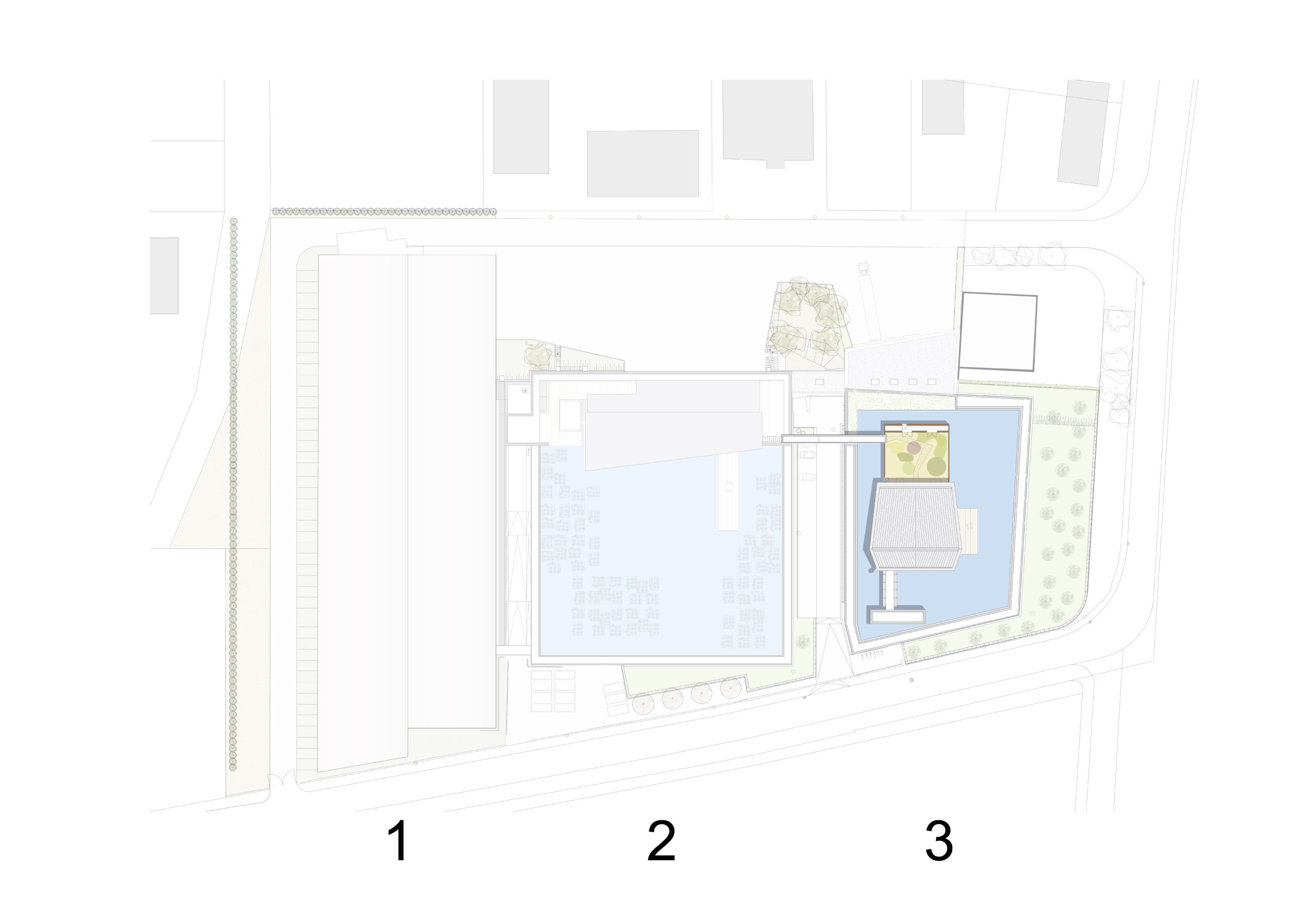
2: RS+Yellow Distribution - Phase 2
3: RS+Yellow Distribution - Phase 3
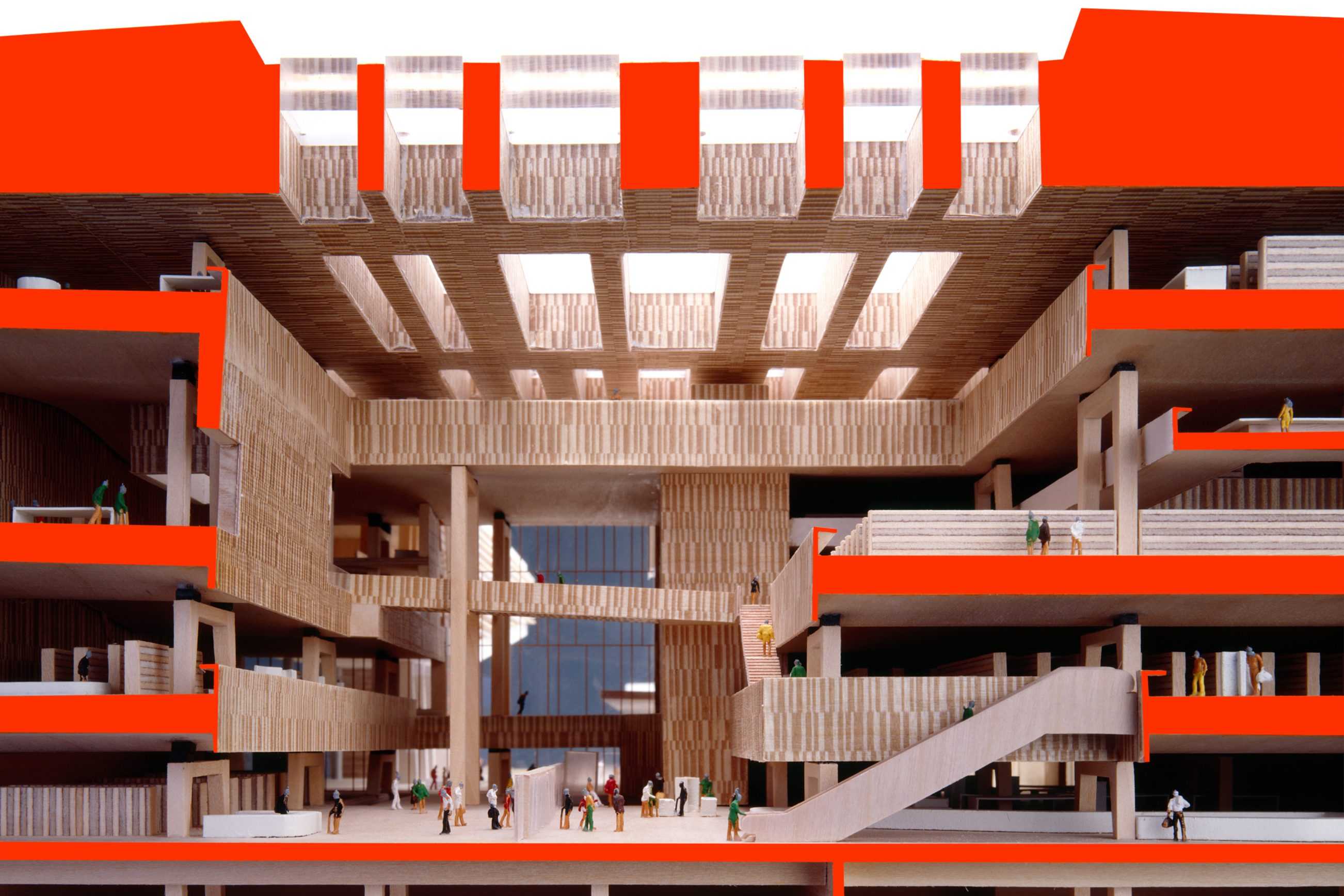
BEIC
TYPOLOGY: Cultural
COUNTRY: Italy
CITY: Milan
YEAR: (final design 2005)
COMPETITION: Invited Competition 2001, 1st Prize
GFA: 83.000 sqm
CLIENT: Fondazione BEIC, Milan
COLABORATORS: ati BEIC Milan: BOLLES+WILSON with ahw Ingenieure and alterstudio partners
PHOTOS MODEL: © Tomasz Sameck
MEDIA: 900.000 books, 150.000 audio-visual media, 3.500 user seats
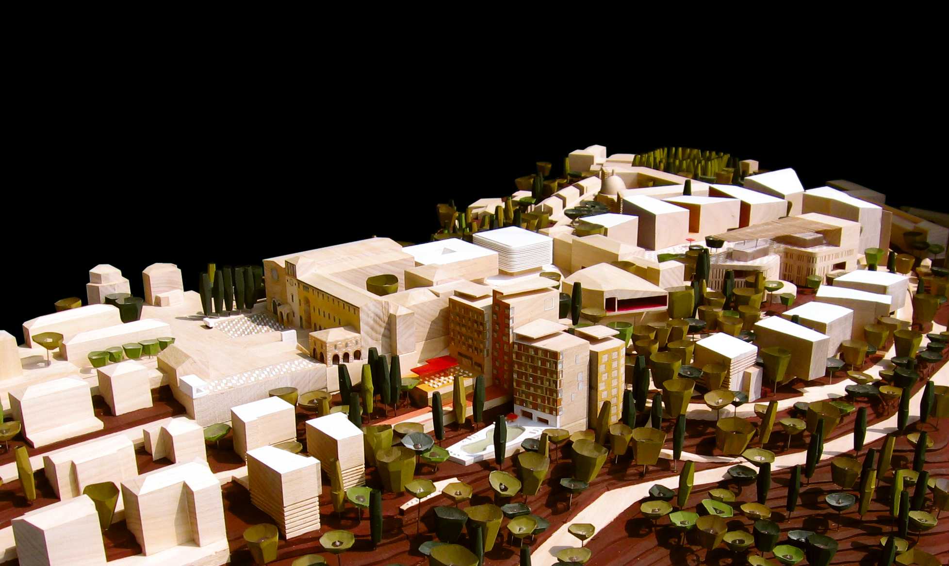
The BEIC is in the state of becoming. It already exists on the agendas of countless participating planners, librarians, expertly shepherding clients, politicians, Milanese and other future users. As the planning steadily marches through preliminare, definitivo and on to esecutivo phases, expectations multiply (optimism is contagious) and the physical character, the individuality, the unique spaces of this exceptional endeavour come ever more sharply into focus. Despite the grand scale the building conjures a certain intimacy for individual users. It invents an entirely new constellation of the ‘house of knowledge’, where digital ephemerality cohabits with our old friend the book. The emerging BEIC remains true to the concept that won the architectural competition. Within this architectural and organizational framework countless refinements have been invented (terracotta facade, the bar-chart-acoustically-absorptive interior panelling) and significant opportunities like the earthquake resistant wave-like ceilings have been identified and integrated.
Urban Concept – The site is linear, as is the remembered trajectory of the Stazione Vittoria. The BEIC’s two doors address the east (the centre of Milan, Viale Umbria) and the west (new subway exit, Viale Mugello and the new sport and recreation landscape beyond). An east-west pedestrian walkway runs not parallel to but through the BEIC – urban networking.
A 36 m high Urban Landmark – A vessel of culture and information, invitation, frame and enabler to multiple passages and trajectories. Entrance ramps fold surrounding pavements up to the +5.00 piazza, entrances and lobby. Reading arms extend out from the main volume.
Windows like that to the main elevator lobby on axis with the Via Vertoiba, tie through framed views the interior back into the urban context.
The terraces of the various departments frame a communicative forum, a landscape of knowledge. Reading salons nestled into the sidewalls of the frame or balcony edge desks offer a wide variety of working atmospheres. Warm acoustically absorptive materials provide the required library ambience.
Program – A 5 m high socle contains all functions outside the controlled library – Conference, Teaching Centre, Media Forum, Childrens Library with garden, carparks. The walkthrough Lobby gives a visual orientation to all departments galleried above. It flows into the entrance, general information and reference zones. Reading Rooms are on the north side, Users Own in the east arm, connecting to youth areas. Departments are on three upper balconies, with variable stores and connected via ramps in the reading arms – a flowing together. Workshops, offices and administration are in the 3 storey arm along the Via Monte Ortigara.


Ligor Rembeci
TYPOLOGY: Residential
COUNTRY: Albania
CITY: Korça
YEAR: 2021
CLIENT: Bregu Group
PHOTOS: © Roman Mensing
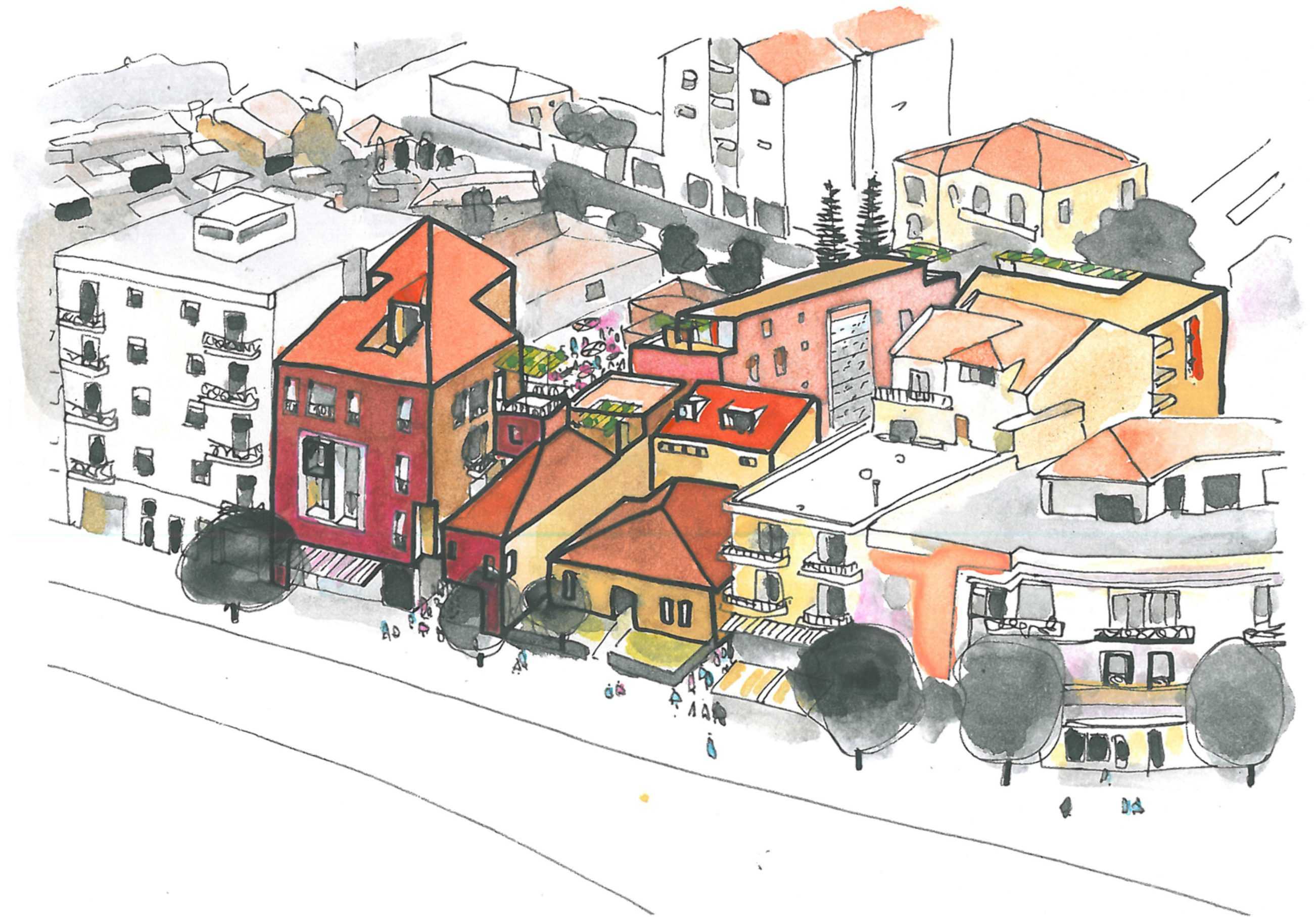
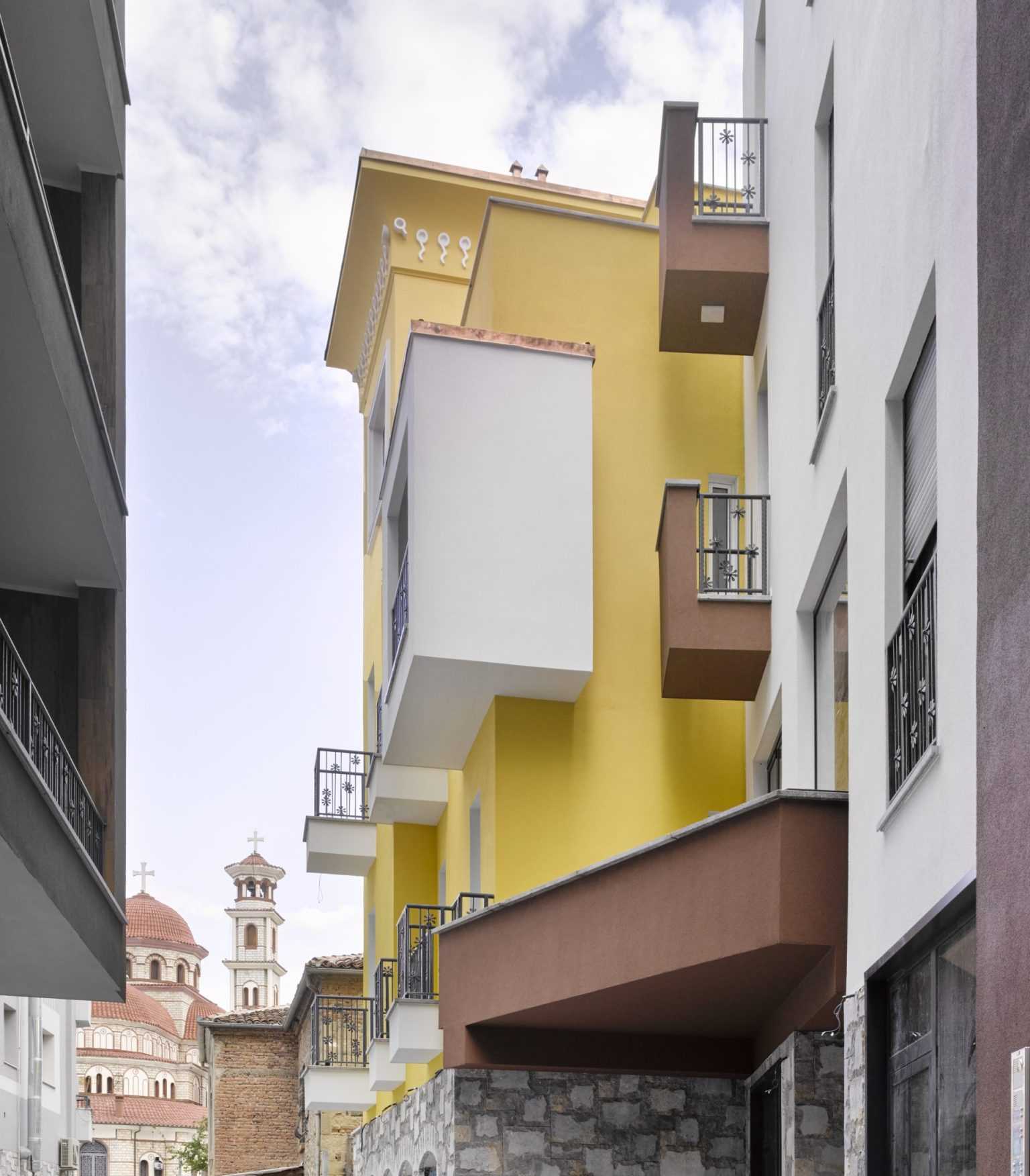
The original BOLLES+WILSON 2016 Masterplan for the center of Korça identified the Ligor Rembeci Quarter as a zone for careful insertion of new buildings in symbiosis with existing stone villas – this strategy – activating a block interior accessed by a network of passages – is now emerging with the recently completed Serenity Villas.


Icon Museum
TYPOLOGY: Cultural
COUNTRY: Albania
CITY: Korça
YEAR: 2016
CLIENT: Municipality of Korçë
COLLABORATOR: Dea Studio
AWARDS: Nomination, The Plan Award 2017
Nomination, Aga Khan Award for Architecture
PHOTOS: © Roman Mensing
The building for the Korça Icon Museum was originally a structure of columns and floor slabs (Maison Domino) abandoned when communism collapsed in Albania.
The Albanian office DEA Studio were comissioned to design facades and BOLLES+WILSON were then asked by the municipality of Korça to design and develop an interior exhibition design and sequence for the 300 Orthodox icons.
The heavy walls on the exterior with their small windows were intended to give an appropriate medieval reading.
The small windows from the inside did give an appropriate mysterious atmosphere but in terms of viewing Icons they were too bright and needed some interior masking to avoid too much contrast between a small area of bright outside light and the surrounding.
As the museum neared completion the albanian Prime Minister Edi Rama visited, and thinking the facades were too prison-like asked BOLLES+WILSON to extend their interior language to the entrance facade. Black painted plaster was added framing and respecting the DEA window composition. BOLLES+WILSON also added ‚Barnett Newman colours‘ to the existing communist fountain.
EXHIBITION ORGANIZATION
The given three levels subdivide well into Basement Archive with ground level laboritories/administration. The Exhibition spaces belong on the entrance level and the 1st floor – here the interior concept proposes a specific circulation route for visitors and an absolute division between public spaces and ‘back-of- house’. This is necessary for reasons of security (the public must not have the possibility to enter rooms where Icons are being worked on).
The floor between entrance level and 1st floor has been removed over the entire left hand exhibition room. This allows a new stair facilitating a simple and spectacular visitors circulation route. The new stair gives panorama views of a 9.5 metre high golden wall – for this wall the Petersburg hanging system was chosen – a close packing of Icons, a tapestry of images covering the entire wall, impressing visitors with the size of the Korça collection.
A SEQUENCE OF ROOMS
The interior concept develops zones of strong individual character defined by colour: gold on the left, black matt and gloss black in the central ‘Black Labyrinth‘ zone and Red for the Iconastas (Altar screen) on the right. The Sequential Rooms are carefully choreographed for the most dramatic effect:
(a) Entrance Lobby – an abstract collage of shelves for merchandising, postcards, posters, local handcrafts and even small Icons painted by Korça artists (a new local industry) are displayed and sold.
(b) The Gold Room – a two floor high gold screen (one that also wraps the sidewalls and
tames natural light from slit windows). The screen is packed with Icons. Visitors promenade freely and then step up to the stair landing where an information handrail tells them what they are looking at.
(c) The White Balcony – overlooking the Gold Room – has a heavy Black handrail and a white (conventional museum) rear wall for a row of small Icons. These lead to an opening on the right.
(d) The Black Labyrinth – the central zone of the museum is particularly dark and mysterious with individually lit Icons floating in the penumbra. Walls are painted in a collage of matt and gloss black and grey to enhance the collage effect. Side alcoves with lower ceilings and wooden floors bring individually hung Icons intimately close to viewers.
(e) The Red Salon – from the Black Labyrinth visitors emerge into a sensual space where all surfaces are red. The central zone is defined by a 10cm high platform on which stands the iconastas (Altar screen).
(f) The final exhibition room is white with an illuminated ceiling – an ethereal space. The room displays the two most valuable icons from the 14h century.
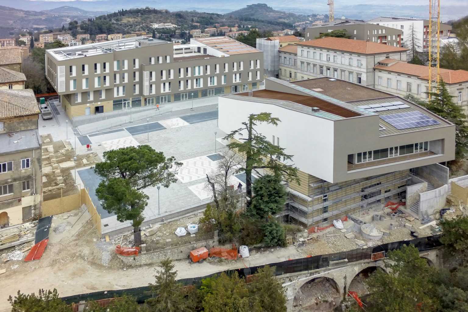
Monteluce Quarter
TYPOLOGY: Masterplan / Mixed Use / Landscaping
COUNTRY: Italy
CITY: Perugia
YEAR: 2006 – 2015
COMPETITION: Invited Competition 2006, First Prize
CLIENT: BNL Fondi imobiliari SGR p.A. / Fondo Umbria – Monteluce Unit / BNP Paribas REIM SGR p.A.
AWARDS: Premio Urbanistica 2007 (category Quality of Public Spaces), Italian National Institute of Urban Planning
CONSTRUCTION PHOTOS: © BNP
MONTELUCE MASTERPLAN
On 12th sept. 2006 the office of Bolles+Wilson was awarded the first prize in the International Design Competition for Monteluce in Perugia.
The jury lead by Axel Sowa, director of “Architecture d’ aujourd’hui” commended the winning entry for its respect and sensitivity to the scale of Monteluce, its morphological compatibility with the historic structure of Perugia and its sympathetic relationship to the surrounding Umbrian landscape.
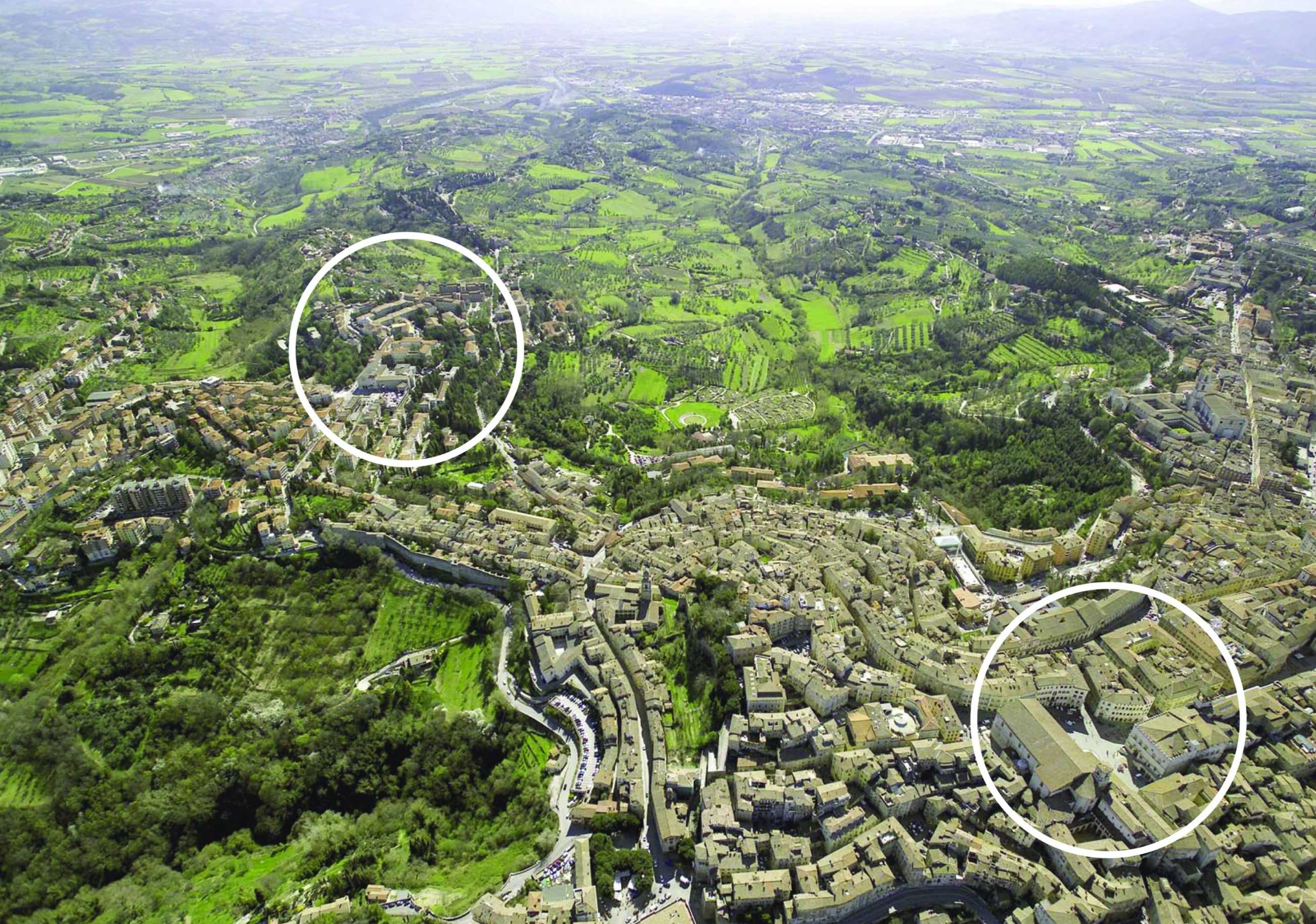
The Convento delle Clarisse of S. Maria di Monteluce originating in 1218 stands outside the Etruscan walls of Perugia, an outpost protecting one of the main access roads. Expansion outside the medieval walls reached Monteluce at the end of the nineteenth century. A concurrent appropriation of religious assets by the State instigated the opening of a gate to the Piazza Monteluce and between 1910 and 1923 the construction in the monastery garden of a series of hospital pavilions.
The Competition Program developed in close co-operation with the Commune di Perugia called for a total of 65,000 sqm – 43% of which is student and private housing and 25% subsidised housing. The new urban Quartier is networked in terms of a continuity of urban spaces and a rich programmatic mix including a maximum of 10% retail and 5% office use as well as hotel and conference facilities, local health offices, kindergarten and a new public park.
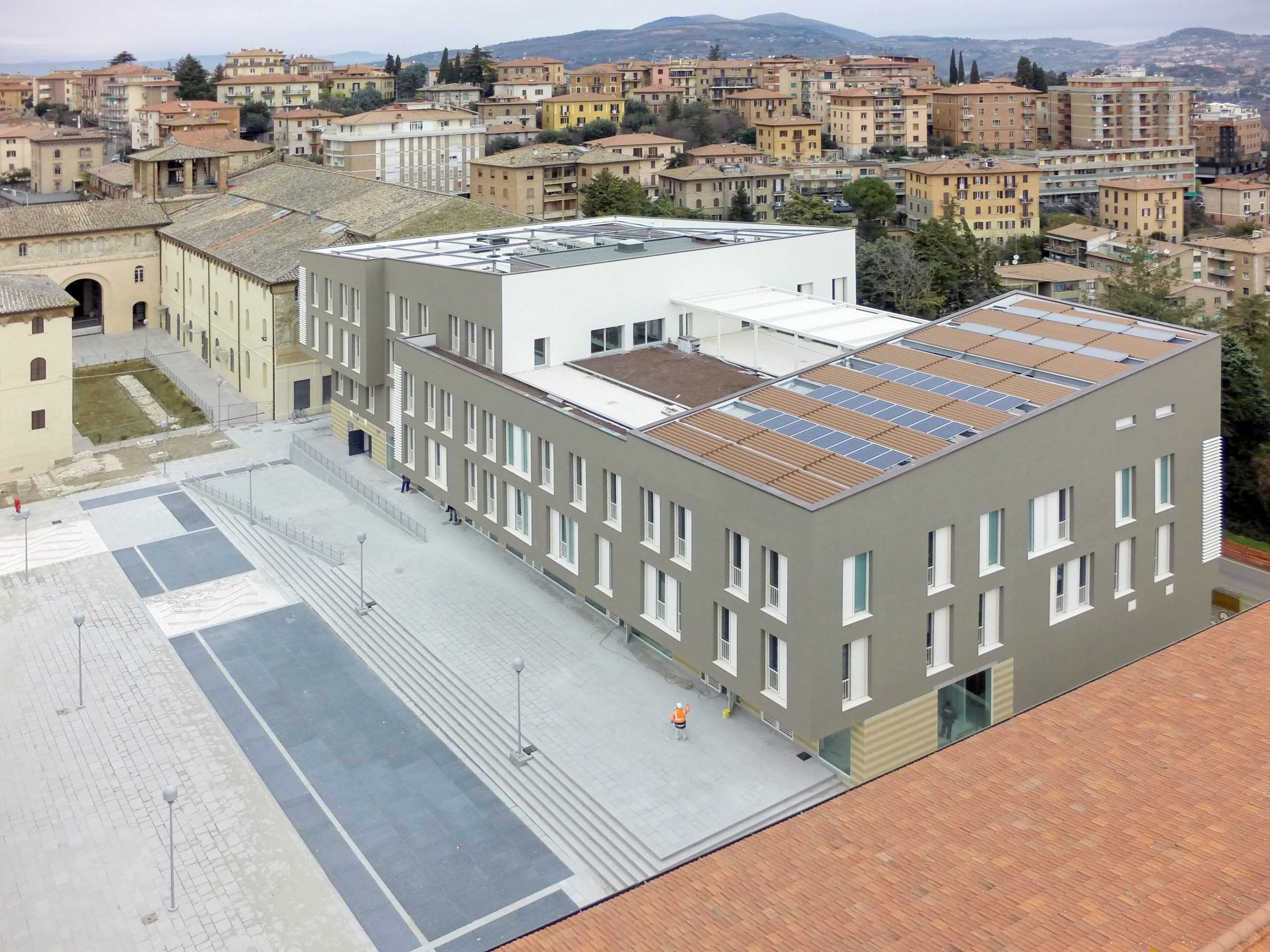
The Bolles+Wilson design developed and presented in 1:500 model format rejects authoritative geometry in favour of a sequencing of localised responses tailored to the dramatic topology and framed views out and across the luxurious Umbrian landscape. For economy and continuity many new structures occupy the footprint of redundant hospital buildings, a strategy that preserves the extensive terraced system of retaining walls and protected trees.
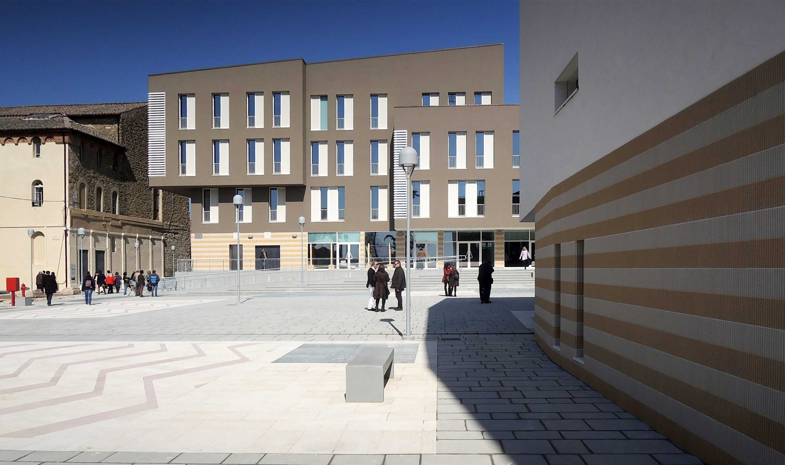
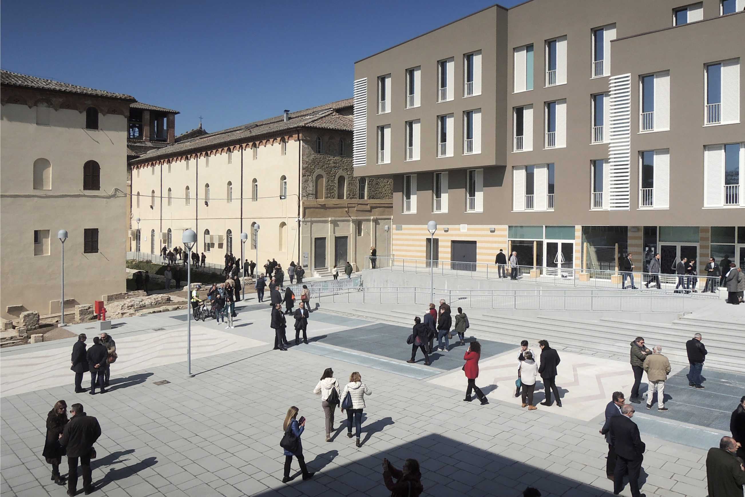
Bolles+Wilson describe their scheme as Urban Choreography, a sequence of public spaces unfolding from the S.Maria di Monteluce church in the west to the new Park d’Este. A first Piazza is framed by the Monestry portico and the one remaining Hospital Pavilion (Public Health Offices). To the north are offices and a submerged supermarket. To the south a Hotel and Conference Pavilion frame the view in the direction of Assisi. A second Conical Piazza is enclosed by a row of student housing buildings to the north and an opposing commercial/ restaurant Acropolis. Here deck- like upper terraces offer spectacular views of the historic skyline and Umbrian landscape.
MONTELUCE QUATTRO
The core of the new urban quarter became the (architectural) responsibility of BOLLES+WILSON (see siteplan). In realization it follows very closely the competition proposal of two Piazzas on the crest of the hill/ridge, underneath these two levels of carparking ensure car free public spaces (500 cars disappear underground). The strategic placement of these two Piazzas follows the typical Perugian trope of leaving one side of a space open for cooling winds and views out across the sensuous and gently rolling Umbrian landscape (views across the valley to Assisi).
The strategy of two piazzas introduces a spatial sequence resulting from the integration of the historic monastery and the12th century chapel – their arched entrance portal announces the entry to the first new Piazza, now named Piazza Cecilia Coppoli (1426-1500, poetess and humanist) and opened on 19th March 2015 by Catiusca Marini – President of the Region of Umbria. Signora Marini described the Monteluce spaces as ‘an investment in the culture of the city, also in the public patrimony of Perugia, an exemplary work and graceful urban transformation, one that experiments with a new contemporary urban architecture.’