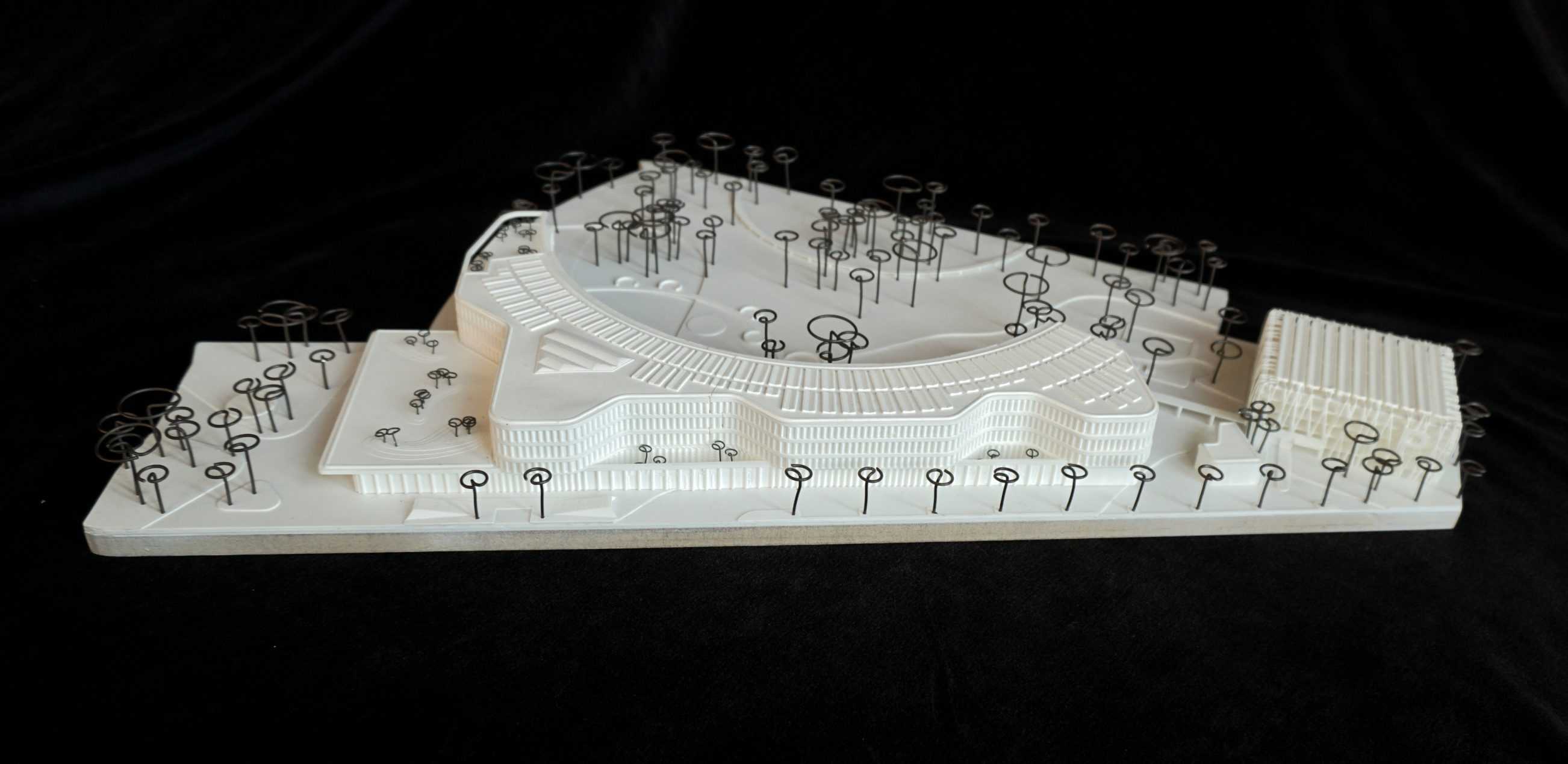
TYPOLOGY: Competition / Office
COUNTRY: Germany
CITY: Potsdam
YEAR: 2022
COMPETITION: Closed two-phase competition, 1st Prize
GFA: 23.000 sqm
CLIENT: District of Potsdam-Mittelmark
COLLABORATORS: Lindschulte+GGL Ingenieurgesellschaft mbH, Gerhardt Landschaft, Nees Ingenieure GmbH
The structural design for the administration building on the site of the historic Beelitz sanatorium was based on the winning design by B+W for the previous urban planning competition.
By following the course of the original footpaths, the new building blends gently into the park landscape. The restored circular hiking trail in the historic park serves as a “natural” construction limit and forms the connection to the listed building.
The south side of the new building develops parallel to the street and mediates between the alignments of the different existing buildings and the traffic routes.
Public and semi-public functions such as the entrance hall, conference center, advice center and canteen are lined up in the base. The three upper floors form the main building that is visible from afar and house the office and administration area. Towards the park, like the base, it leans against the circle of the historic circular path, while towards the street sides the volume is structured into individual sections by a wave shape.


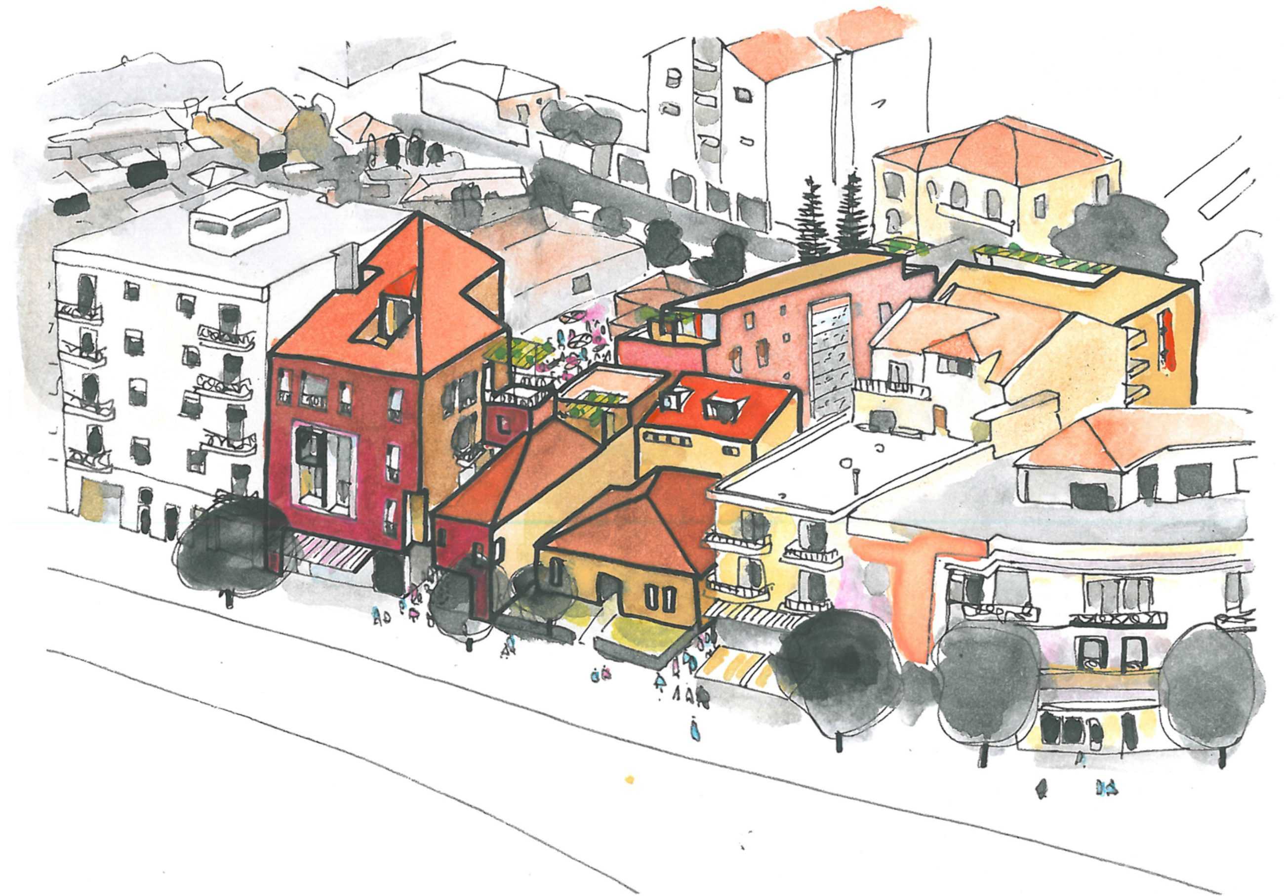
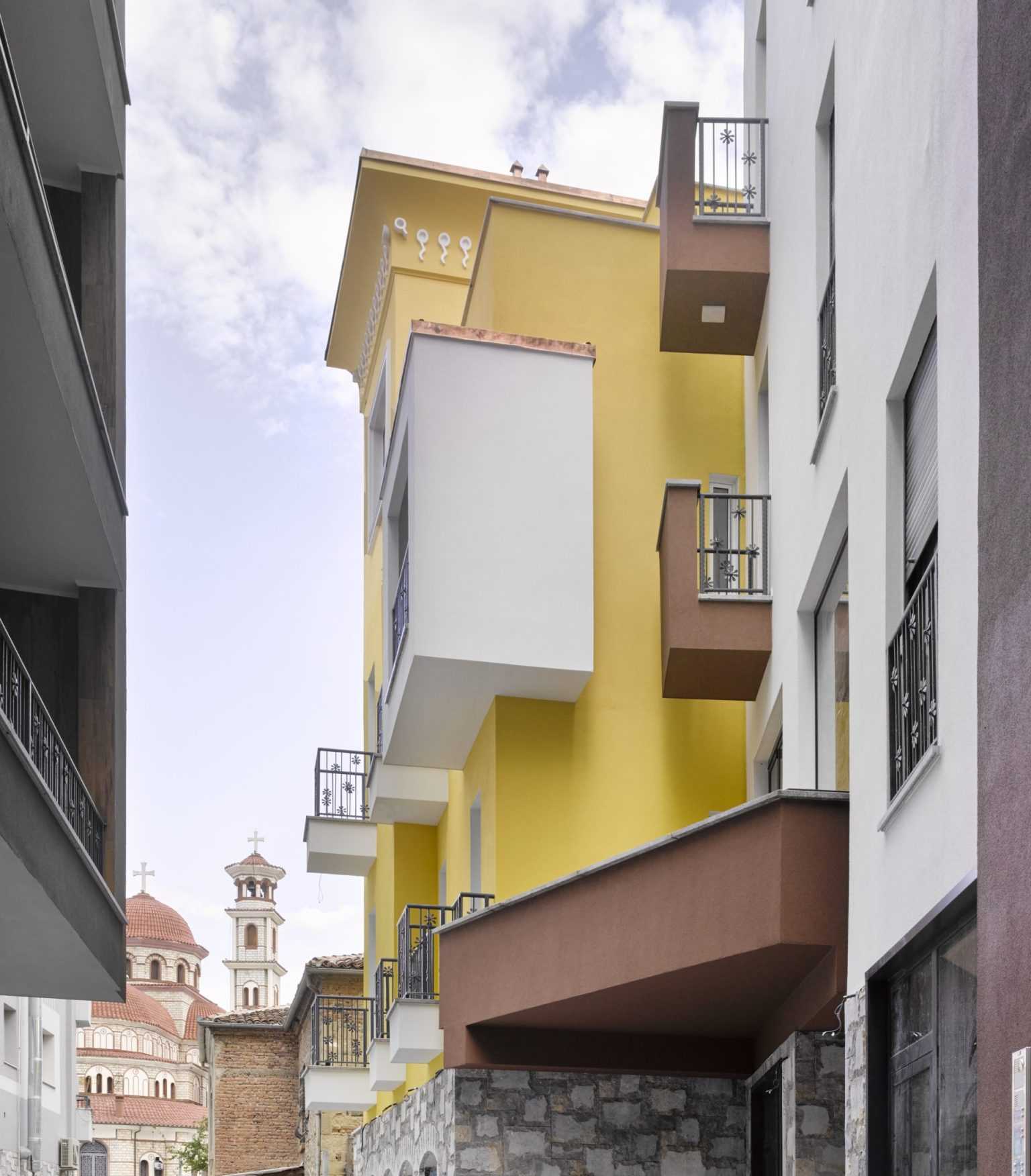
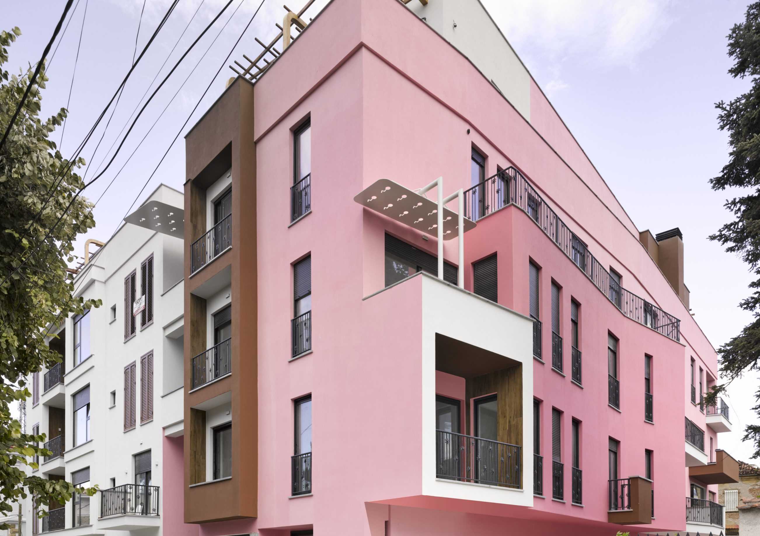
TYPOLOGY: Residential
COUNTRY: Albania
CITY: Korça
YEAR: 2021
CLIENT: Bregu Group
PHOTOS: © Roman Mensing
The original BOLLES+WILSON 2016 Masterplan for the center of Korça identified the Ligor Rembeci Quarter as a zone for careful insertion of new buildings in symbiosis with existing stone villas – this strategy – activating a block interior accessed by a network of passages – is now emerging with the recently completed Serenity Villas.


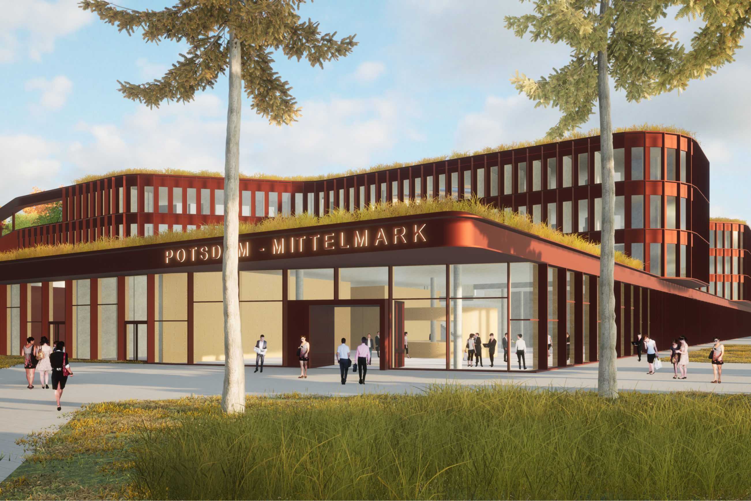
TYPOLOGY: Administration Offices
COUNTRY: Albania
CITY: Tirana
YEAR: 2020
PHOTOS: © Roman Mensing, BOLLES+WILSON
LOCAL ARCHITECTS: APE Shpk
The commission was first for the reuse of a derelict crescent shaped communist building, (Illus 2A), not a comfortable fit for open plan offices and upper level president and executive council rooms. `X´columns were here invented to support the top-heavy layout. These survived the decision to demolish and build a new headquarters. Both layouts framed a green field site embraced by a ring of trees. Existing pines were also retained.
Layout – Four levels of open plan offices lurk behind the ambulant `X´ Colonnade. These are for the various departments: event management, national team dept, marketing, referees, finance, legal, human resources, drivers etc. (Illus. 7 + 8).
The rear side entrance is themed green and blue with a canopy and raised entrance plaza above a press and conference
room for 180. (Illus. 9. 3.4.5.6.)
Albania is now embedded in the UEFA international football circuit and the success of their HQ has led to the 2925 commission for BOLLES+WILSON to design a partner building on the same site – A 5-star Hotel for the Albanian National Team (Illus. 14).


A SECOND BUILDING ON THE SAME SITE.
2025-2029

TYPOLOGY: Competition / Office
COUNTRY: German
CITY: Eschweiler
YEAR: 2023
COMPETITION: Closed competition, 2nd Prize
COLLABORATOR: wbp Landschaftsarchitekten GmbH, Bochum
GFA: 11.880 sqm
CLIENT: Stadt Eschweiler
The Change Factory is Eschweiler’s new green, flexible, and flood-resilient innovation hub.
Instead of one large block, it’s a cluster of pavilions, halls, and workspaces connected by a leafy promenade linking the city center to Drieschplatz. Reclaimed bricks, repurposed windows, and lush façades show a commitment to circular construction, while active roofs host orchards, gardens, sports areas, and solar panels. A contoured green ring and rain-retention meadows provide natural flood protection, turning resilience into a design feature. Inside, adaptable modular buildings offer space for events, co-working, research, and community life. Combining low-tech solutions with smart energy systems, the Change Factory sets a new standard for sustainable urban development.


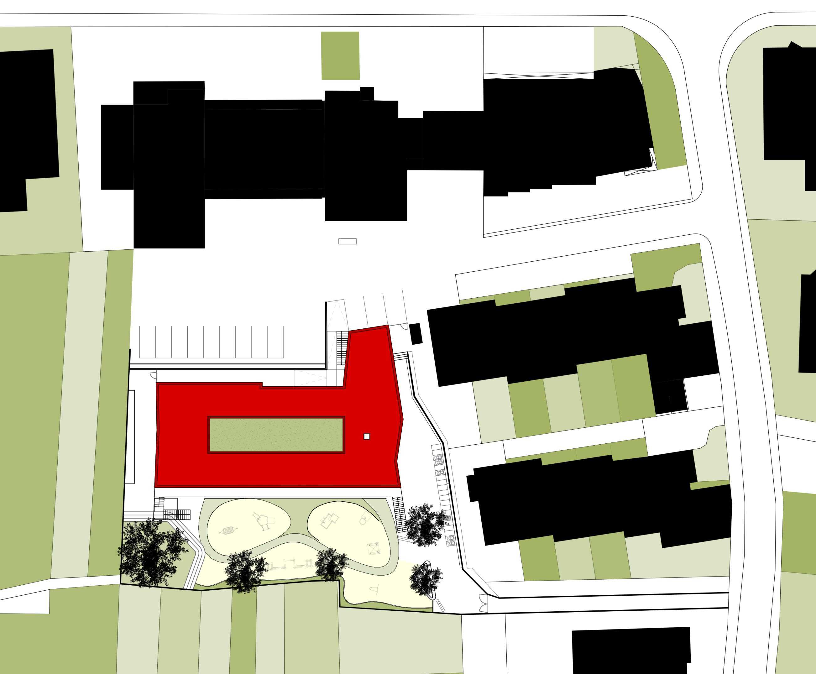
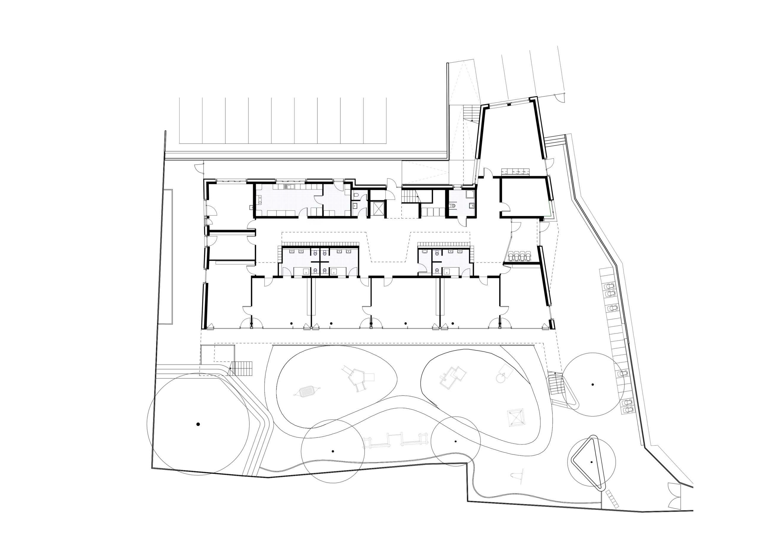
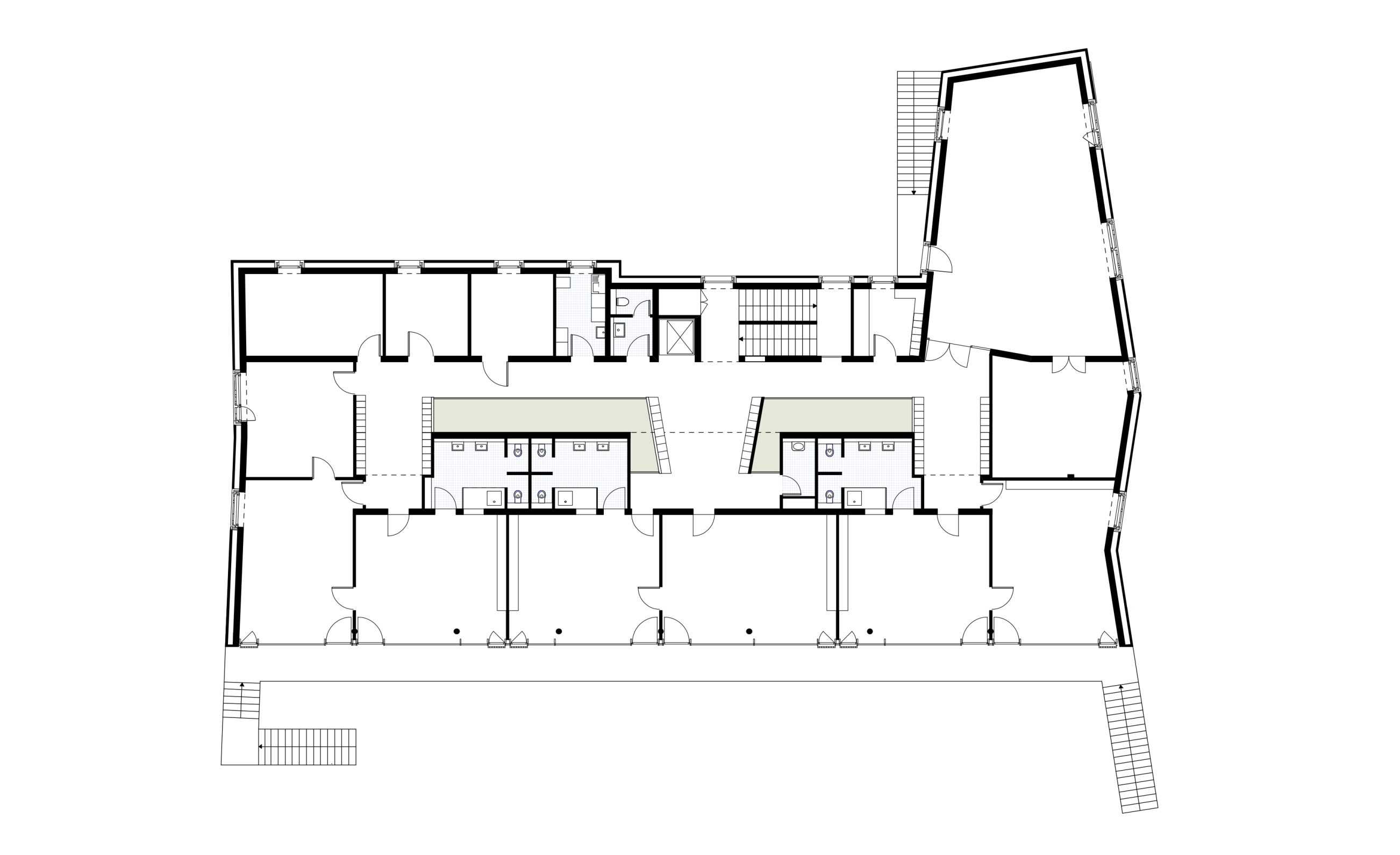
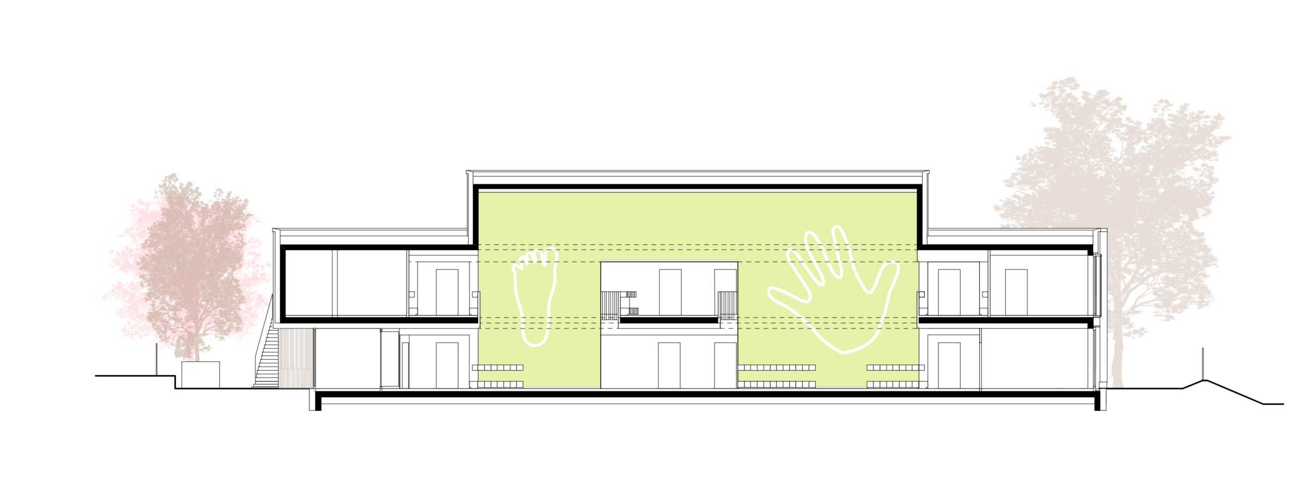
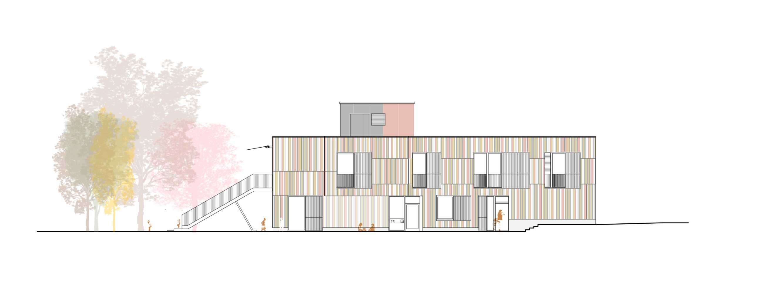
TYPOLOGY: Educational
COUNTRY: Germany
CITY: Frankfurt
YEAR: 2022
CLIENT: City of Frankfurt
PHOTOS: © Roman Mensing
The latest BOLLES+WILSON kindergarten is now, after a protracted incubation open for its 60 mini-customers.
It is beside a fire station and behind suburban villas in Frankfurt’s Bergen Enkheim district.
The `coat of many colours´ façade is wood, sustainable, a signal for the building’s `passive house´ status. Colourful sun awnings animate the south façade where the six group rooms open to the playground or to the first floor balcony (where stairs connect down to playground). Sliding white sunscreens on the East and West façades also give night time security for open windows.
The flat roof is planted for rainwater retention and for insect habitat.
The compact volume and upper level multi purpose room are consequence of the limited site and a ground level change 2,20 m.
The interior circulation gallery is animated by an optimistic green/yellow wall with giant foot/hand prints.
A thematicising of scale is endemic to a building whose customers are only 90 centimeters tall.