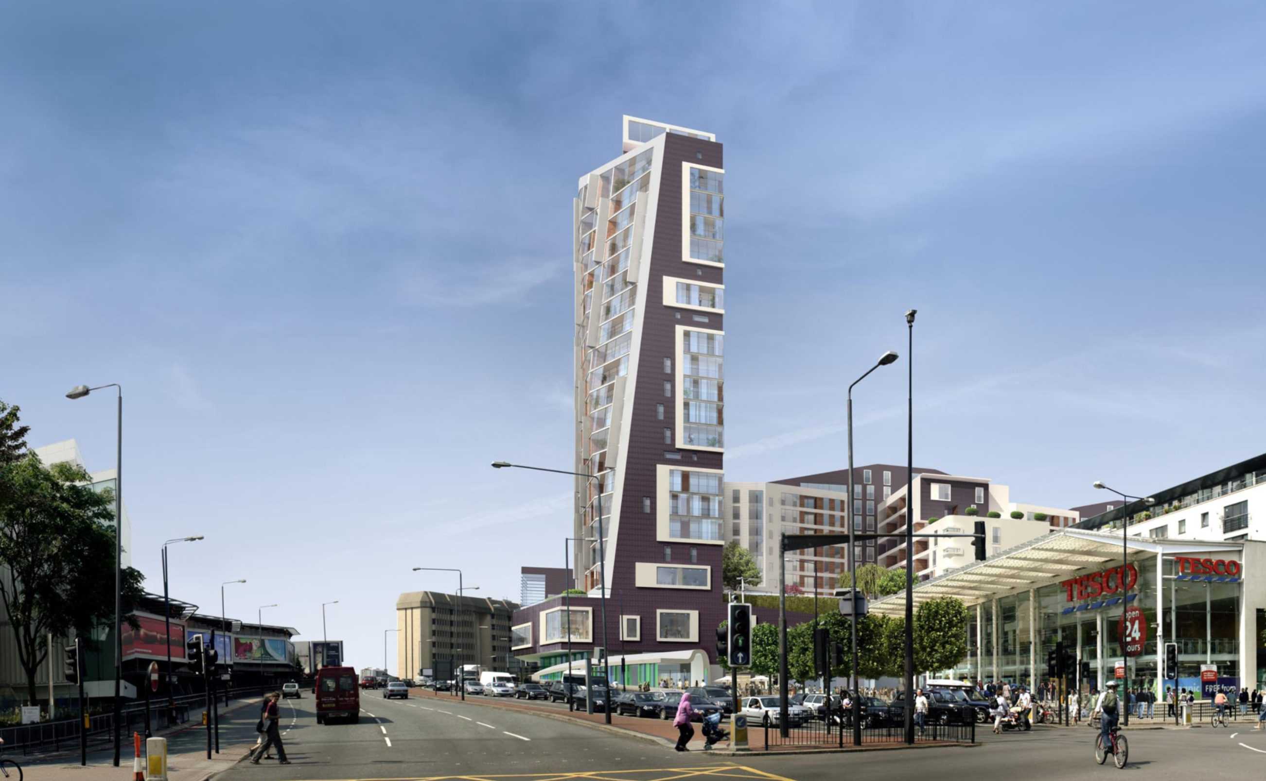
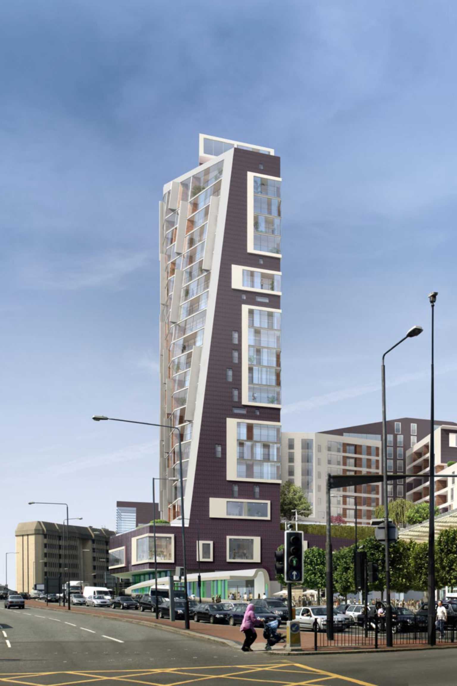
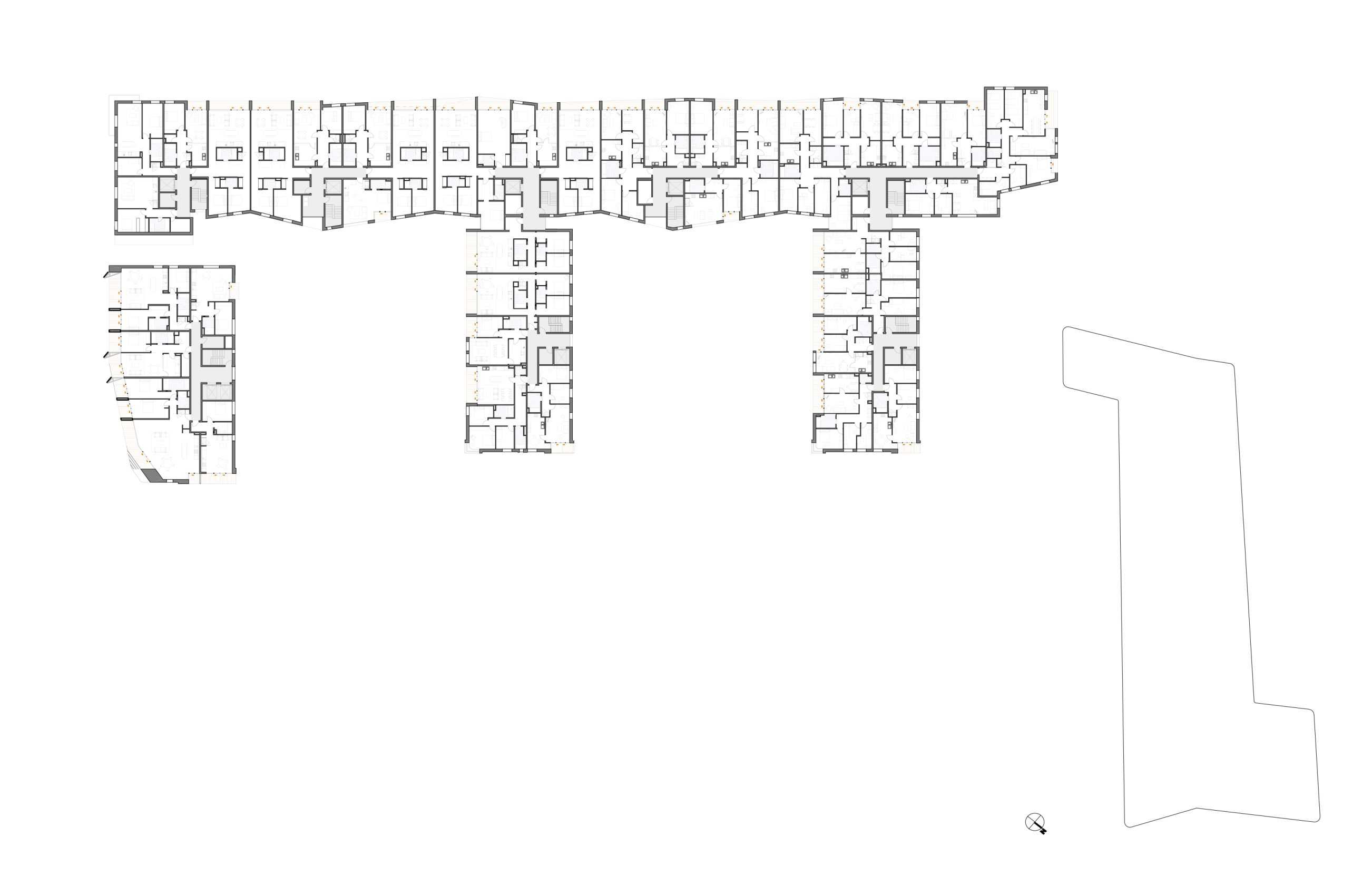
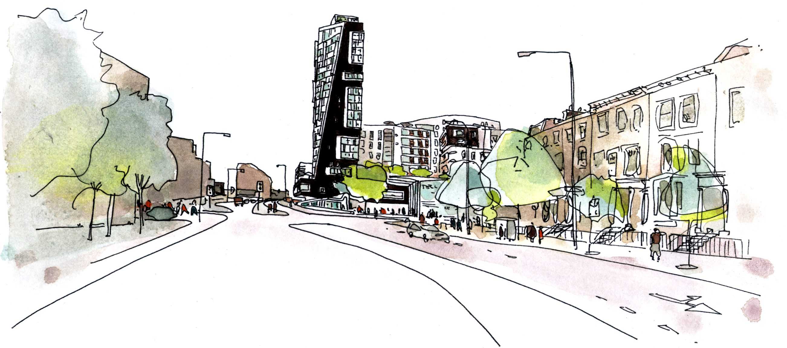
TYPOLOGY: Mixed Use
COUNTRY: UK
CITY: London
YEAR: 2008
CLIENT: Brookfield Development (UK) LTD, TESCO Stores Limited
PHOTOS MODEL: © Julian Vogt
The raked tower silhouette terminates the wide street axis for those exiting London westward. At its base the tower extends horizontally, a Fitness Arm (window to pool) frames the Tesco Plaza. The E Form begins at the third floor concourse, above existing carpark decks. The south elevation is glazed (winter gardens); the east and west are dark rippled ceramic.
Community Use: The inclusion of an additional swimming pool for the sole use of the local community has increased the Gross Internal Area of the community facility by some 30%. A Community Trust will be established to manage the pool and associated facilities.


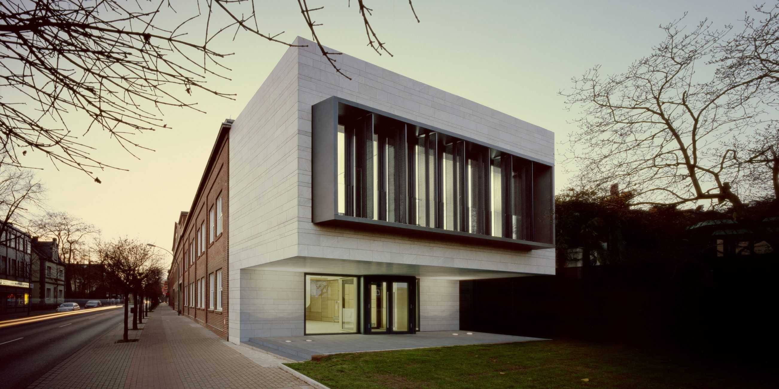
TYPOLOGY: Office
COUNTRY: Germany
CITY: Ahlen
YEAR: 2007
GFA: 550 sqm
CLIENT: Franz Kaldewei GmbH & Co. KG
PHOTOS: © Rainer Mader, Christian Richters
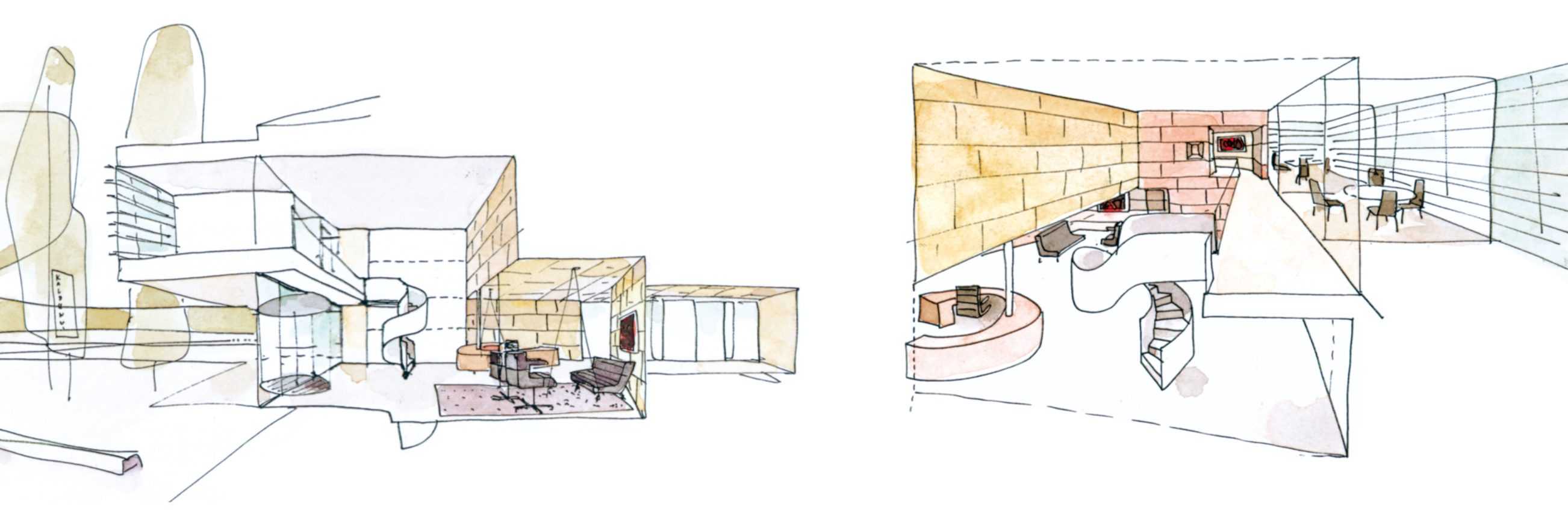
The small ‘signalising’ pavilion re-focuses and re-orients the visitors entrance to the main Kaldewei production plant. The pavilion stands like a bookend in relation to the original 1930s Works Facade of the leading manufacturer of enamel steel bathtubs. It connects to new reception spaces within the existing structure and to a planned administration wing.
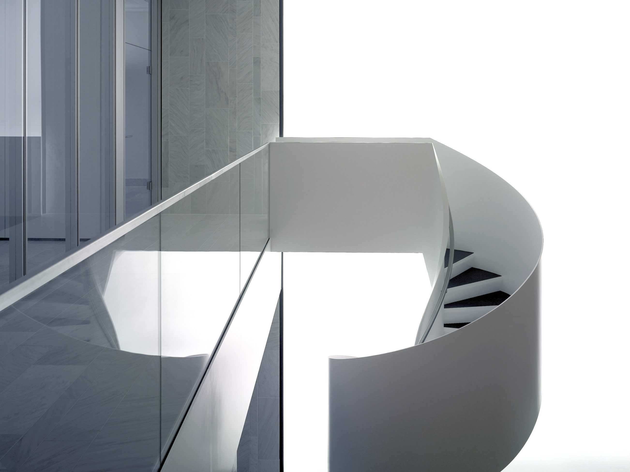
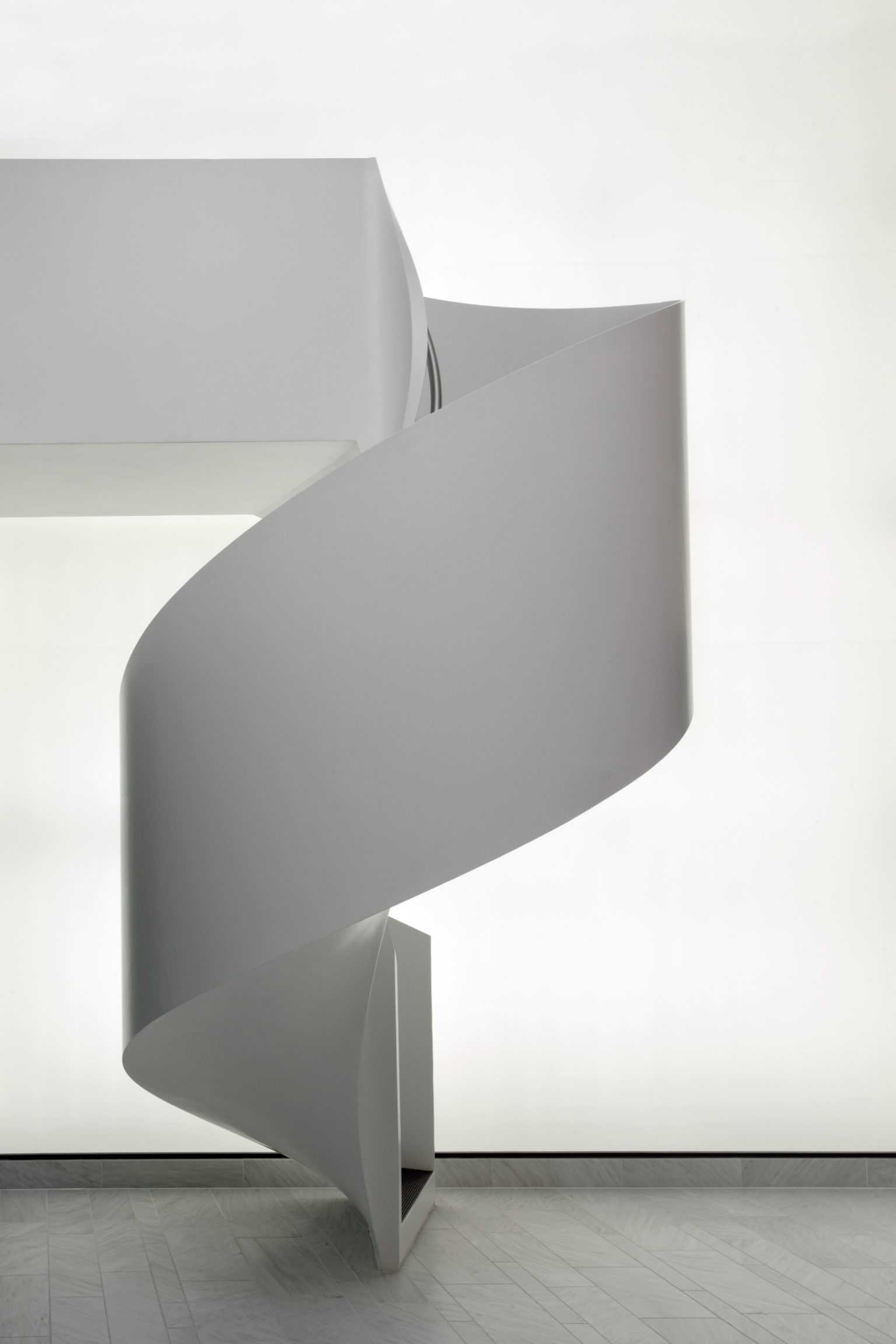
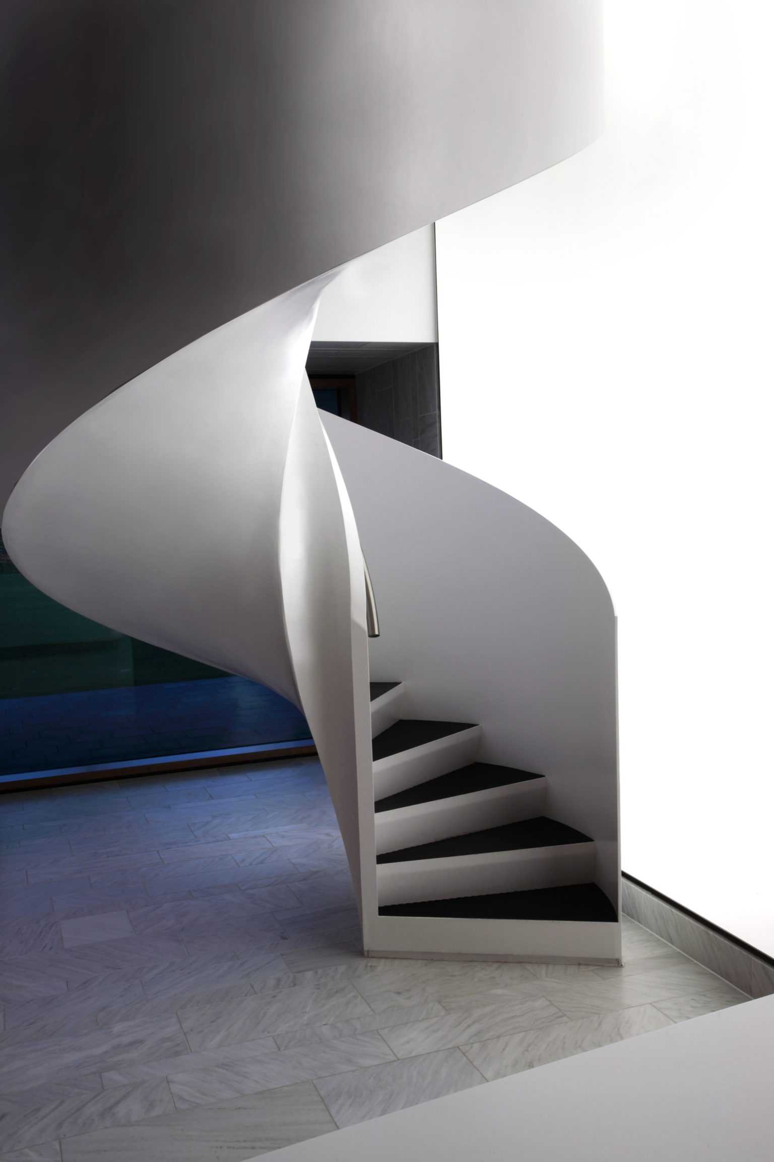
The mass of the stone-clad volume projects acrobatically. Structural dexterity is not the issue, mass is here co-opted as a silent, announcing presence. The lobby behind is carved out of the existing volume. Meeting rooms hover above the entrance, the white stone of the new facade extends inwards as lobby floor and wall material. A steel spiral stair stands centre-stage and backlit by a dematerialised ‘Light Wall’. After the spatial expansion of the lobby, lower ceilings and an emphasized materiality of wood panels introduce a contrasting intimacy. The ‘Actor Stair’ leads the visitor through a short but complex spatial sequence. The spatial and material language here is closely related to that of BOLLES+WILSONs first Kaldewei building. – the nearby KKC (Competence Centre) 2003-2005.


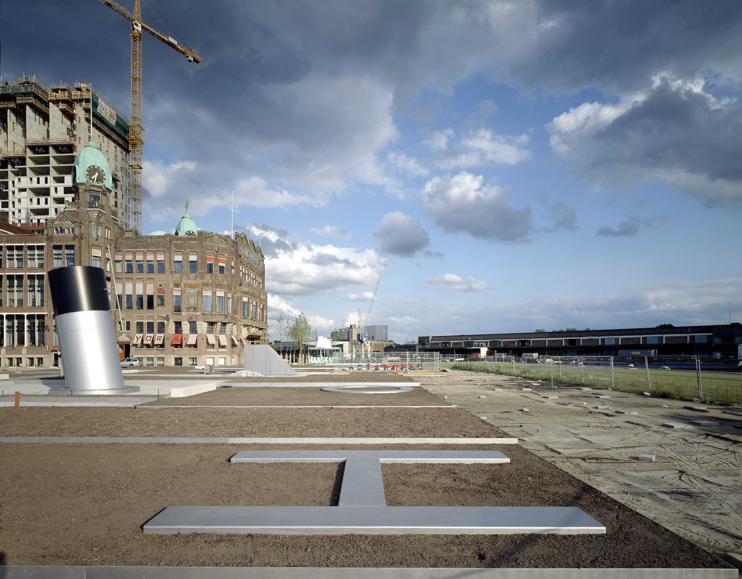
TYPOLOGY: Landscape
COUNTRY: The Netherlands
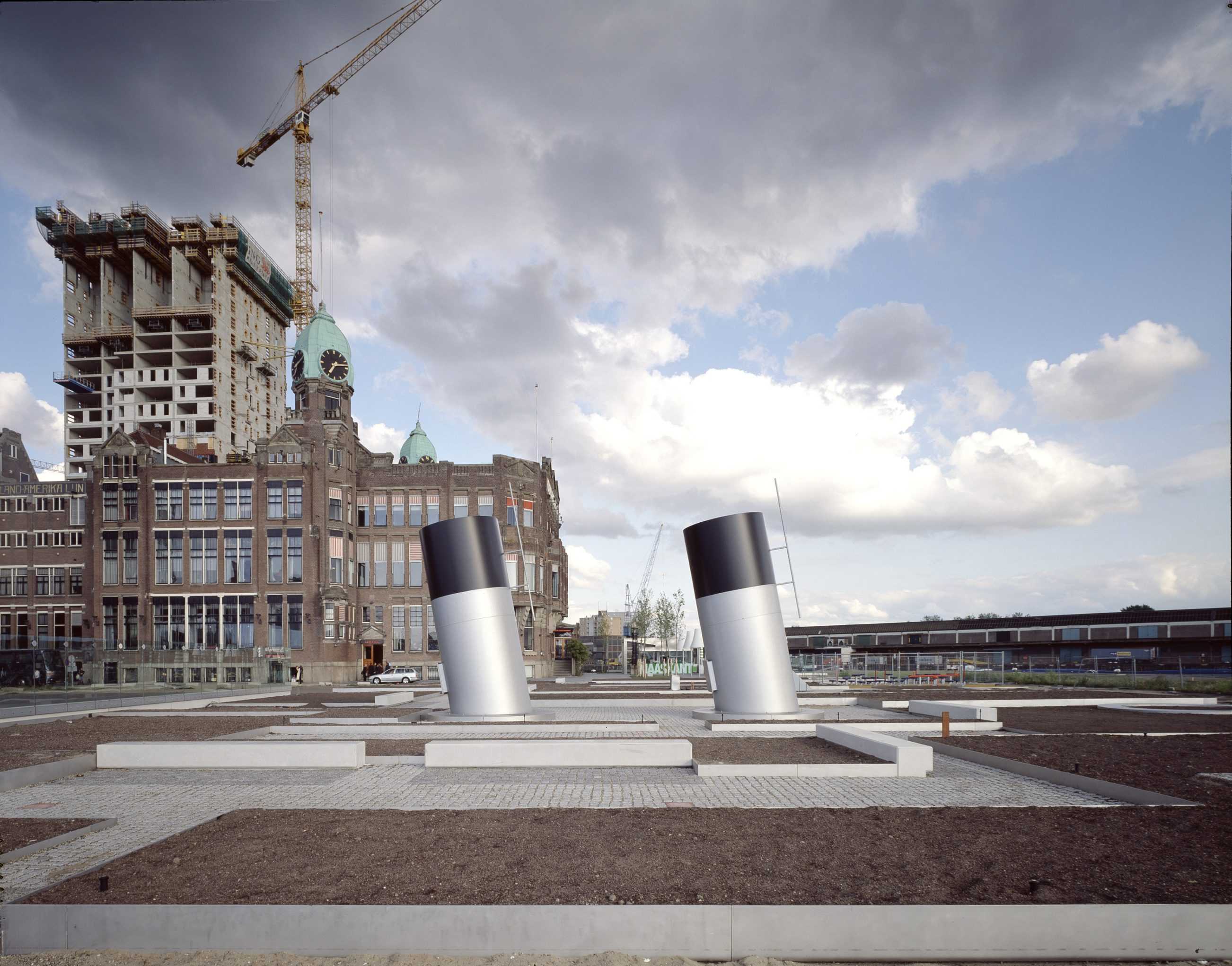
CITY: Rotterdam – Kop van Zuid
YEAR: 2006
CLIENT: City of Rotterdam (dS+U), Hotel New York partner
PHOTOS: © Christian Richters
The former embarkation point for emigration to the New World – a ‘Holland/America’ theme. Two landscapes (intimate Dutch gardens and a prairie-like American event- space) are divided by a conceptual border. Large scale text (like a Steinberg drawing) is inlayed in the pavement. To date the Dutch side including the Hotel Terrace, Maaskant Pavilion, vent Funnels, playground and intimate Dutch gardens is complete. despite regular dockings of American warships the narrative landscape on the American side of the Dutch-Amerika border remains unexecuted.


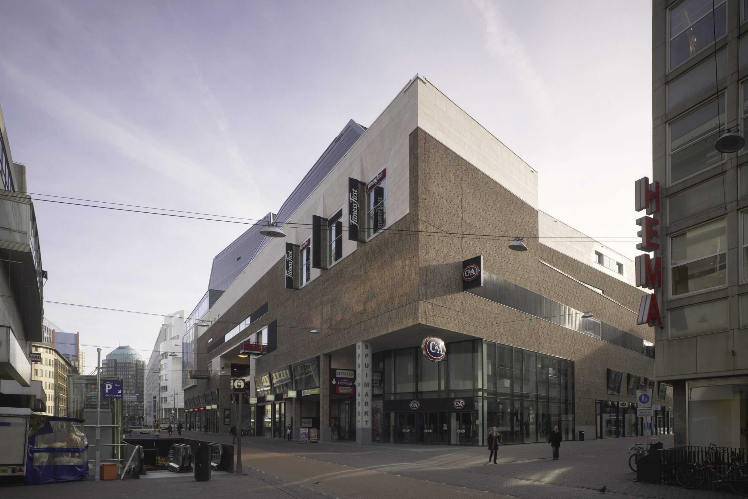
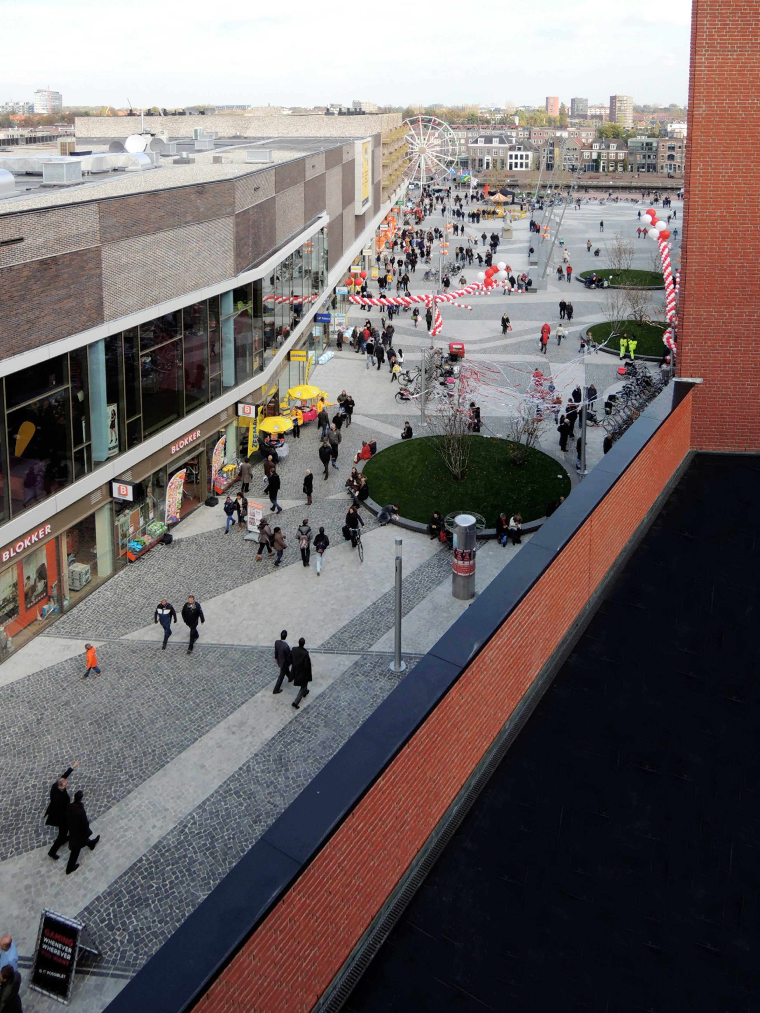
TYPOLOGY: Shopping // Retail, Leisure, Cultural
COUNTRY: The Netherlands
CITY: The Hague
YEAR: 2008
Masterplan 1997
Design Commercial Block 2005-2007
GFA: 36.400 sqm
CLIENT: ING Vastgoed, The Hague; Pathé Theatres B.V.
COLLABORATOR: Bureau Bouwkunde (facilitating architect)
AWARDS: Shopping Centre of the Year NL 2009
PHOTOS: © Christian Richters
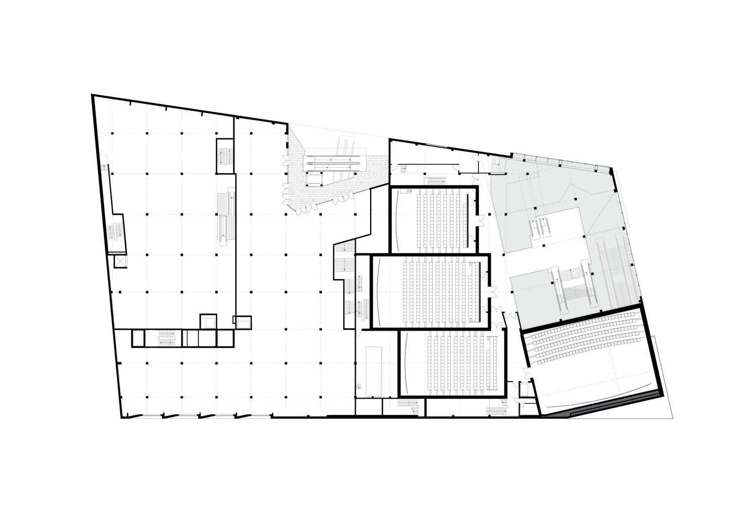
The Spuimarkt is a permeable block, it hosts the life of the city (tides and eddies of shoppers), it leads Bioscoop and other leisure seekers dramatically upward, and perches them in grand foyers, outlook windows, privileged vantages. The Pathé cinema foyer is a Piranesian space, its stairs flow dramatically upward, they cross, they hover. Just arriving at one of the nine cinemas (2,270 seats) is a cinematic experience – along the way some of the best views in Den Haag.
A richly textured brick facade gives unity and dignity to the whole block; the tactility of the rotated and projecting bricks is comparable to a tweed jacket, its hand-made quality both abstract and traditional. Spuimarkt’s sculptured corporal autonomy is carefully dovetailed into the wider context, mediating between the Bijenkorf and the City Hall to form a trilogy of major urban statements. The building’s varying scales respond to the surrounding context, the grand Grote Marktstraat facade steps down behind to the more intimate street scale of Gedempte Gracht. The lower Pathé cinema entrance reflects the height of the traditional houses it faces.
The sinuous roof silhouette, moulded around the cinema within, is like a topographic landform; an anchoring that gives measure and scale to the complex Den Haag skyline.


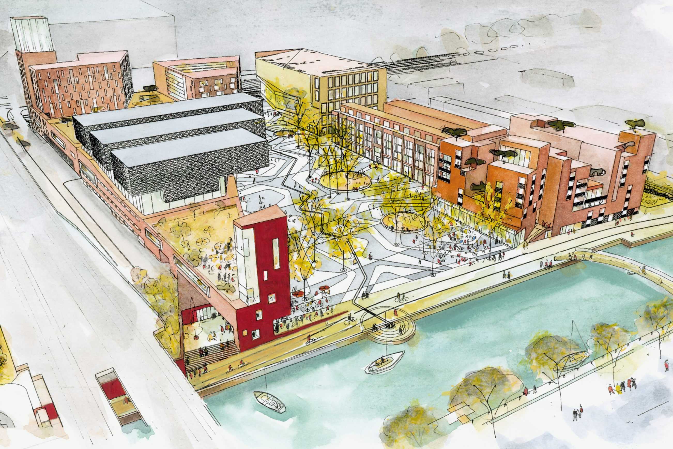
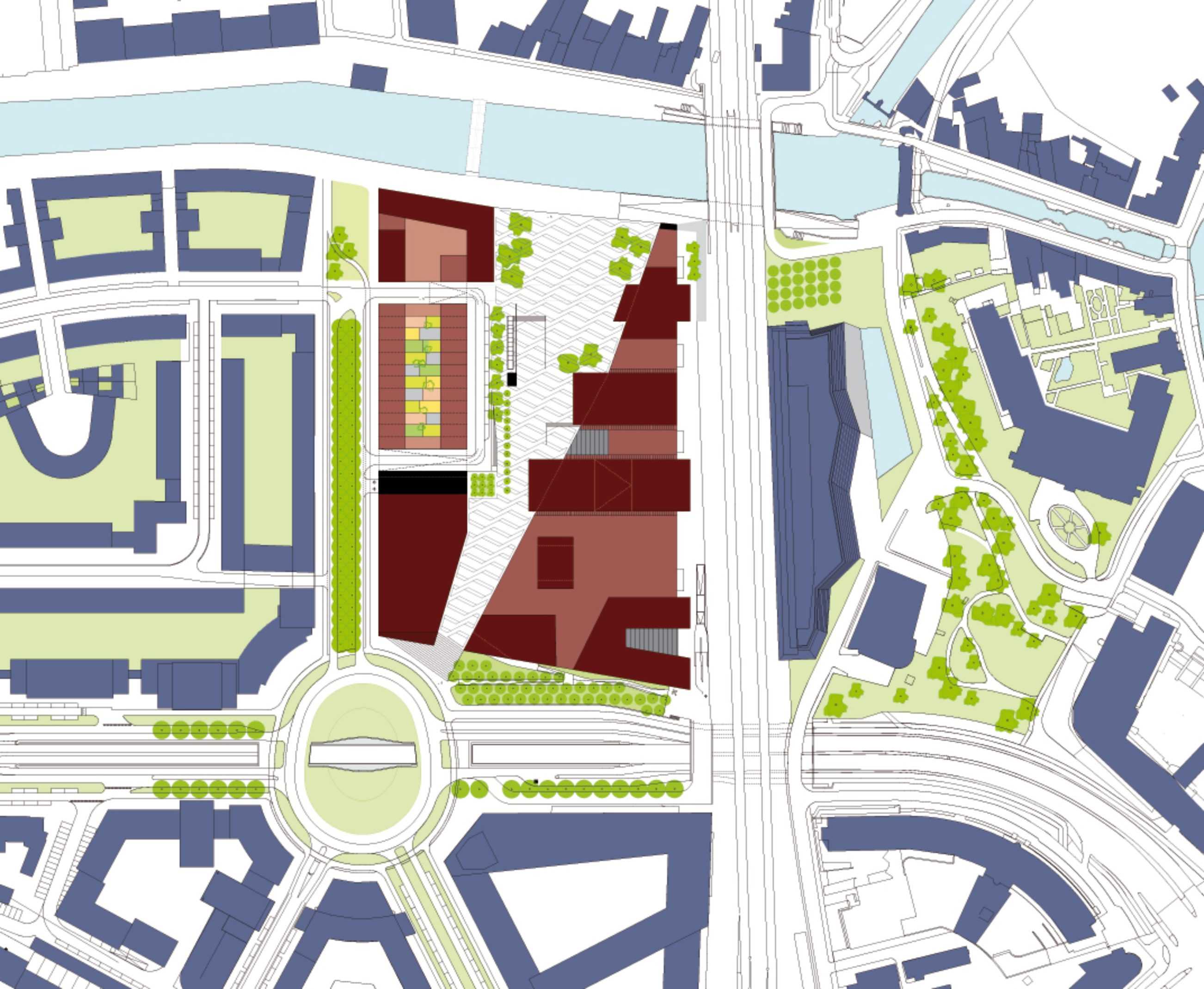
TYPOLOGY: Masterplan
COUNTRY: The Netherlands
CITY: Amersfoort
YEAR: 2008
GFA: 60.000 sqm
CLIENT: AM Vastgoed, Gouda / City of Amersfoort
Direct Planning Commission (City of Amersfoort) 2003
The Eemcentrum is a new cultural, leisure and residential quartier directly adjacent to the historic city centre. Cinema, housing and commercial components in combination with new city library, art school and pop podium face a conical and sloped square/garden which expands perspectively over its 200 m length. This scenographic choreography developed by BOLLES+WILSON constitutes the aesthetic and legal masterplan for the individual building commissions. Peter Wilson was also planning supervisor monitoring and coordinating the architectural development of the urban ensemble.
Eemblock – O’Donnell + Tuomey
Row Houses – Drost + van Veen
Cinema – Koen van Velsen
Shopping/Housing/Offices – Mecannoo
Library/Art School/Pop Podium – Neutelings Riedijk
Landscaping – Sant en Co