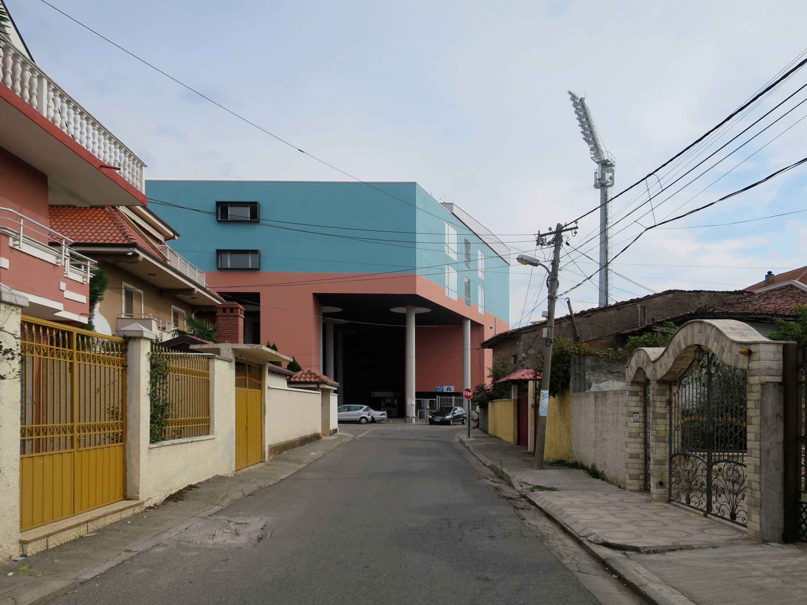
TYPOLOGY: Retail
COUNTRY: Germany
CITY: Munich
YEAR: 2016
GFA EXISTING: 4.047 sqm
GFA NEW: 755 sqm
CLIENT: Möbelum Zentral GmbH
PHOTOS: © Florian Holzherr
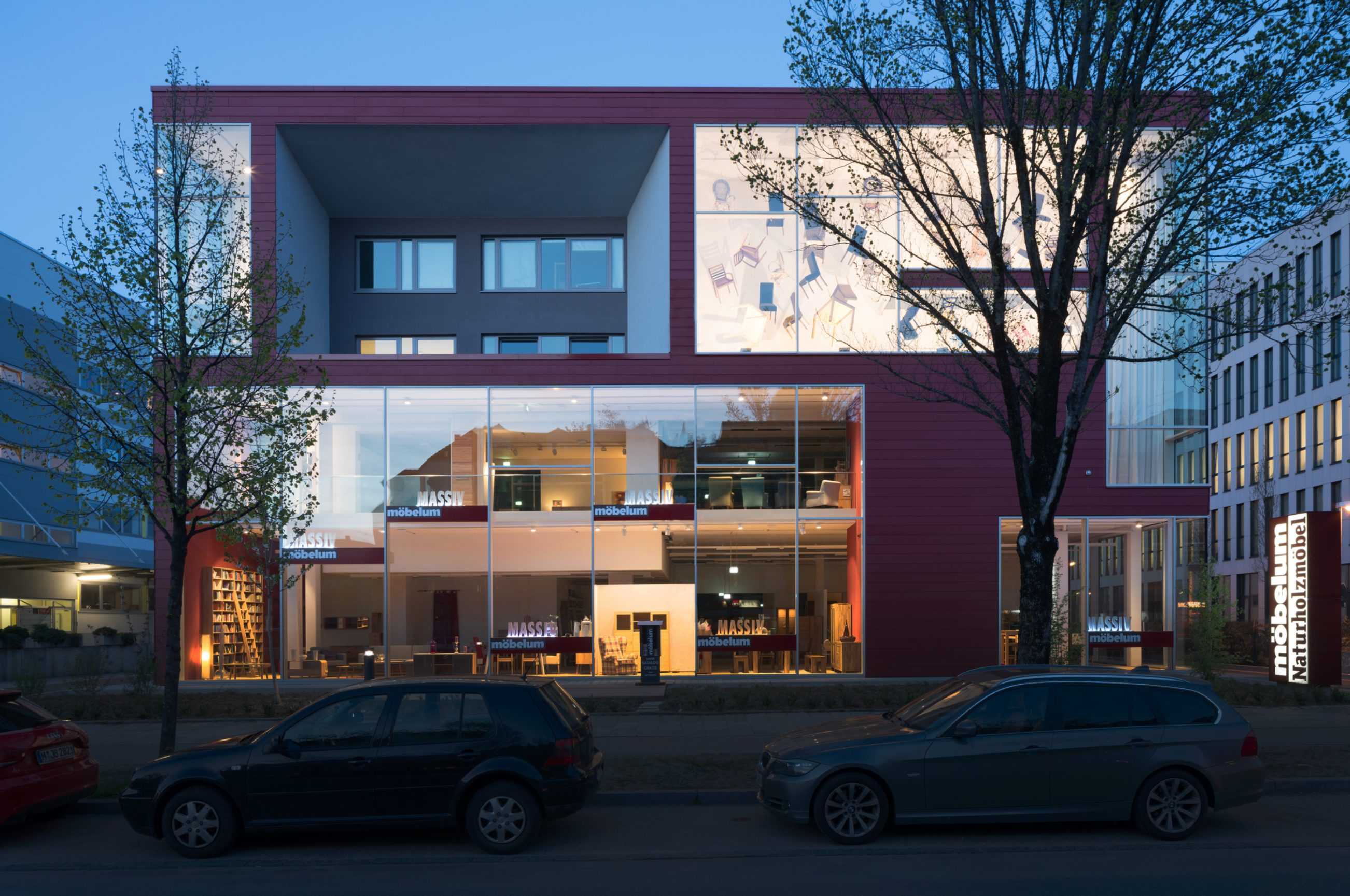
Möbelum furniture outlet – a new facade for an existing industrial building/furniture showroom.
The stacked cassettes of the display facade integrate existing office windows.


TYPOLOGY: Cultural
COUNTRY: Albania
CITY: Korça
YEAR: 2016
CLIENT: Municipality of Korçë
COLLABORATOR: Dea Studio
AWARDS: Nomination, The Plan Award 2017
Nomination, Aga Khan Award for Architecture
PHOTOS: © Roman Mensing
The building for the Korça Icon Museum was originally a structure of columns and floor slabs (Maison Domino) abandoned when communism collapsed in Albania.
The Albanian office DEA Studio were comissioned to design facades and BOLLES+WILSON were then asked by the municipality of Korça to design and develop an interior exhibition design and sequence for the 300 Orthodox icons.
The heavy walls on the exterior with their small windows were intended to give an appropriate medieval reading.
The small windows from the inside did give an appropriate mysterious atmosphere but in terms of viewing Icons they were too bright and needed some interior masking to avoid too much contrast between a small area of bright outside light and the surrounding.
As the museum neared completion the albanian Prime Minister Edi Rama visited, and thinking the facades were too prison-like asked BOLLES+WILSON to extend their interior language to the entrance facade. Black painted plaster was added framing and respecting the DEA window composition. BOLLES+WILSON also added ‚Barnett Newman colours‘ to the existing communist fountain.
EXHIBITION ORGANIZATION
The given three levels subdivide well into Basement Archive with ground level laboritories/administration. The Exhibition spaces belong on the entrance level and the 1st floor – here the interior concept proposes a specific circulation route for visitors and an absolute division between public spaces and ‘back-of- house’. This is necessary for reasons of security (the public must not have the possibility to enter rooms where Icons are being worked on).
The floor between entrance level and 1st floor has been removed over the entire left hand exhibition room. This allows a new stair facilitating a simple and spectacular visitors circulation route. The new stair gives panorama views of a 9.5 metre high golden wall – for this wall the Petersburg hanging system was chosen – a close packing of Icons, a tapestry of images covering the entire wall, impressing visitors with the size of the Korça collection.
A SEQUENCE OF ROOMS
The interior concept develops zones of strong individual character defined by colour: gold on the left, black matt and gloss black in the central ‘Black Labyrinth‘ zone and Red for the Iconastas (Altar screen) on the right. The Sequential Rooms are carefully choreographed for the most dramatic effect:
(a) Entrance Lobby – an abstract collage of shelves for merchandising, postcards, posters, local handcrafts and even small Icons painted by Korça artists (a new local industry) are displayed and sold.
(b) The Gold Room – a two floor high gold screen (one that also wraps the sidewalls and
tames natural light from slit windows). The screen is packed with Icons. Visitors promenade freely and then step up to the stair landing where an information handrail tells them what they are looking at.
(c) The White Balcony – overlooking the Gold Room – has a heavy Black handrail and a white (conventional museum) rear wall for a row of small Icons. These lead to an opening on the right.
(d) The Black Labyrinth – the central zone of the museum is particularly dark and mysterious with individually lit Icons floating in the penumbra. Walls are painted in a collage of matt and gloss black and grey to enhance the collage effect. Side alcoves with lower ceilings and wooden floors bring individually hung Icons intimately close to viewers.
(e) The Red Salon – from the Black Labyrinth visitors emerge into a sensual space where all surfaces are red. The central zone is defined by a 10cm high platform on which stands the iconastas (Altar screen).
(f) The final exhibition room is white with an illuminated ceiling – an ethereal space. The room displays the two most valuable icons from the 14h century.
TYPOLOGY: Masterplan / Mixed Use / Landscaping
COUNTRY: Italy
CITY: Perugia
YEAR: 2006 – 2015
COMPETITION: Invited Competition 2006, First Prize
CLIENT: BNL Fondi imobiliari SGR p.A. / Fondo Umbria – Monteluce Unit / BNP Paribas REIM SGR p.A.
AWARDS: Premio Urbanistica 2007 (category Quality of Public Spaces), Italian National Institute of Urban Planning
CONSTRUCTION PHOTOS: © BNP
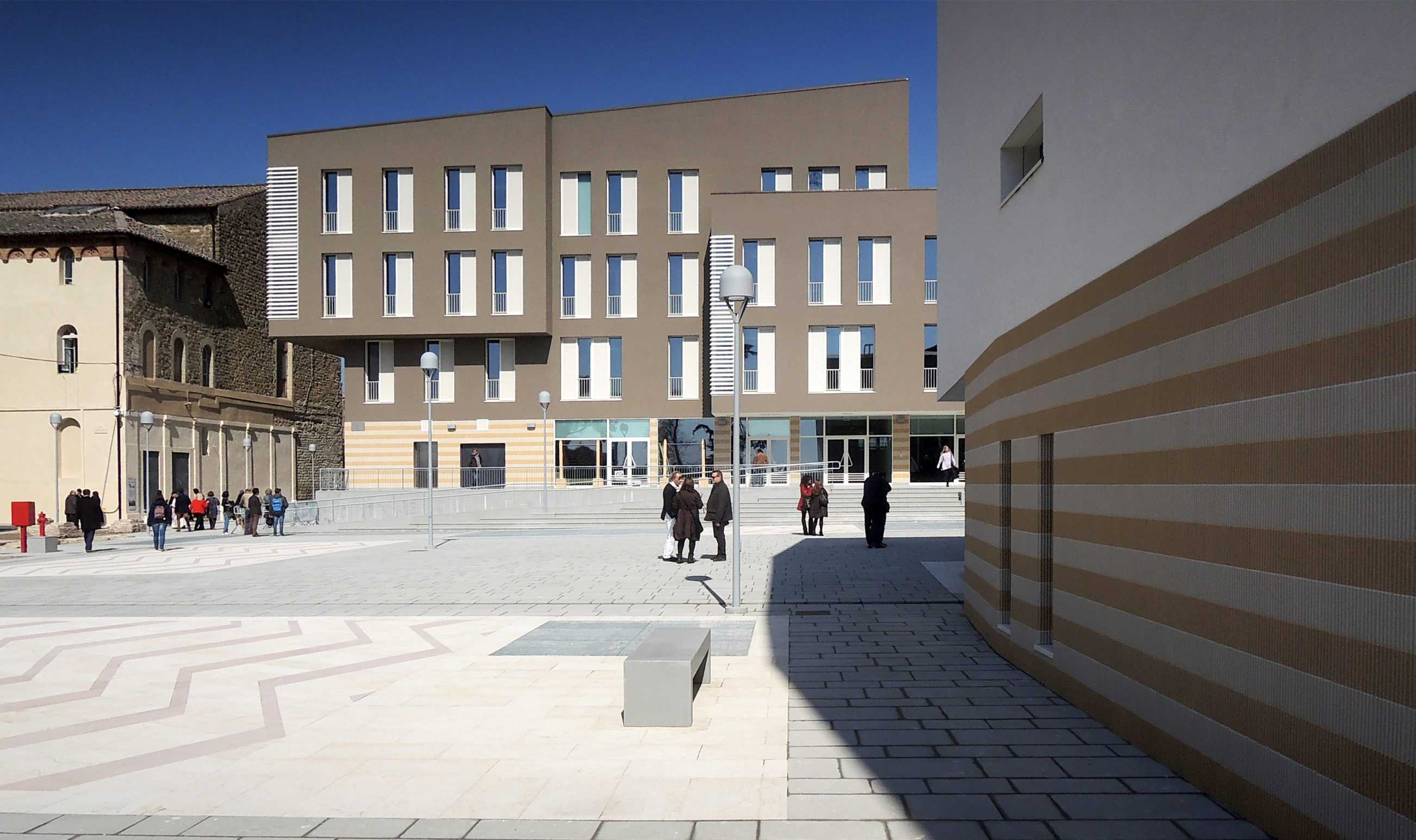
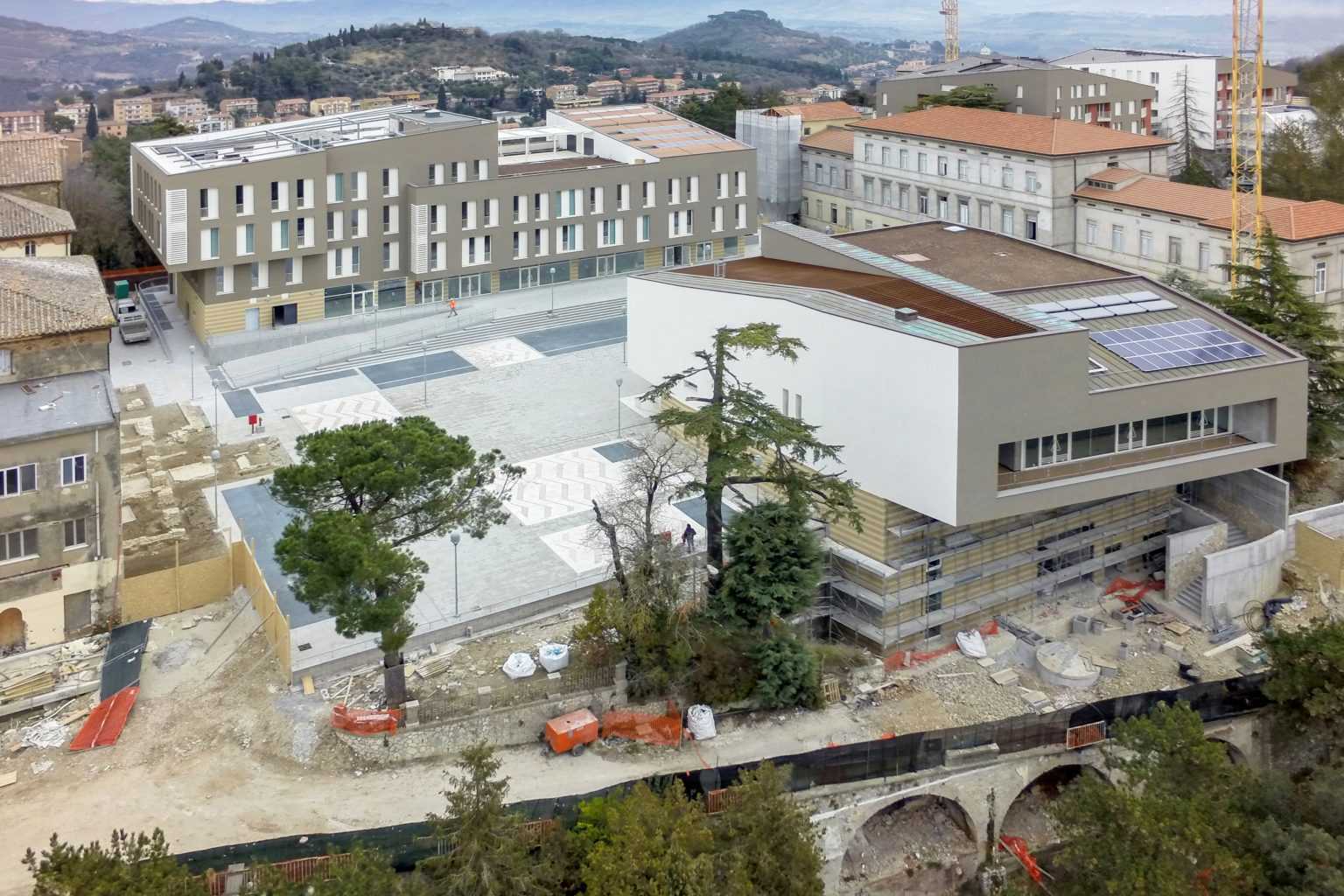
MONTELUCE MASTERPLAN
On 12th sept. 2006 the office of Bolles+Wilson was awarded the first prize in the International Design Competition for Monteluce in Perugia.
The jury lead by Axel Sowa, director of “Architecture d’ aujourd’hui” commended the winning entry for its respect and sensitivity to the scale of Monteluce, its morphological compatibility with the historic structure of Perugia and its sympathetic relationship to the surrounding Umbrian landscape.
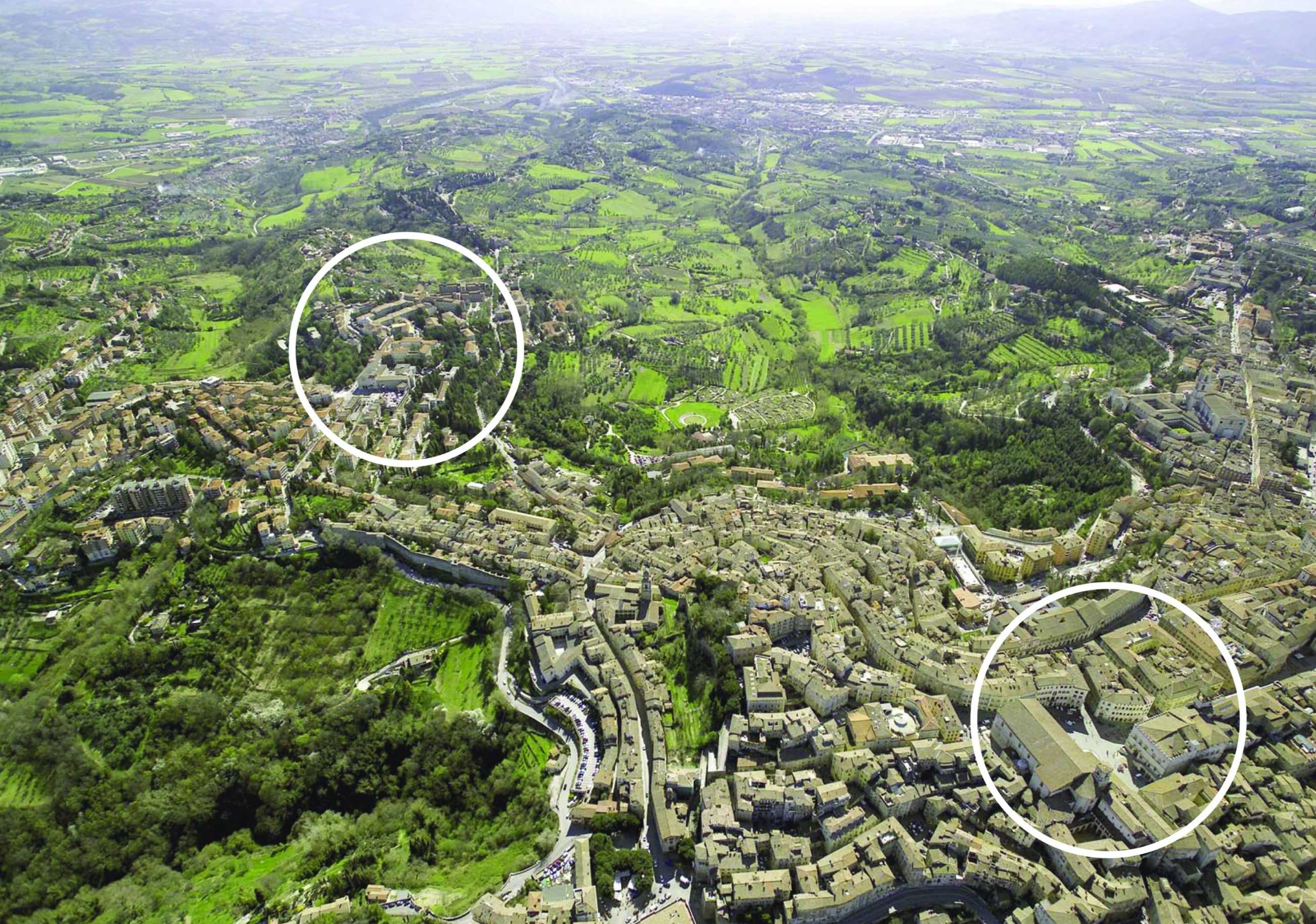
The Convento delle Clarisse of S. Maria di Monteluce originating in 1218 stands outside the Etruscan walls of Perugia, an outpost protecting one of the main access roads. Expansion outside the medieval walls reached Monteluce at the end of the nineteenth century. A concurrent appropriation of religious assets by the State instigated the opening of a gate to the Piazza Monteluce and between 1910 and 1923 the construction in the monastery garden of a series of hospital pavilions.
The Competition Program developed in close co-operation with the Commune di Perugia called for a total of 65,000 sqm – 43% of which is student and private housing and 25% subsidised housing. The new urban Quartier is networked in terms of a continuity of urban spaces and a rich programmatic mix including a maximum of 10% retail and 5% office use as well as hotel and conference facilities, local health offices, kindergarten and a new public park.
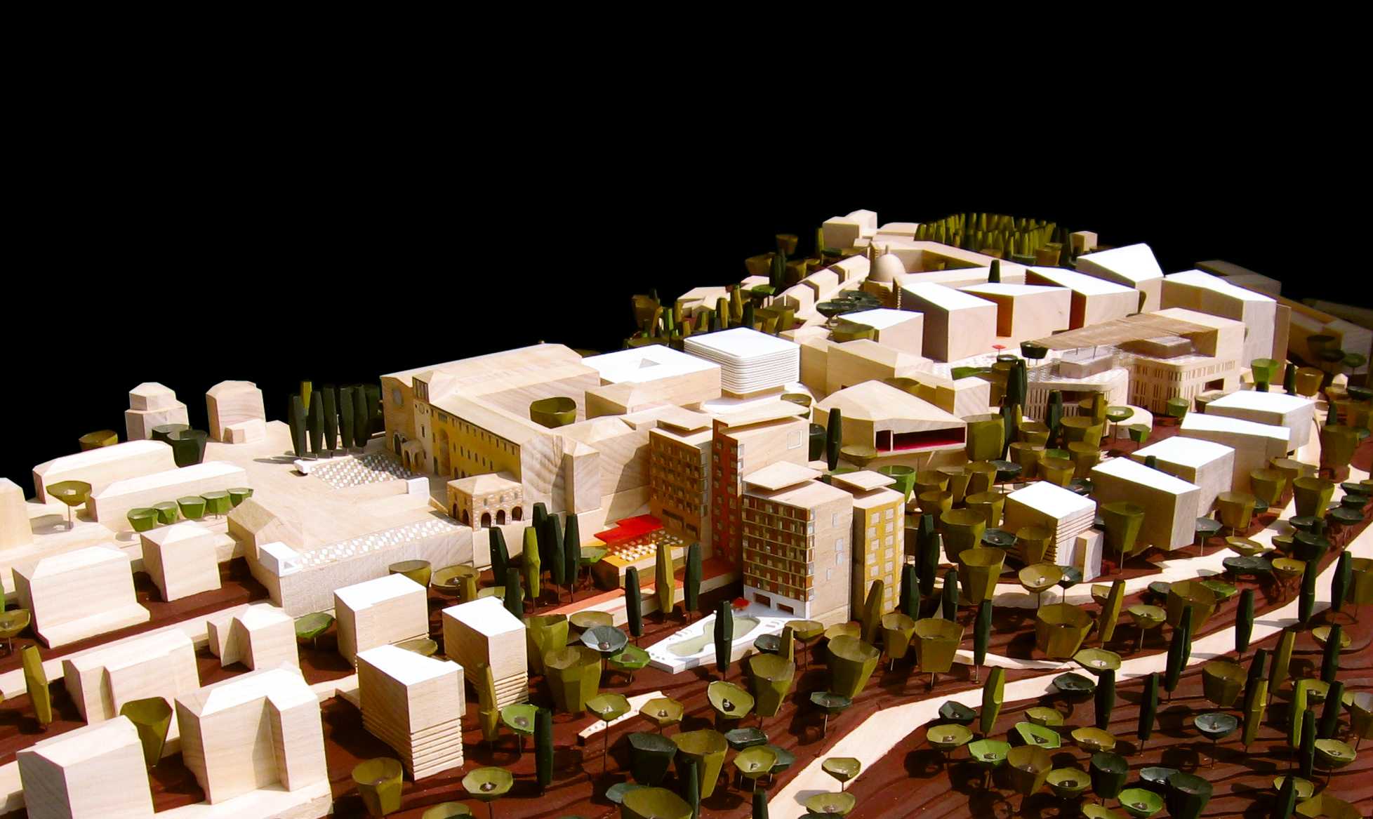
The Bolles+Wilson design developed and presented in 1:500 model format rejects authoritative geometry in favour of a sequencing of localised responses tailored to the dramatic topology and framed views out and across the luxurious Umbrian landscape. For economy and continuity many new structures occupy the footprint of redundant hospital buildings, a strategy that preserves the extensive terraced system of retaining walls and protected trees.
Bolles+Wilson describe their scheme as Urban Choreography, a sequence of public spaces unfolding from the S.Maria di Monteluce church in the west to the new Park d’Este. A first Piazza is framed by the Monestry portico and the one remaining Hospital Pavilion (Public Health Offices). To the north are offices and a submerged supermarket. To the south a Hotel and Conference Pavilion frame the view in the direction of Assisi. A second Conical Piazza is enclosed by a row of student housing buildings to the north and an opposing commercial/ restaurant Acropolis. Here deck- like upper terraces offer spectacular views of the historic skyline and Umbrian landscape.
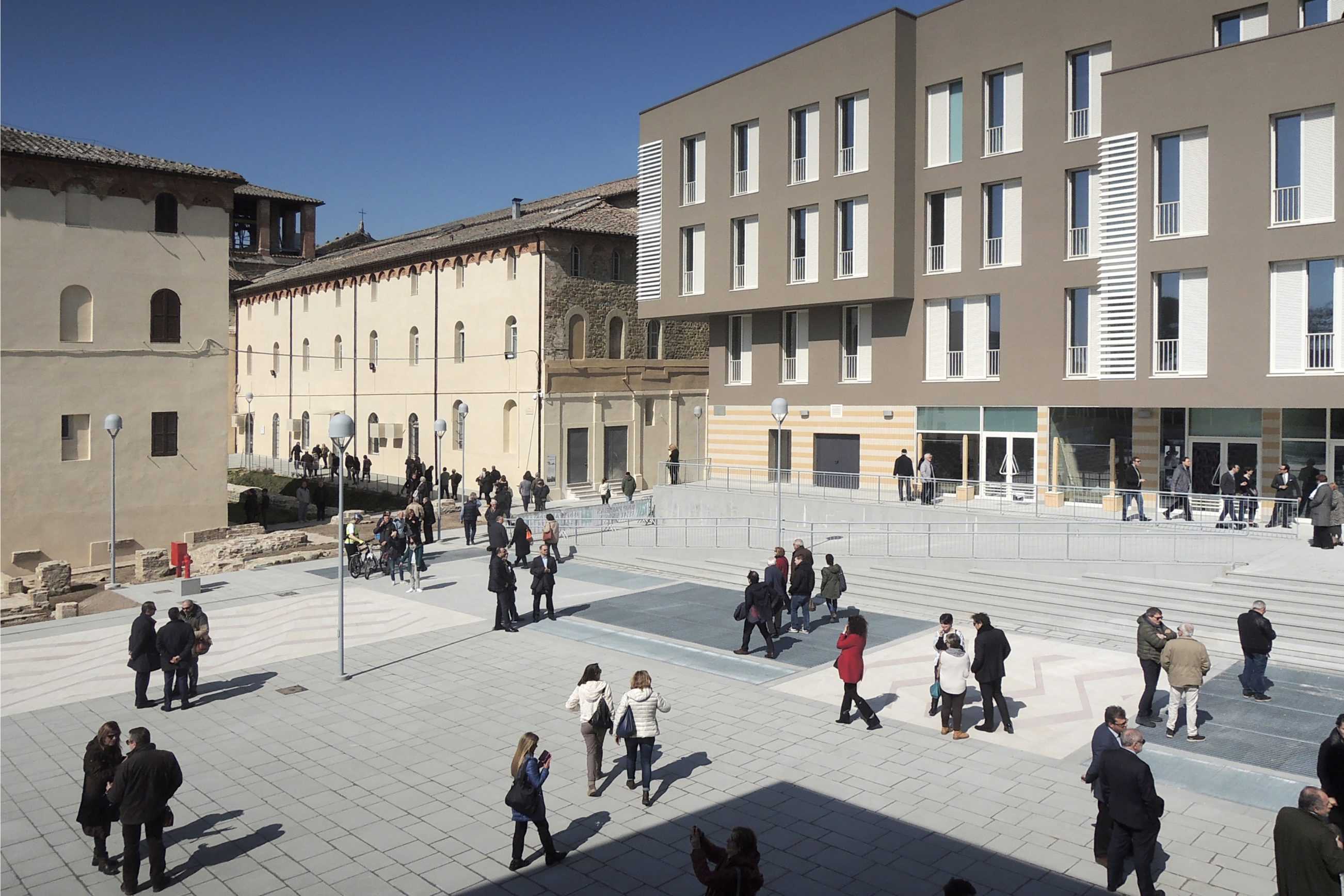
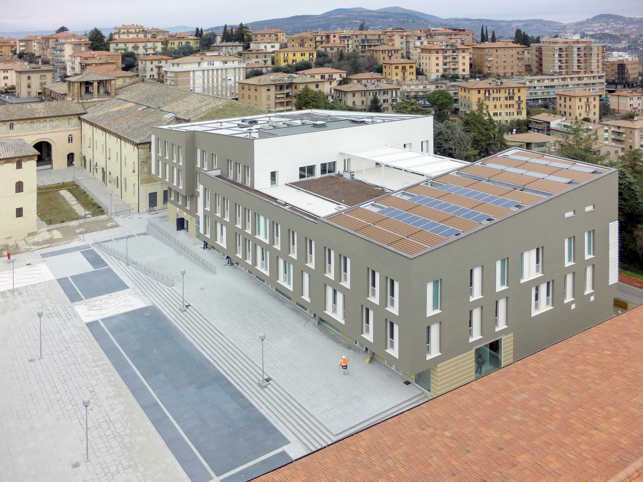
MONTELUCE QUATTRO
The core of the new urban quarter became the (architectural) responsibility of BOLLES+WILSON (see siteplan). In realization it follows very closely the competition proposal of two Piazzas on the crest of the hill/ridge, underneath these two levels of carparking ensure car free public spaces (500 cars disappear underground). The strategic placement of these two Piazzas follows the typical Perugian trope of leaving one side of a space open for cooling winds and views out across the sensuous and gently rolling Umbrian landscape (views across the valley to Assisi).
The strategy of two piazzas introduces a spatial sequence resulting from the integration of the historic monastery and the12th century chapel – their arched entrance portal announces the entry to the first new Piazza, now named Piazza Cecilia Coppoli (1426-1500, poetess and humanist) and opened on 19th March 2015 by Catiusca Marini – President of the Region of Umbria. Signora Marini described the Monteluce spaces as ‘an investment in the culture of the city, also in the public patrimony of Perugia, an exemplary work and graceful urban transformation, one that experiments with a new contemporary urban architecture.’


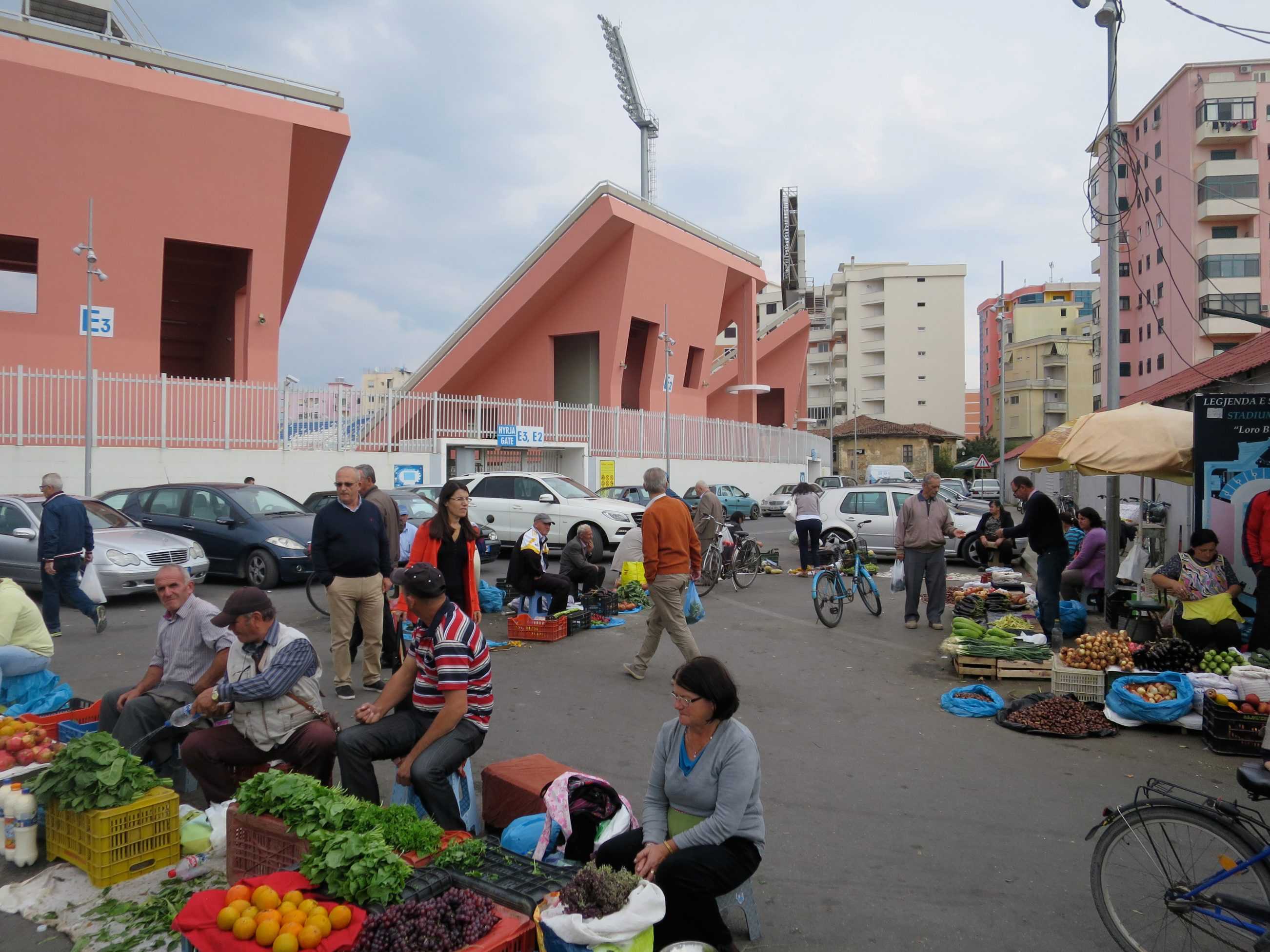
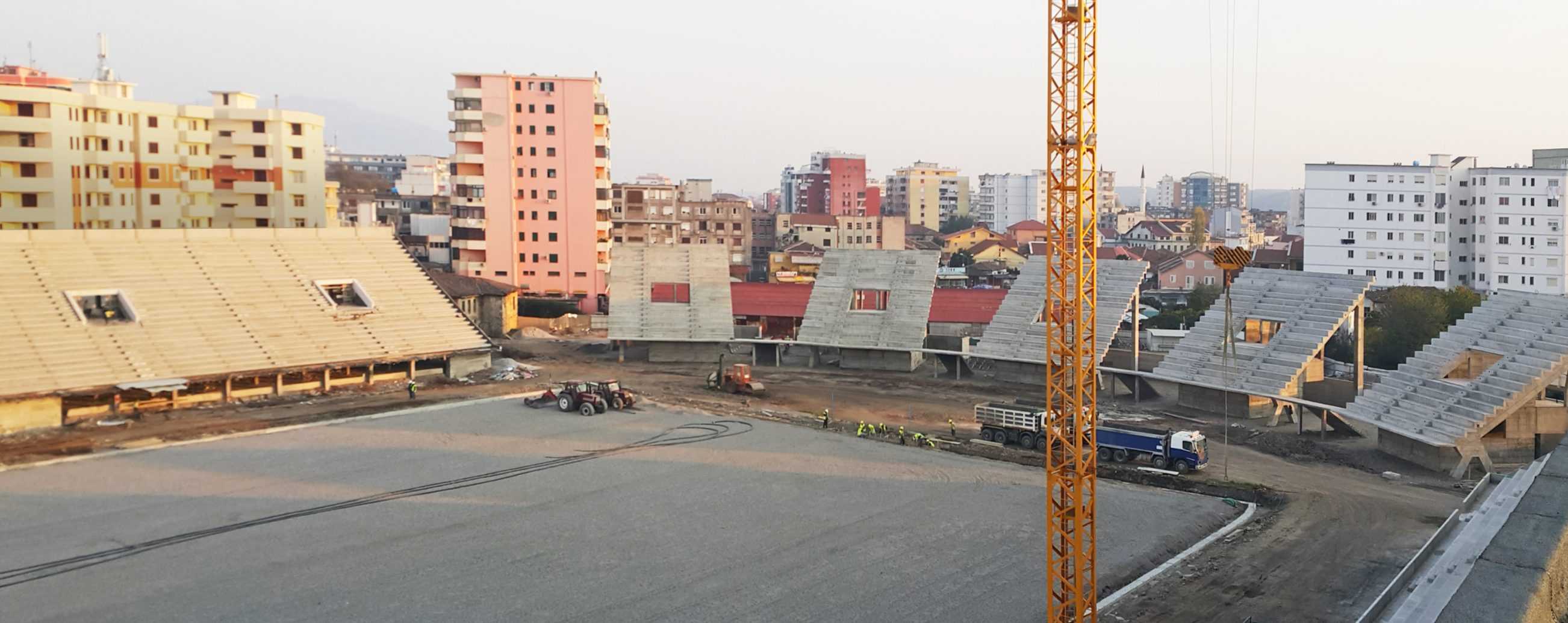
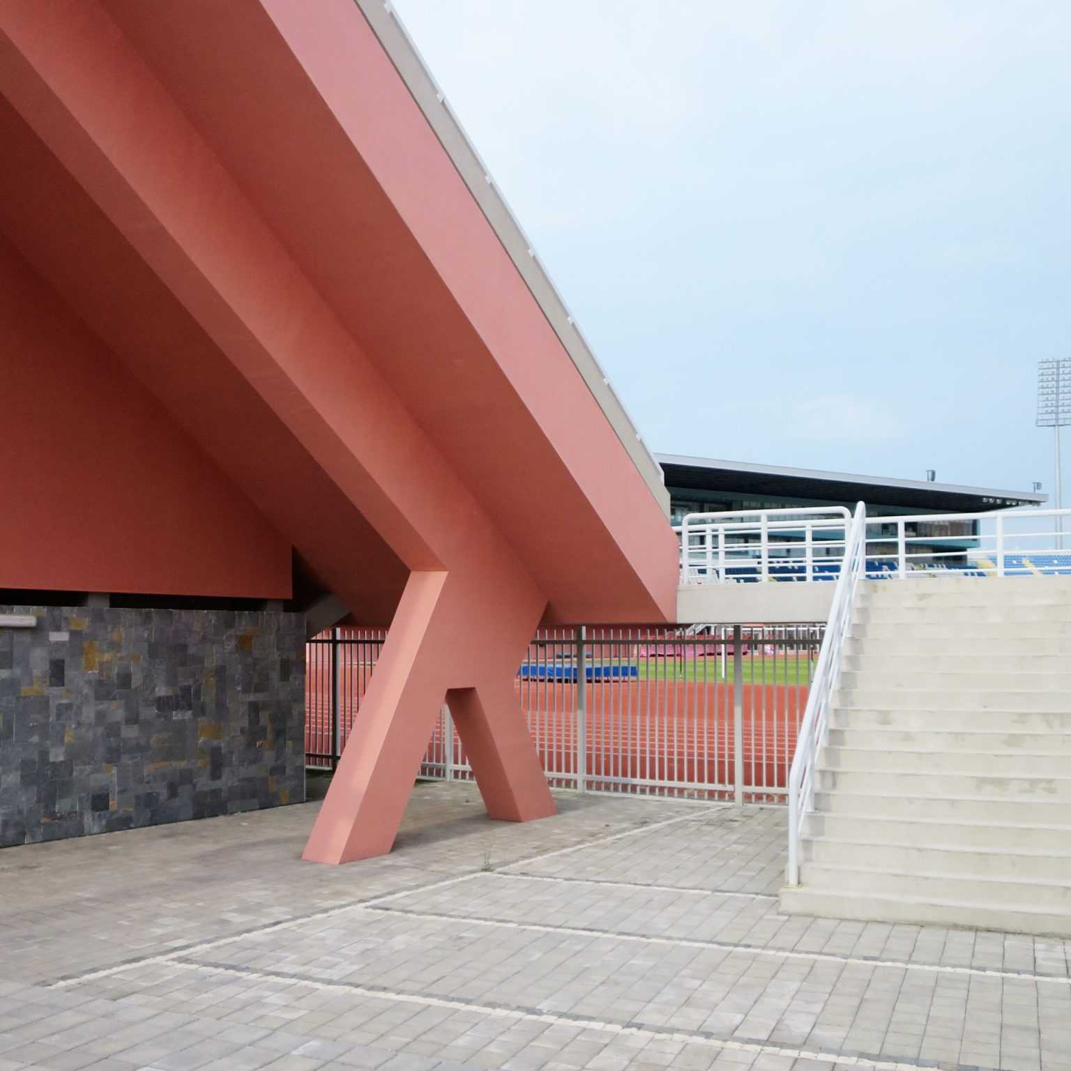
TYPOLOGY: Sport
COUNTRY: Albania
CITY: Shkodra
YEAR: 2017
PHOTOS: © Roman Mensing, BOLLES+WILSON
The 2017 football stadium in the northern Albanian city of Shkodra was a fast-track project – Albania had to host the ritual skirmish with Serbia. To marshal Riotous Serbian fans corral-like platforms were built – each restrains 500 fans within the heavy steel perimeter rail. These raked platforms were as naked concrete an illustration of Louis Kahn’s statement (that a buildings sculptural essence is only visible while under construction or as a ruin). The colours of the Shkodra team are a manly pink and light blue. Finished the pink reverse side of the stadium corrals offer a dramatic backdrop for informal urban life. The new main stadium with V.I.P. deck + press box is lit from up lights reflecting on white circles (see sketch). Existing stadiums were upgraded with a wind animated screen.


TYPOLOGY: Cultural
COUNTRY: Albania
CITY: Korça
YEAR: 2017
CLIENT: Municipality of Korça
PHOTOS: © BOLLES+WILSON, Daniel Dervishi, Roman Mensing
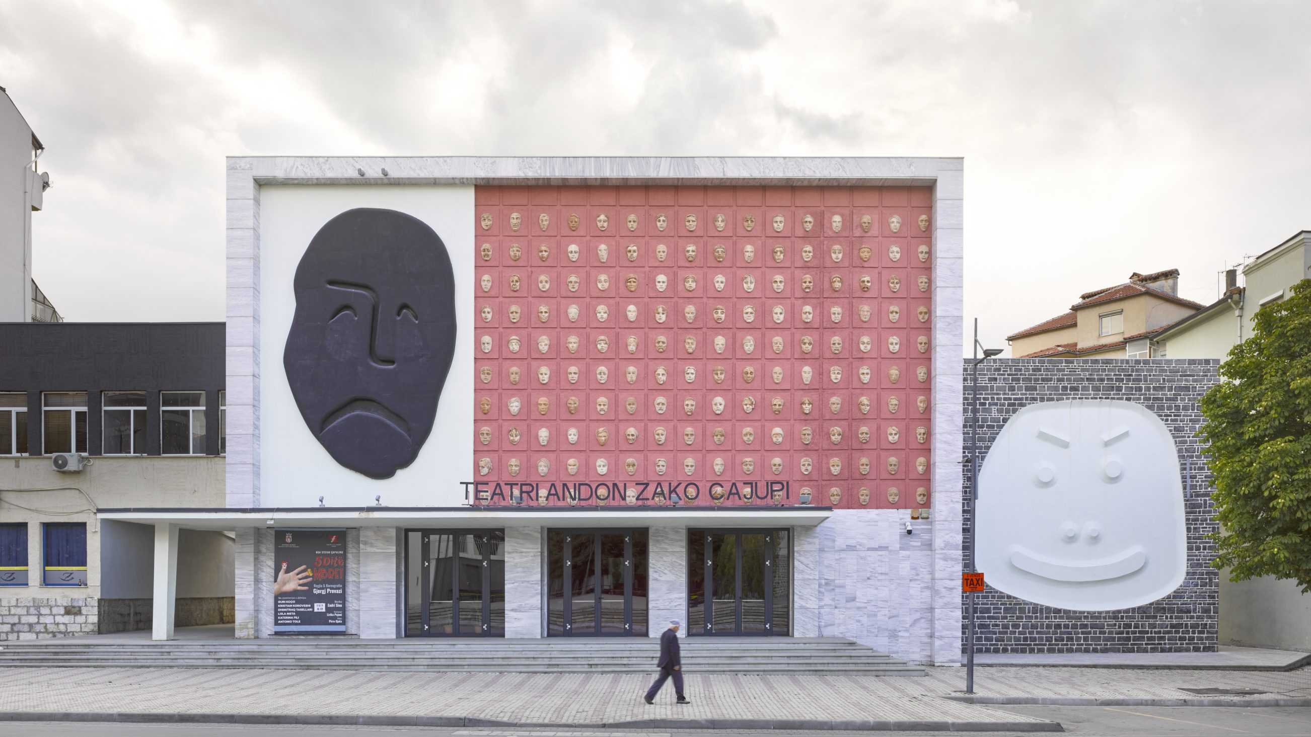
Re-scripting Korca‘s theatre:
The theatre in Korca was initially a present from Moscow prior to Albanian Communism‘s falling out with Post-Stalinist Russia.
Its Soviet classicism was then stripped back to a sort of Balkan Art déco (Illus 1).
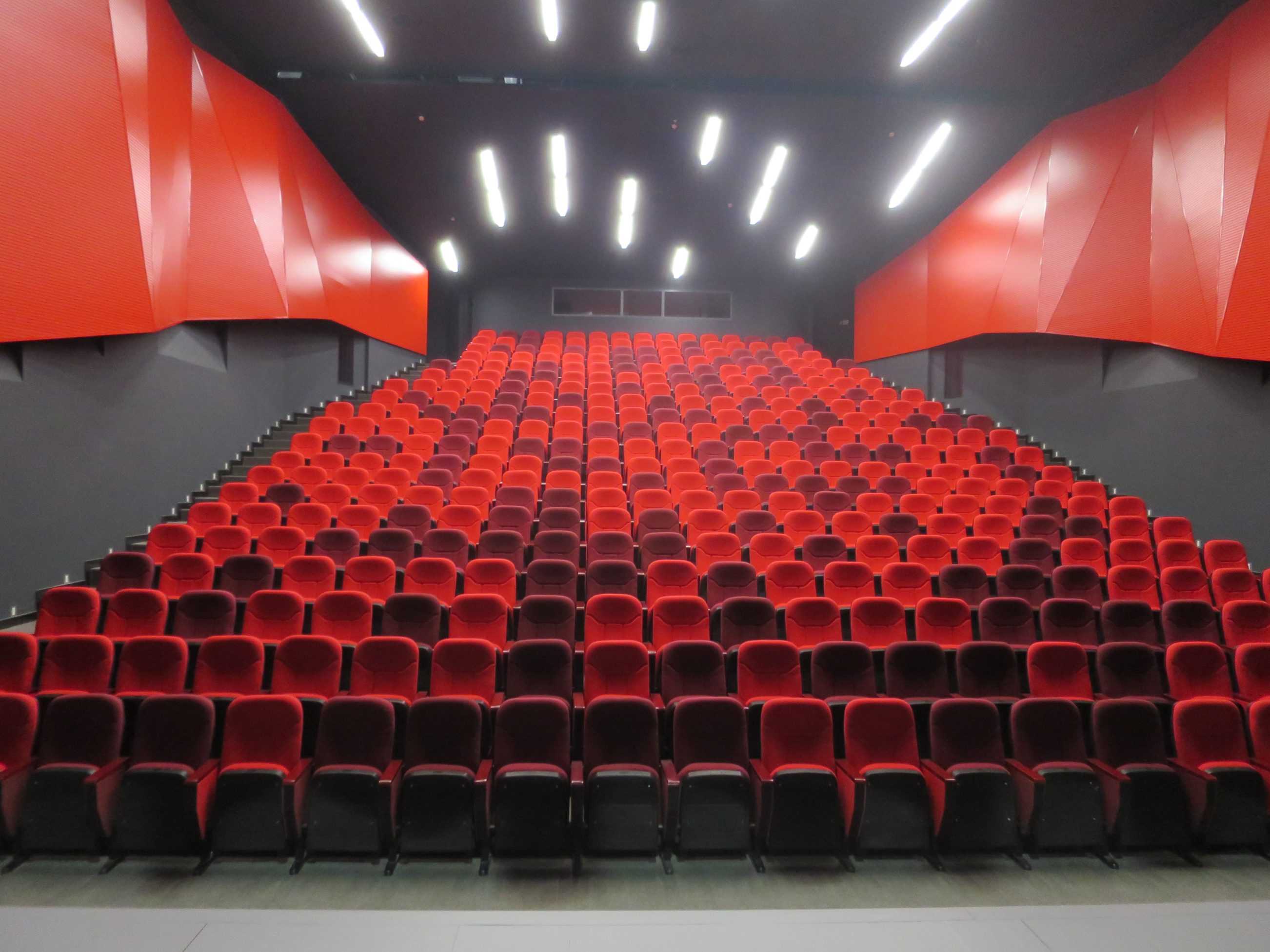
The large triangular Theatre Square, big enough for nationalistic parades, became a subject for re-formatting when in 2009 BOLLES+WILSON won the international planning competition for the historic centre of Korca. The main axis of the now almost fully implemented masterplan is the Bulevard Shën Gjergji (St. George), the new hub of the city, a pedestrian promenade (Illus 2) culminating in the Theater Square (now anchored by BOLLES+WILSON‘s 2014 Red Bar in the Sky – which focuses the Theatre Square, the concluding phase of the B+W 2009 masterplan. The campanile which functions as a lookout tower for Korcians to appreciate the delicate grain of their historic city is located at the end of the central pedestrian boulevard (landscaping by B+W).
The next intervention was the theatre itself – quite literally given a new face (or lots of new faces). Seating capacity was increased by converting a two-tier auditorium to a large raked plane (Illus 3 +4).
The design method as with all BOLLES+WILSON Albanian projects involved Peter Wilson‘s hand drawn concept (Illus 5) interpreted by a local facilitating office (in this case DEA Studio). A methodology that baits ‘lost in translation‘ misinterpretations (as was the case here when the contractors were found scratching their heads at a book of ‘Albanian Bling Renderings‘ but no details, a problem solved by Peter Wilson further sketching, this time 1:1 details direct on the wall).
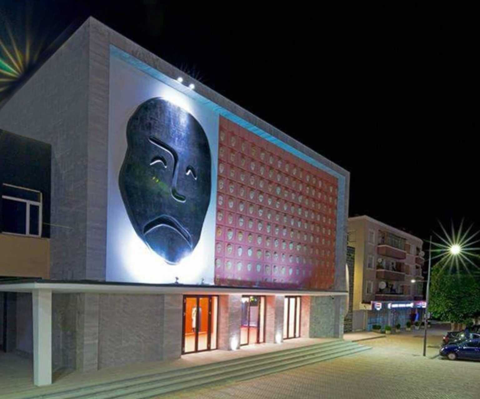
The masks of comic and tragedy belong to theatre iconography, here they are joined by 140 smaller masks – the audience, hand crafted in terracotta by the local potter Vasillaq Kolevica (Illus 6+8). The 80 cm high individualized masks each occupy a grid square of the Art déco facade. The black tragic mask is convex, the white comic mask is concave – the construction principles for these were again hand sketched.
The comic mask is on a side annex (that now houses an internal grand stair), a cube clad in black basalt (Illus 10+13). The perimeter of the mask is defined by a stainless steel profile inside of which the white plaster indentation is recessed. The ominous black silhouette of the tragic mask is built up of polystyrene insulation blocks (Illus 11+12+14). Edge radii were sketched but ultimately a 1:1 demonstration with a bread knife was necessary to communicate the idea to he builders. The surface here is again plastered to resemble a giant Japanese ‘ No-theatre‘ mask (Illus 14+15).