TYPOLOGY: Cultural
COUNTRY: Netherlands
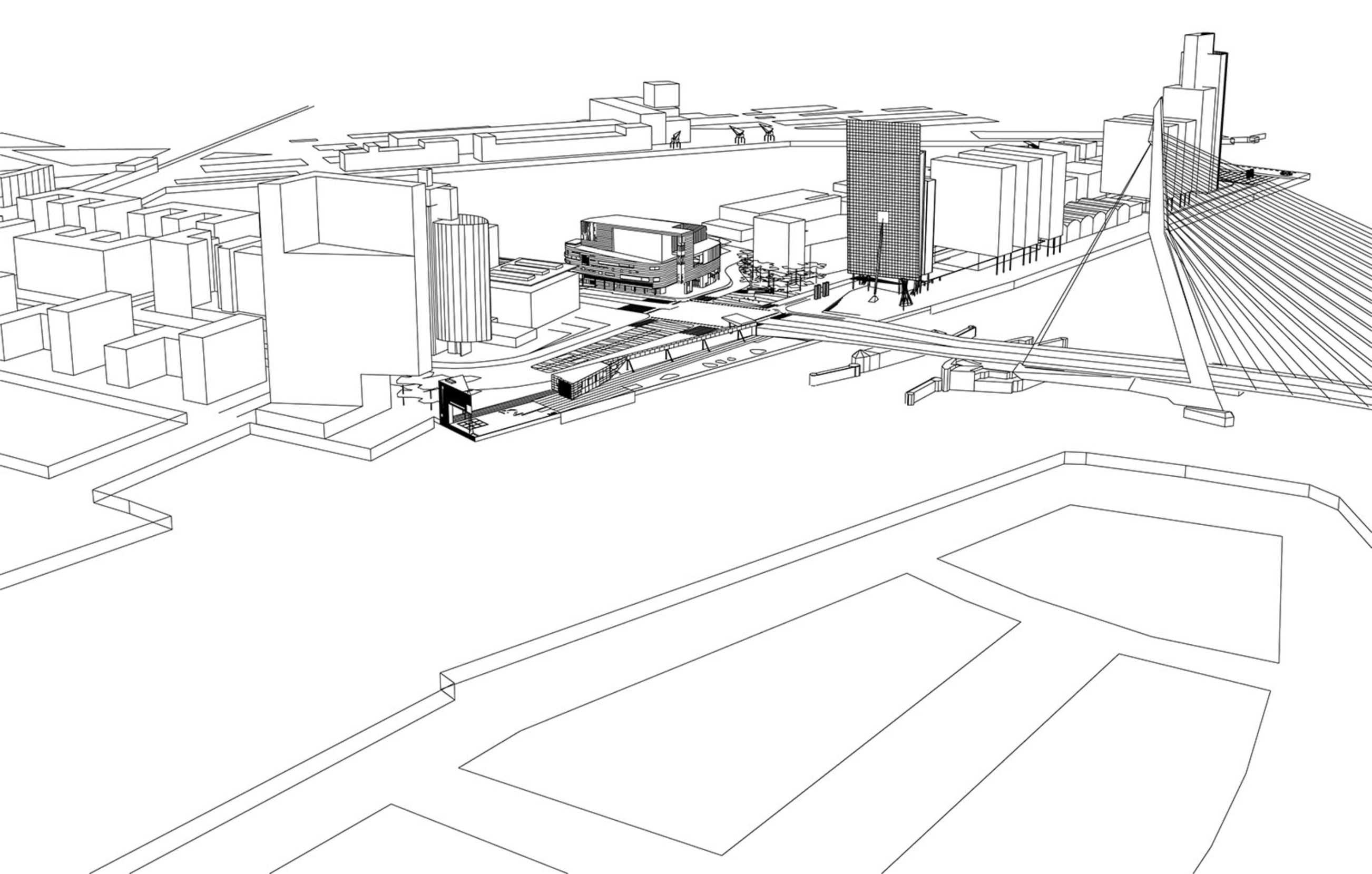
CITY: Rotterdam, Kop van Zuid
YEAR: 2001
COMPETITION: Competition 1996, 1st Prize
GFA: 24.000 sqm
CLIENT: City of Rotterdam
COLLABORATOR: Bureau Bouwkunde (local support office)
AWARD: Mies van der Rohe Award 2001 (Shortlist)
PHOTOS: © Christian Richters, © L5, © BOLLES+WILSON
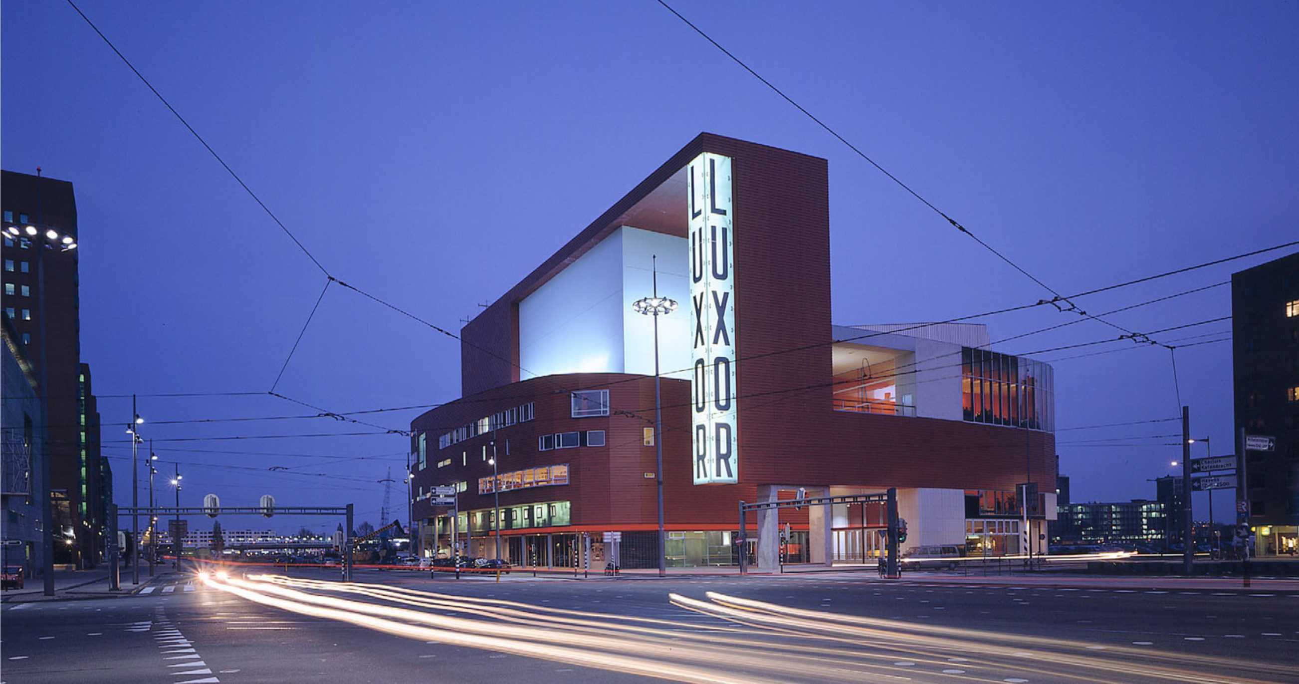
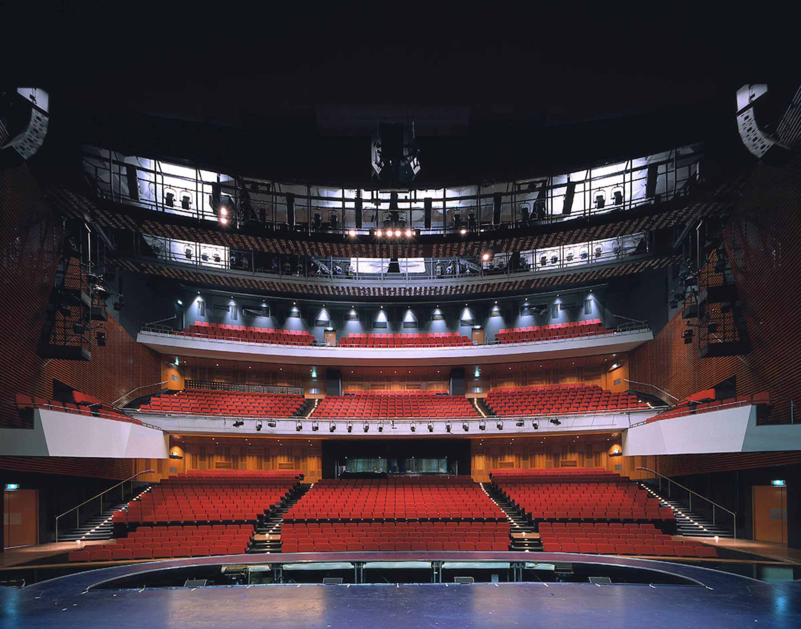
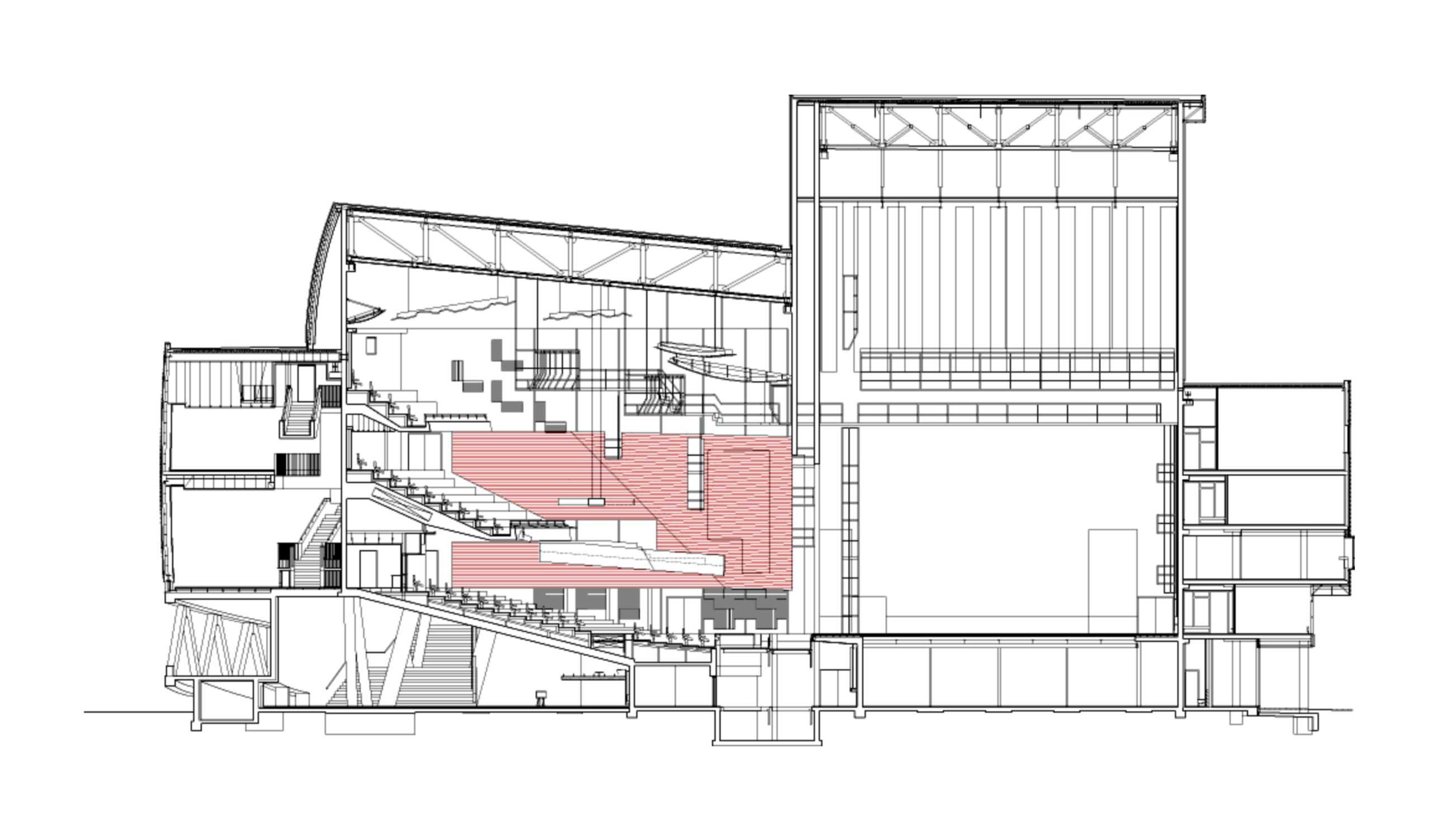
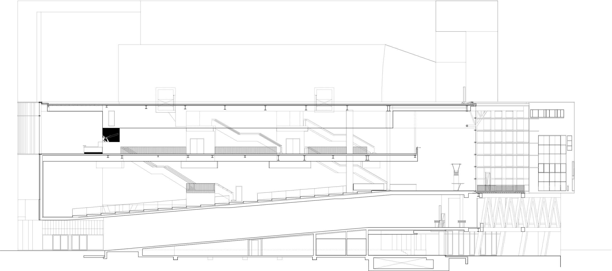
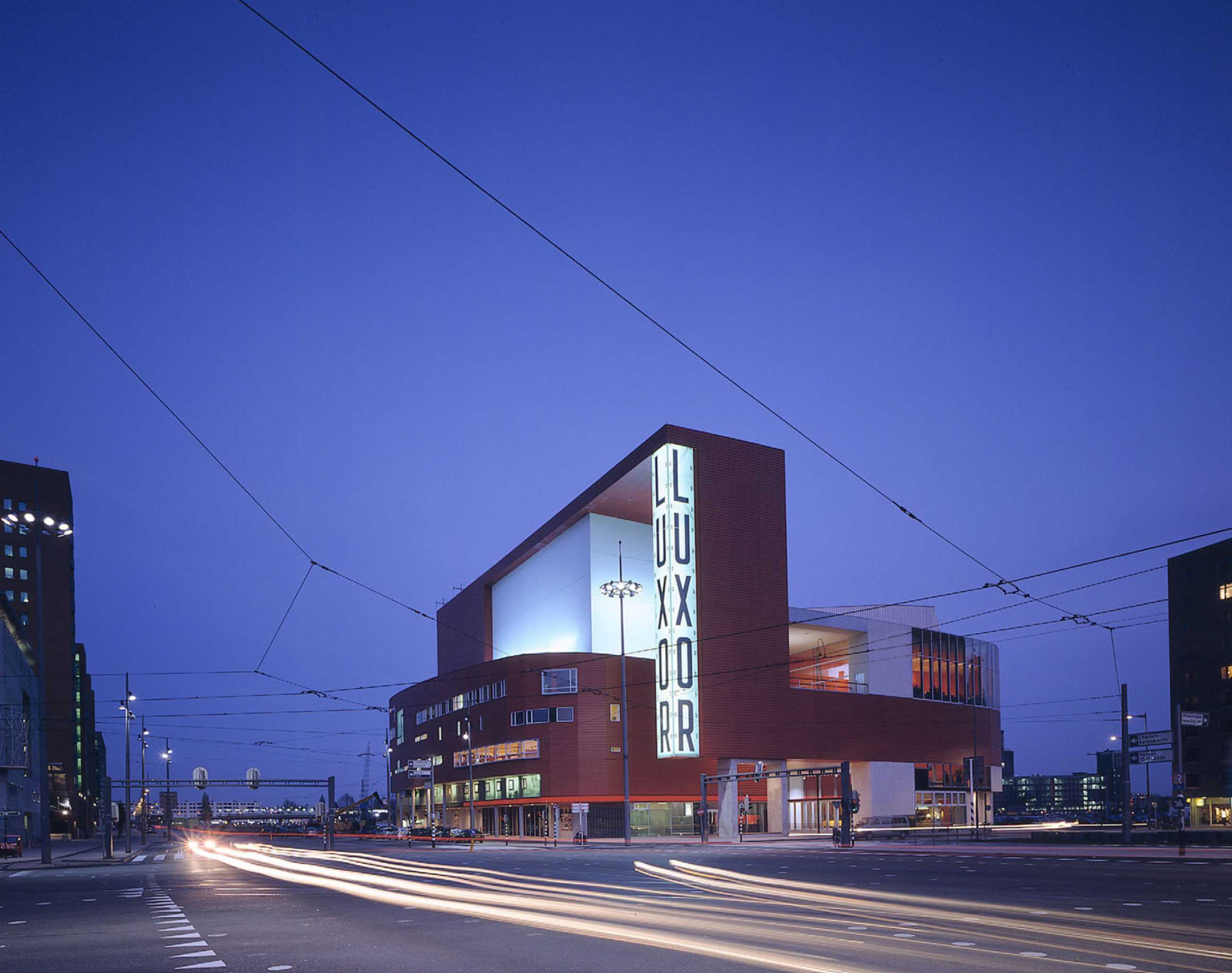
The New Luxor Theatre faces both the Maas River and Rijn Harbour – A multiple orientation, a single wrapping facade, a 360° building. An internalised ramp allows three 18 m long trucks to park directly besides the first floor stage. The ramp roof provides an architectural promenade in the foyer. The Luxor auditorium seats 1500, a giant scaled musical instrument, a surprisingly ‘intimate room’. The Luxor facilitates with an appropriated spatial theatricality the well working of complex theatre logistics.
On the 11th of May 2011 BOLLES+WILSON’S Luxor Theatre in Rotterdam celebrated its tenth anniversary with a spectacular Gala show.
The evening also marked the retirement of Luxor director Rob Wiegman – the great Rob Wiegman without whom this building, this resounding and on-going cultural event would not have happened. Tributes abounded, speeches – emotional Actors, Performers, Politicians, Rotterdamers – Architects.


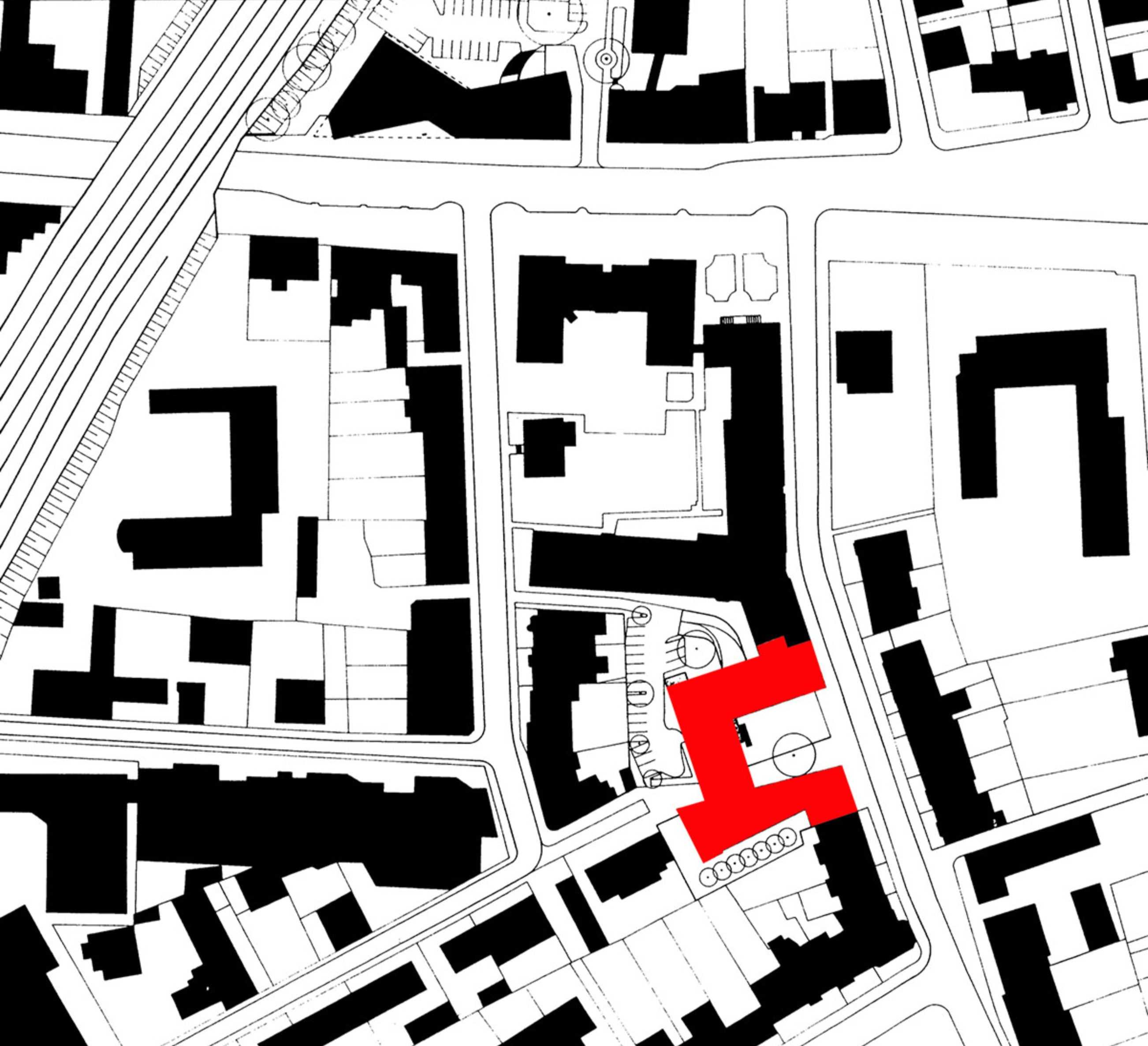
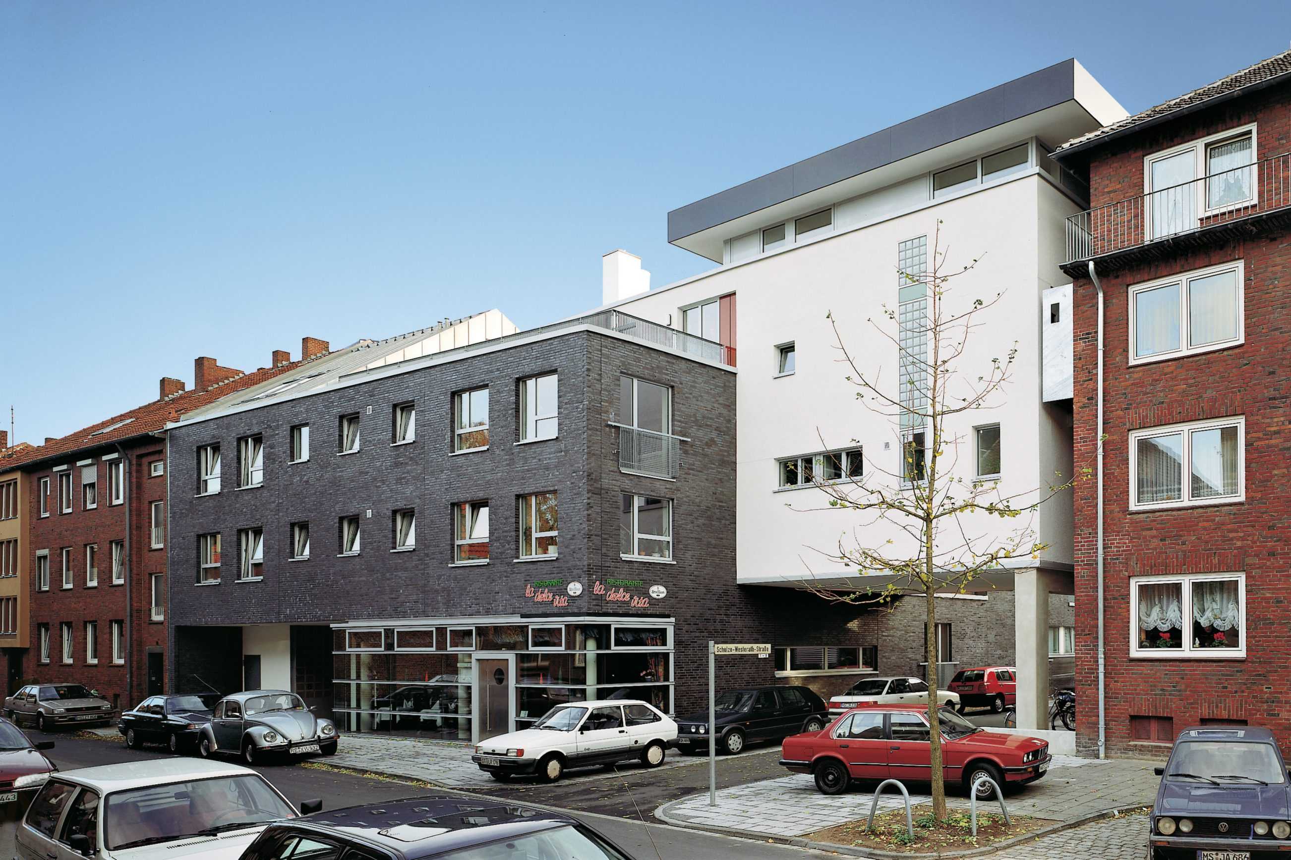
TYPOLOGY: Office
COUNTRY: Germany
CITY: Münster
YEAR: 2000
PHOTOS: © Christian Richters
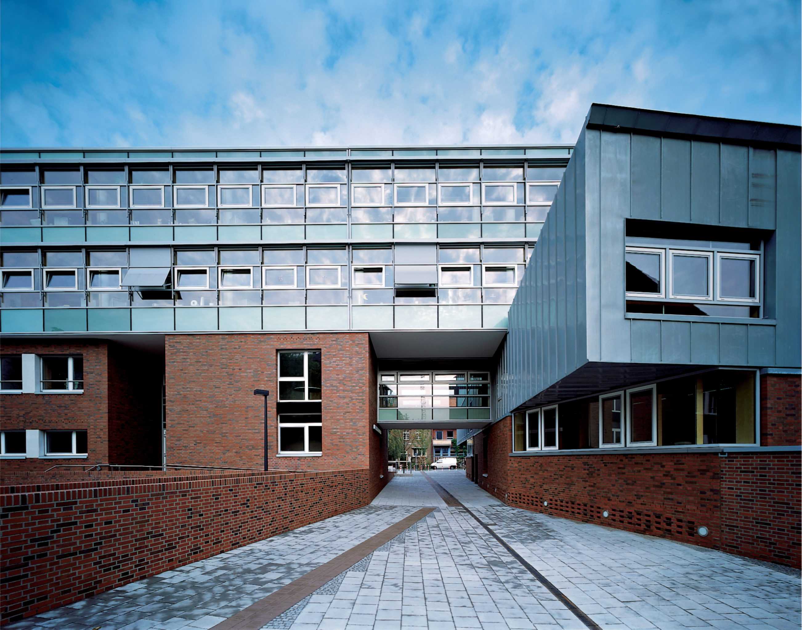
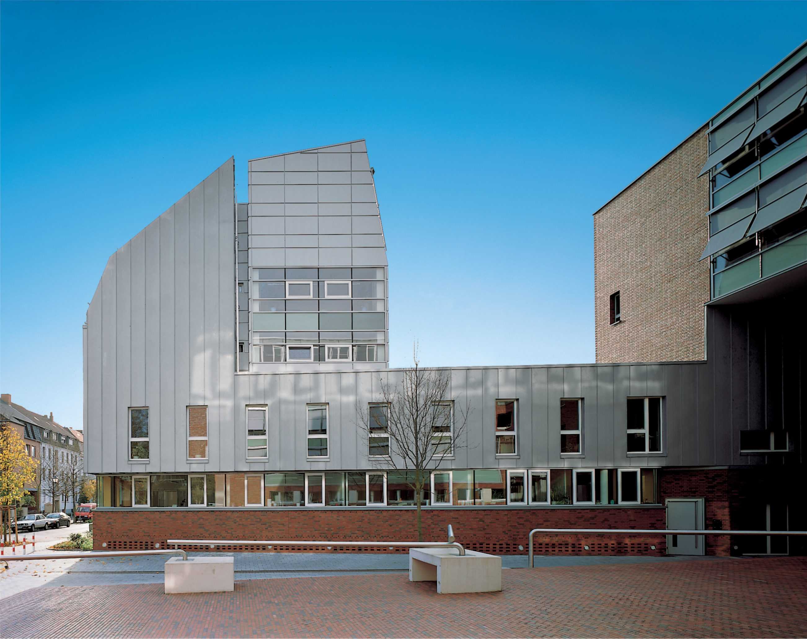
A building that inserts a new square in the plan of the City, in a zone of transition from monumental 19thcentury administration buildings to smaller scale row houses with no major urban frontage, but bisected by a public right of way (commuter bicycle route). The “U”-form of the new building frames a ramped square, scales change in stages. The bicycles punch a grand portal through the office facade. Cellular offices open through a glass facade supported on a frame of laminated timber giving the conventional offices a lightness and transparence.
The principle which animates this convention bound site and program is that of carefully detailing and choreographing everyday necessities – entrance, office layout, meeting rooms. The whole adds up to a clear and precise urban insert, sculptural in its form both object and container.
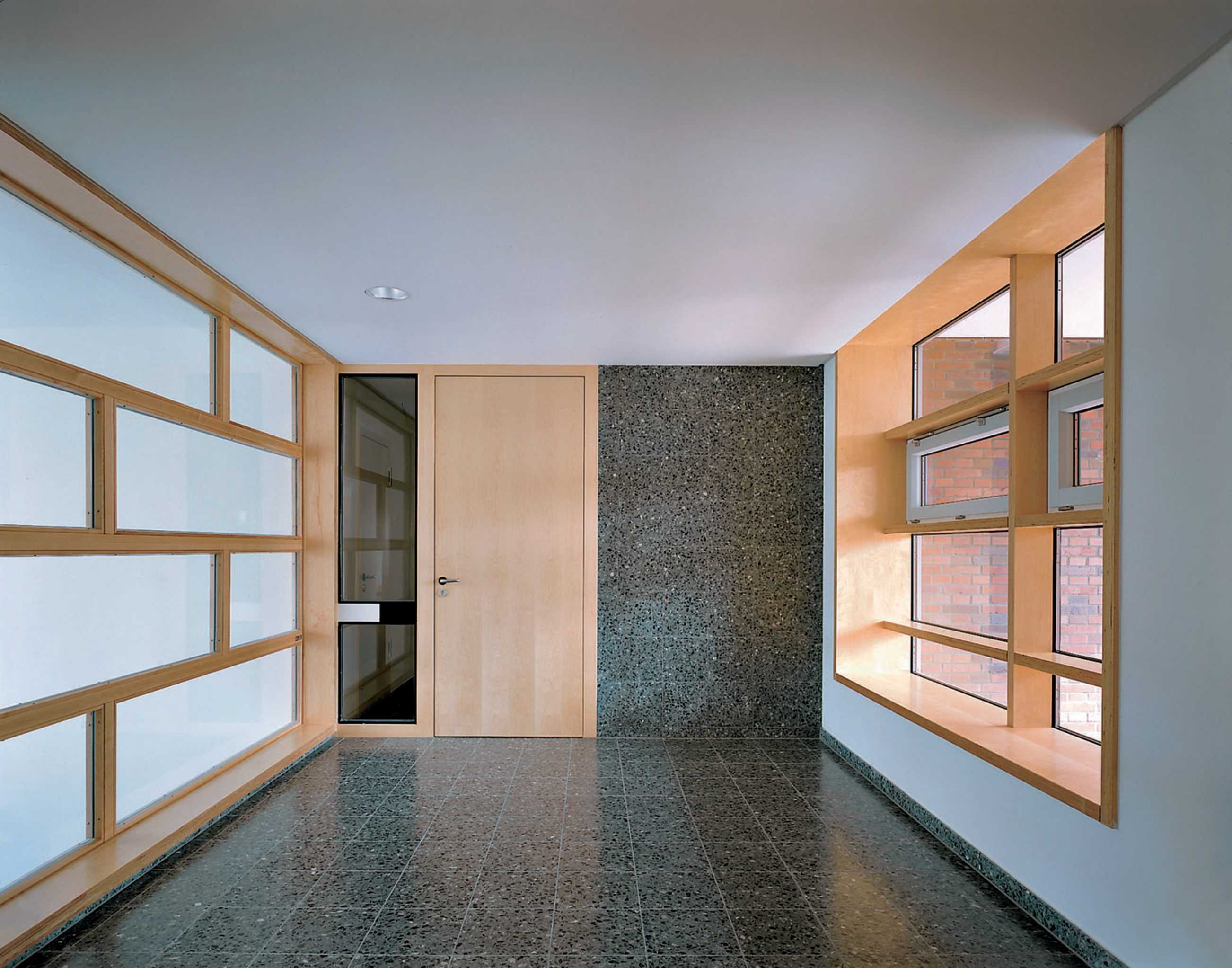


TYPOLOGY: Residential
COUNTRY: Germany
CITY: Münster
YEAR: 1997
GFA: 4.950 sqm
CLIENT: LVM Versicherungen
PHOTOS: © Christian Richters
A knitting together of street lines and block interior in a modest scaled residential district. The theme is more Vitruvius’ comoditas than grand or explicit architectural narrative. Street lines, precise boundaries between public and private realms are anchored with a solid dark, oil-fired, almost industrial and implicitly north German brick plinth. In contrast the upper floors in white plaster transcend this intentional massivity through their material and geometric abstraction. The two layers dovetailed together framing private terraces and necessary setbacks.
The 26 apartments are vertically ordered. Small units suitable for elderly occupants or studio apartments with garden below, the larger first floor apartments have generous balconies while the upper two floors are organised as maisonettes. An urbane facilitating of daily life is in the interiors and layout achieved with a reduced material palette – wood, stone, plaster.


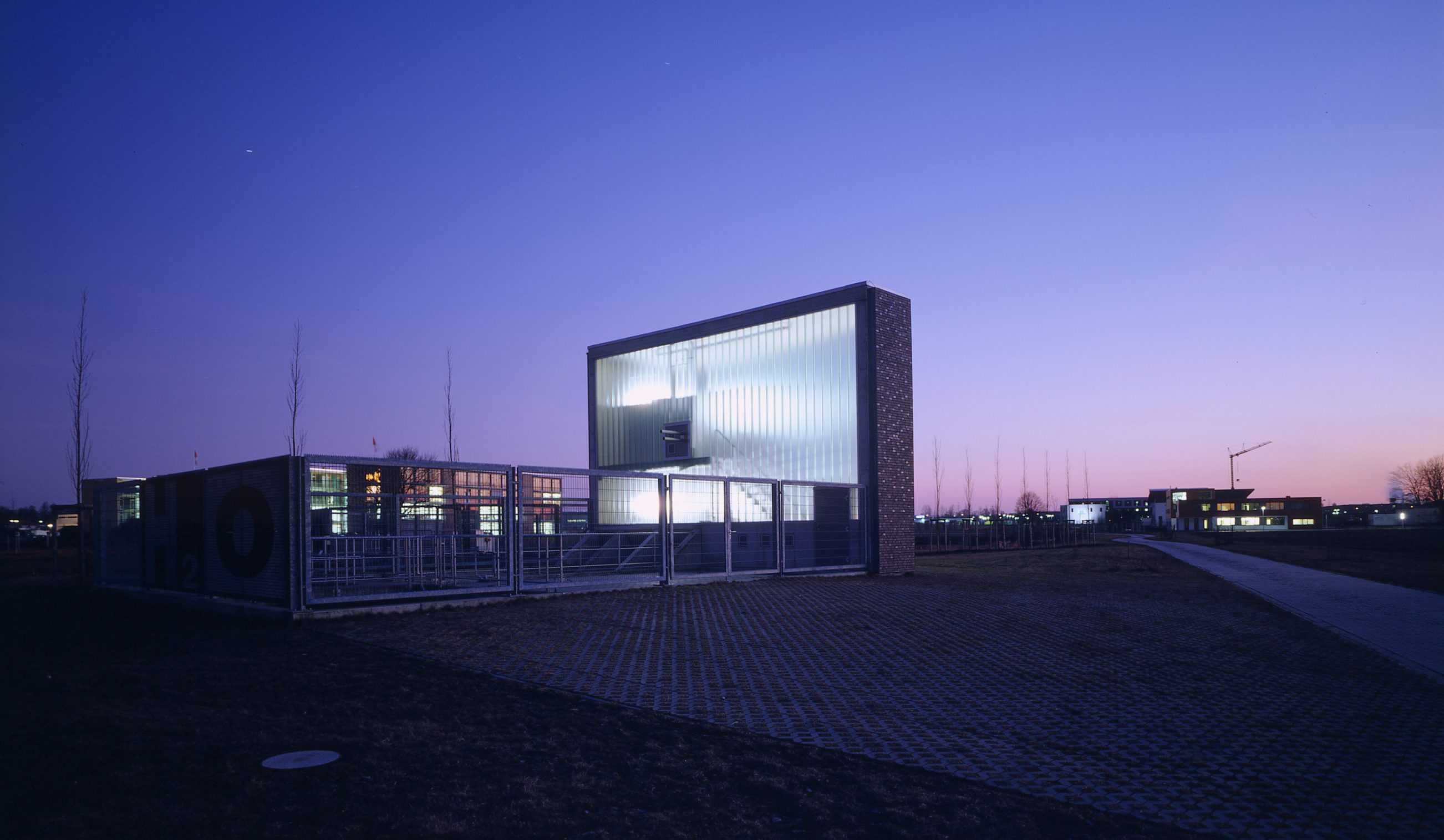
TYPOLOGY: Technical
COUNTRY: Germany
CITY: Munster
YEAR: 2021
PHOTOS: © Christian Richters, © BOLLES+WILSON
40 Years of Water Research – 20 years of Water Pumping
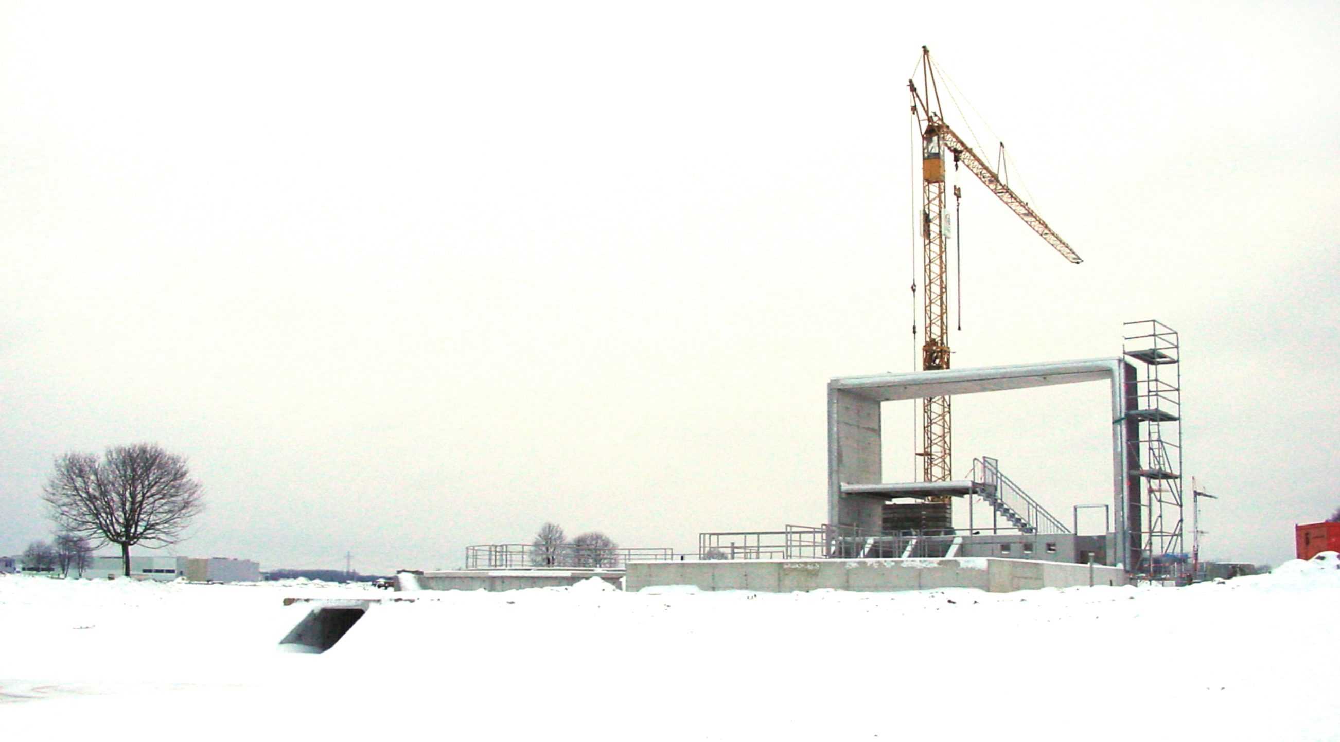
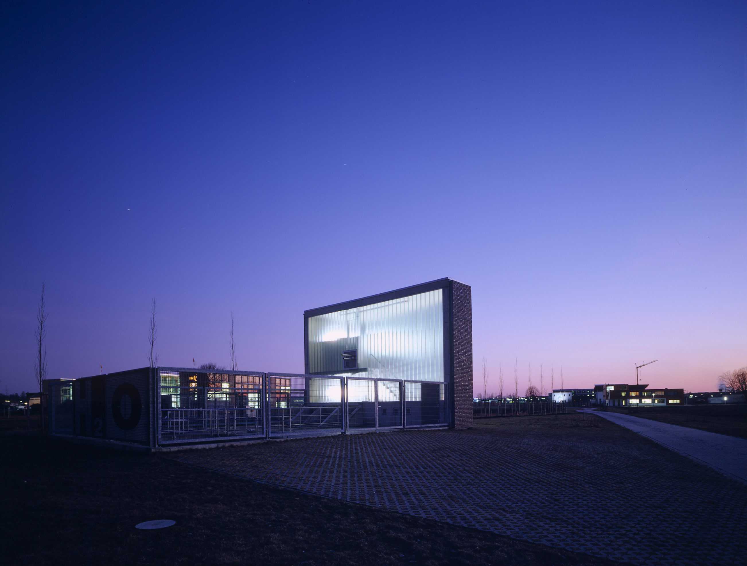
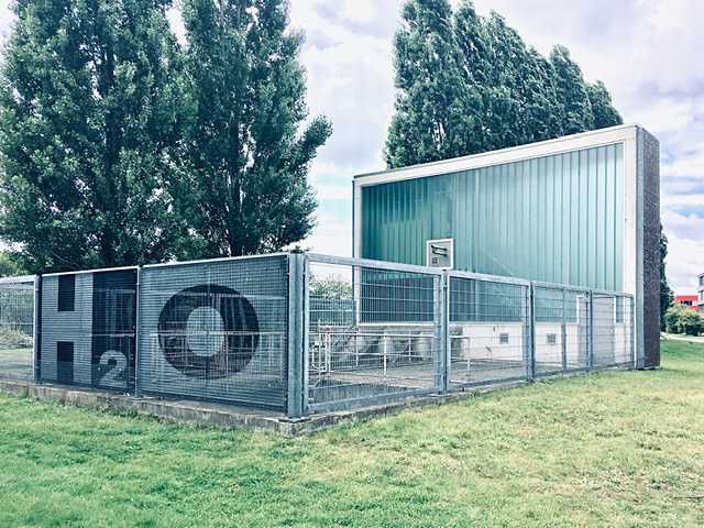
The 2001 Loddenheide Water Filtration Plant is almost BOLLES+WILSON’s smallest building. It has for the last 20 years been cleaning and filtering road runoff before it lands in the re-absorption pond of the Loddenheide Business Park. The pond itself is a re-naturalizing success, now a bird sanctuary for countless water foul. The glazed vitrine of the pump house now stands serenely in winter snow or spring blossom. Its machines turn two Archimedes Screw Pumps, aerating the water before splashing into a circular filtration tank. The rectangular plan geometry of the first is set against the circular form of the second. A line of poplar trees, now fully grown, bisects these two fundamental geometries. For those inexperienced at reading metaphoric content into infrastructural equipment the fences surrounding the two machines come with subtext – although the supergraphic H2O on the fence mesh is not readable when approached front on, only when seen in the oblique is it there to underline the theme of ‘Water’.
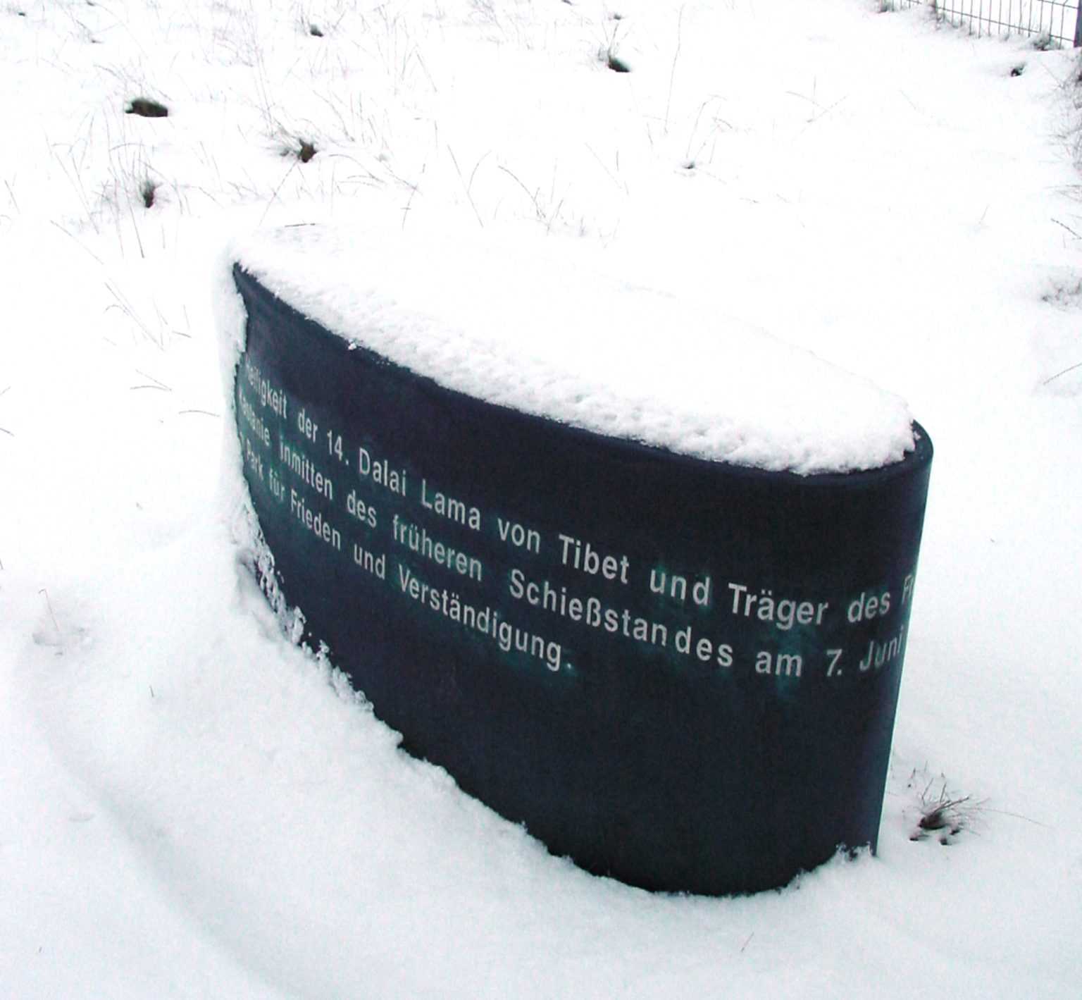
The Business Park was at the outset renamed Freedom Park by the Dalai Lama, then visiting Münster. The Dalai Lama Commemoration Stone stands 120 meters away from the pumping facilities – just follow the line of poplars. It is certainly BOLLES+WILSON’s smallest work. To read its text one must walk three times around the dark green stone. We like to believe that the rainy day inauguration photo documents the Dalai Lama gleefully asking Münsters lady Mayor – ‘Is it really a BOLLES+WILSON design’.
BOLLES+WILSON water research began in 1976 with Peter Wilson’s Iconic Water House. In 2018 the watery trajectory continued with the second warehouse for RS+Yellow both with ‘Infinity Pool’ roofs.


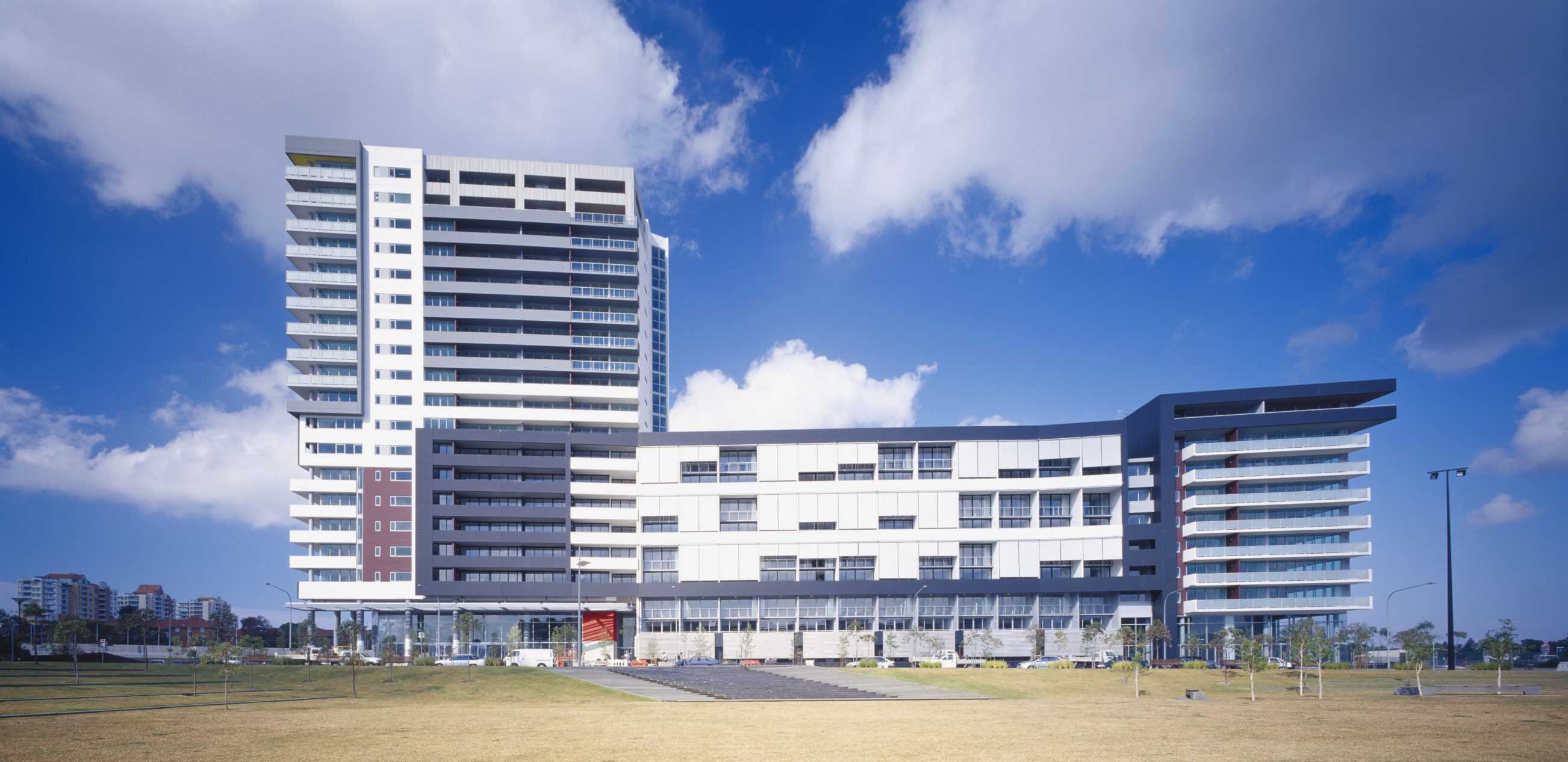
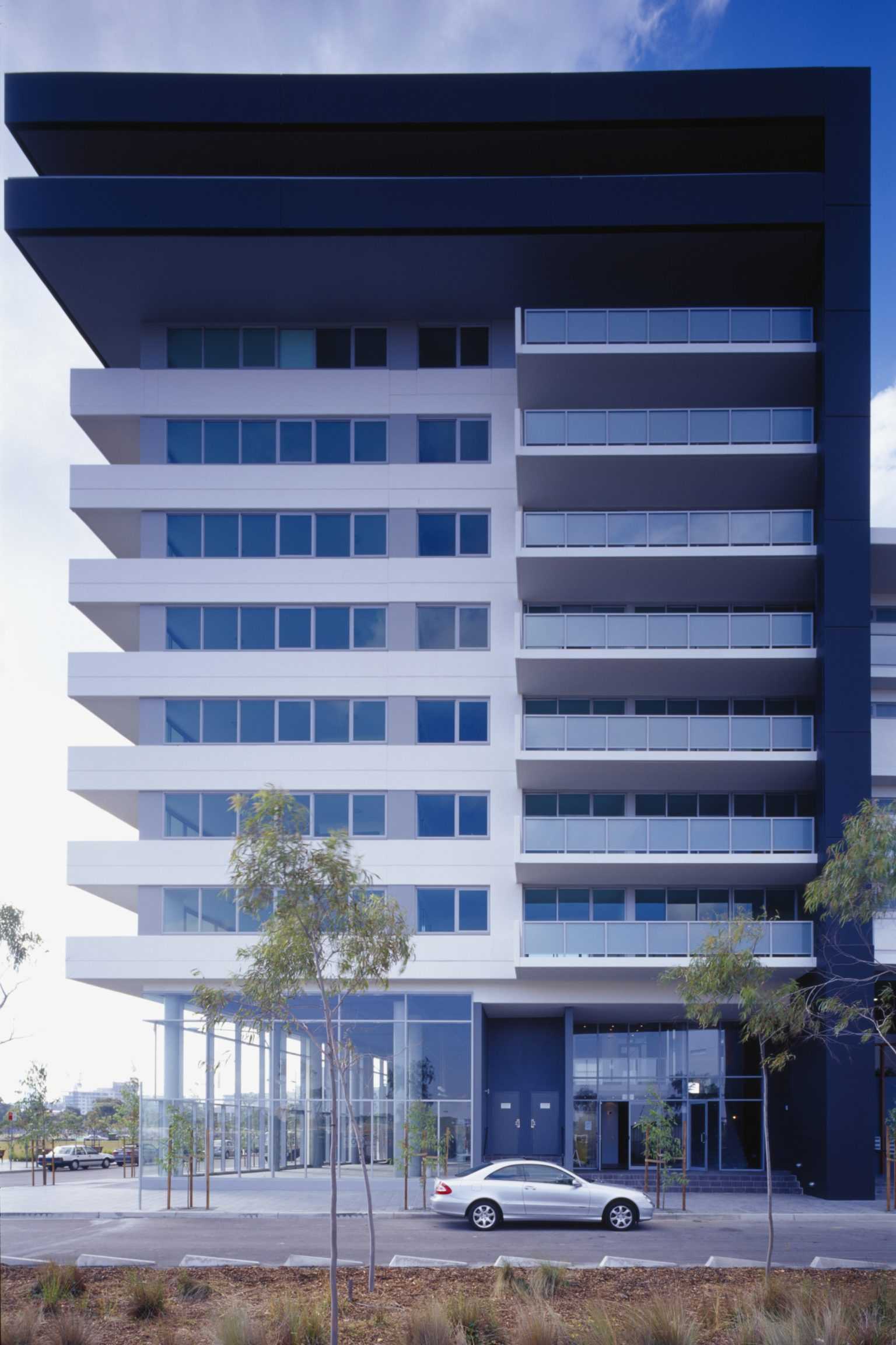
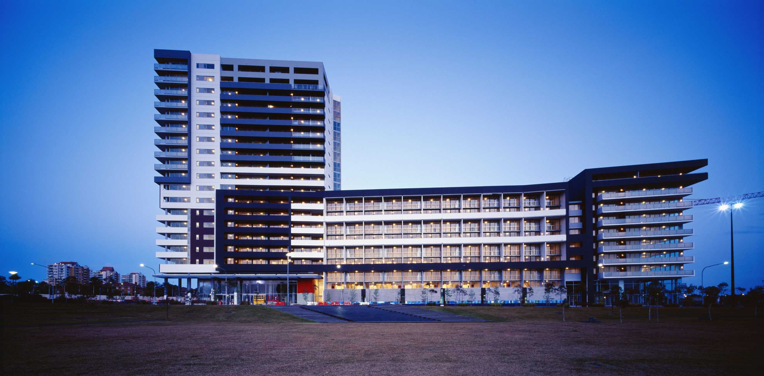
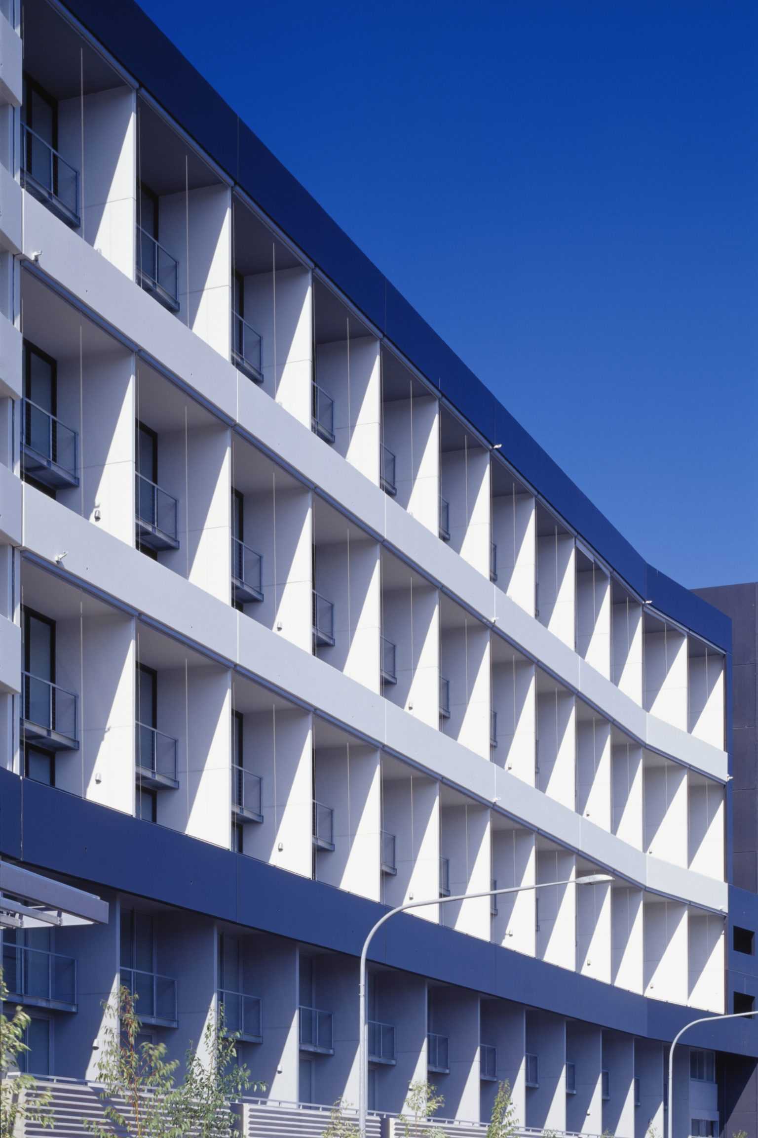
TYPOLOGY: Masterplan + Residential
COUNTRY: Australia
CITY: Sydney
YEAR: 2001
CLIENT: Waltcorp. Ltd
PHOTOS: © Turner
The visitor’s image of Australia is of huge skies, bleaching light and wide horizons. The planning model for this new Sydney quarter involved dense urban blocks with six to nine story street fronts and towers with views to their downtown big brothers. Surprisingly photos of the first two of the four blocks satisfy both expectations. One thinks of Brasilia or the suburbs of Milan in the 1950s. This ex-industrial site has in its transitional state the appearance of landscape becoming city in one heroic eruption.
Sydney is growing rapidly, due in part to an exodus from country towns, to immigration and to a cunning ‘down-under’ financial regulation that only allows foreign investors to buy into new buildings. To meet this quantitative demand a radical systematising of the building process into a ‘house of cards’ stacking of prefabricated concrete panels and standard repetitive apartment layouts has emerged. This basic logic of the ESP Block and of the ‘FORM’ Block is subsequently enhanced by balcony variations. These are essential for climatic reasons, shade and outdoor living space. (As a substitute for the suburban back yard balconies in Australia are often equipped with gas outlets for high-rise barbecuing.) Compositional juxtapositions and articulations of balconies hung outside the repetitive and regular apartment grid also reverses the modernist dictum of outside expressing interior functions. Here the heterogeneous surface instigates variations in apartment types.
2001 Four Block Masterplan
2004 ESP Block completed,
2005 Block 301 (“FORM”) completed,
2005 Blocks 303 and 305 in planning.