TYPOLOGY: Landscape
COUNTRY: The Netherlands
CITY: Rotterdam – Kop van Zuid
YEAR: 2006
CLIENT: City of Rotterdam (dS+U), Hotel New York partner
PHOTOS: © Christian Richters
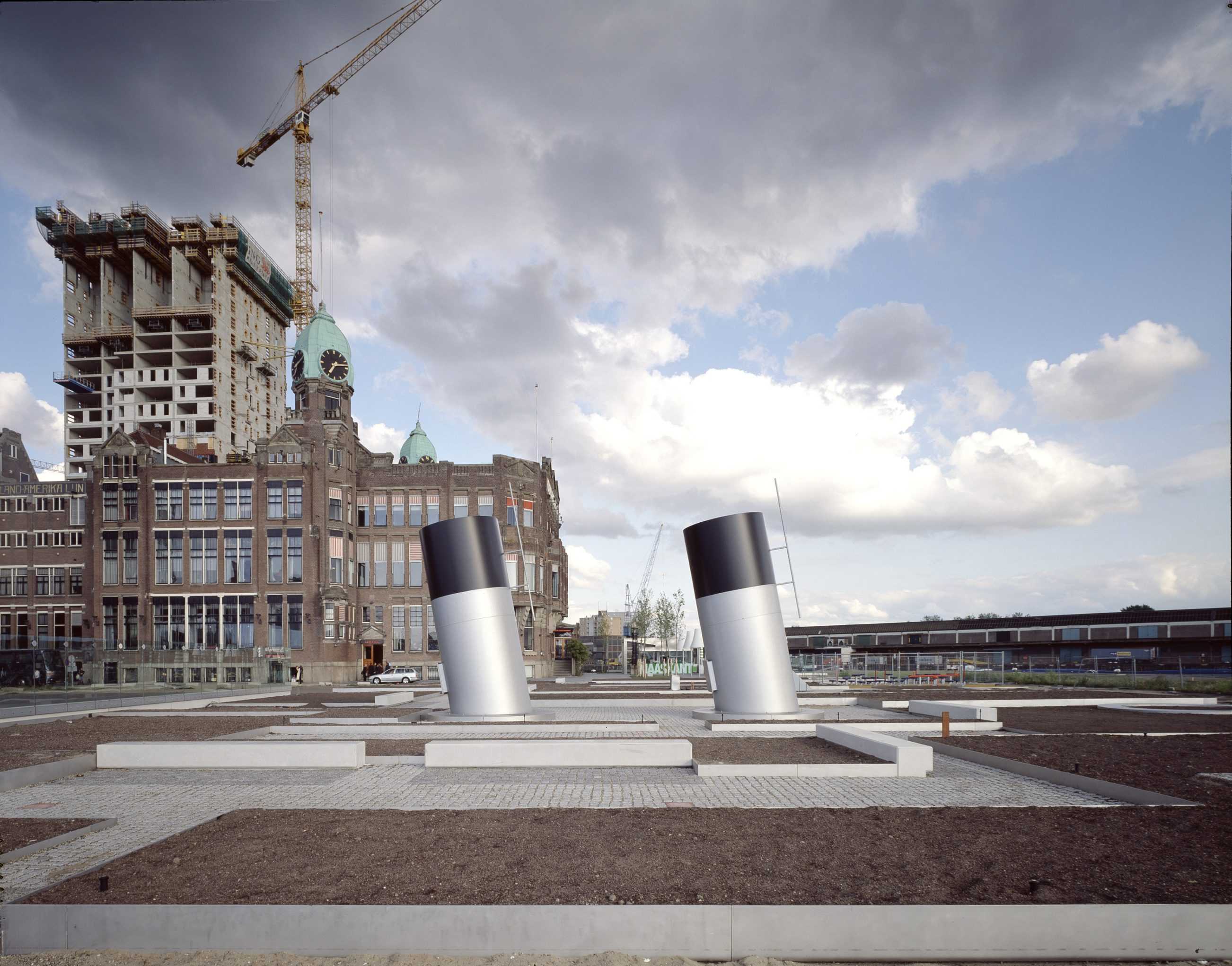
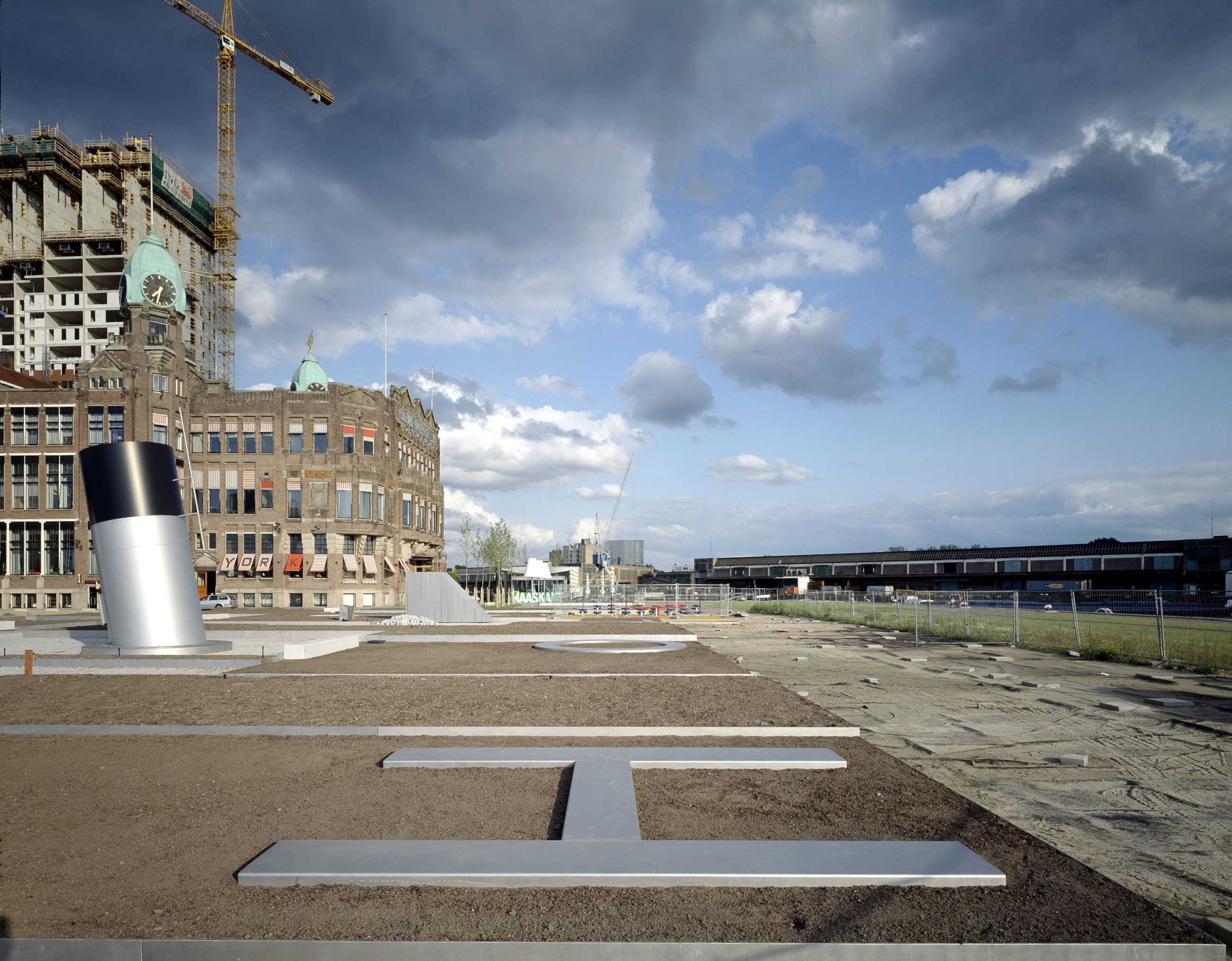
The former embarkation point for emigration to the New World – a ‘Holland/America’ theme. Two landscapes (intimate Dutch gardens and a prairie-like American event- space) are divided by a conceptual border. Large scale text (like a Steinberg drawing) is inlayed in the pavement. To date the Dutch side including the Hotel Terrace, Maaskant Pavilion, vent Funnels, playground and intimate Dutch gardens is complete. despite regular dockings of American warships the narrative landscape on the American side of the Dutch-Amerika border remains unexecuted.




TYPOLOGY: Office
COUNTRY: Germany
CITY: Münster
YEAR: 2006
GFA No. 14: 6.400 sqm
GFA No. 16: 5.000 sqm
CLIENT: LVM Versicherungen, Julia B. Bolles-Wilson, Peter Wilson
PHOTOS: © Rainer Mader, Christian Richters
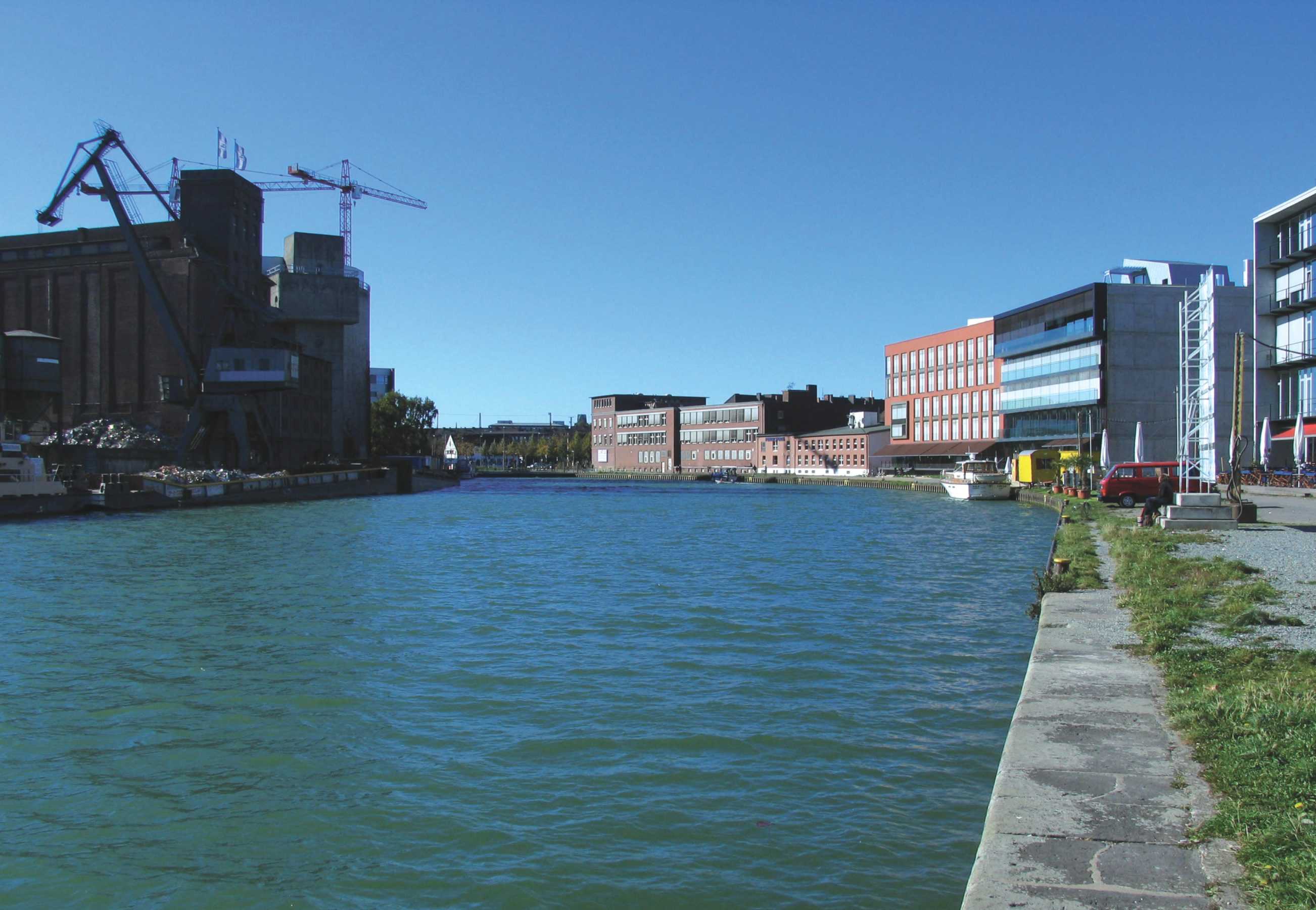
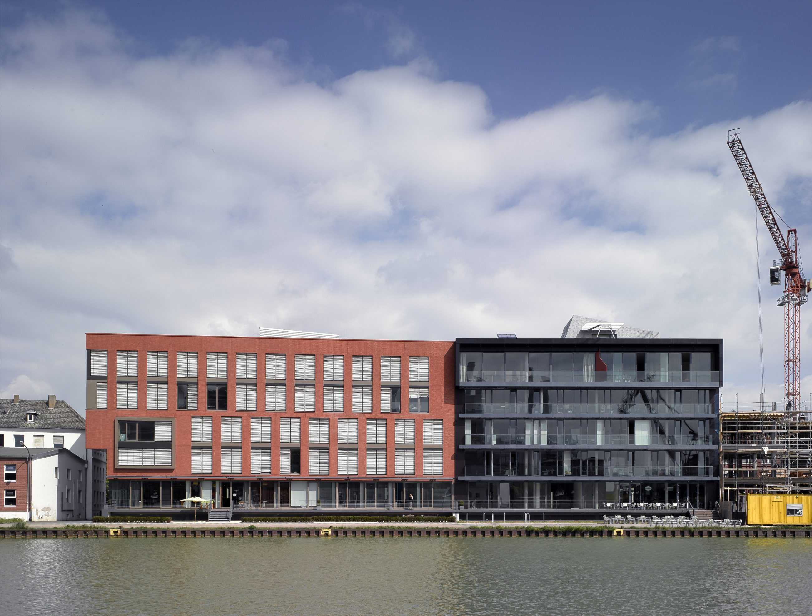
Like its big brothers in Rotterdam, Hamburg, London or Genoa, Münsters canal harbour (released from servitude) is in the process of becoming – but what – a new urban quartier, bar and café mile, victim of city-event culture or melancholic post-industrial hangout for artists and architects.
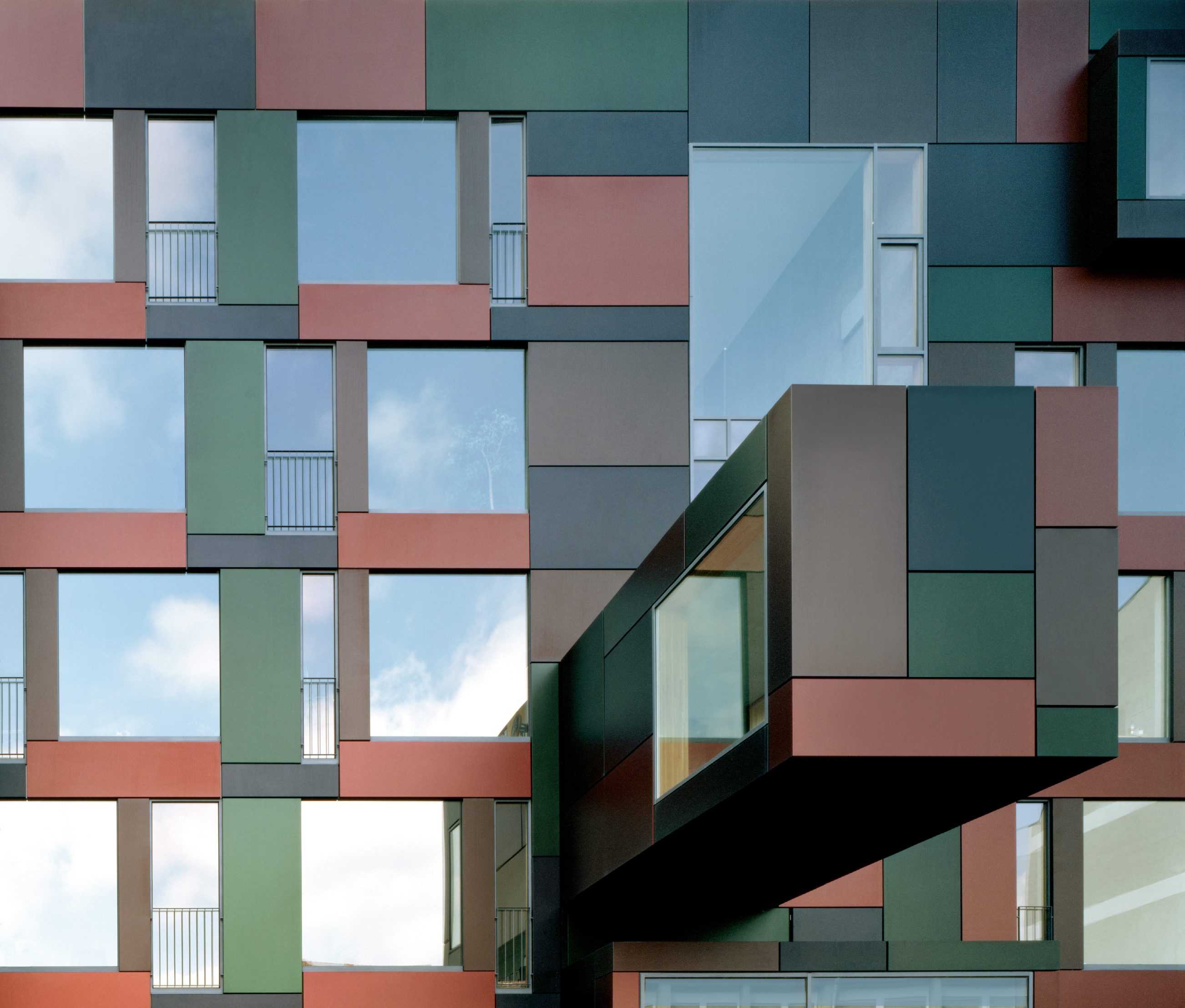
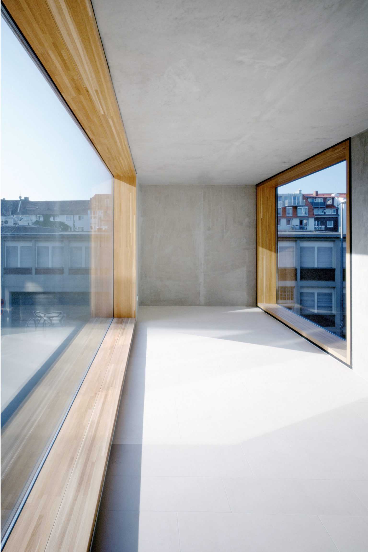
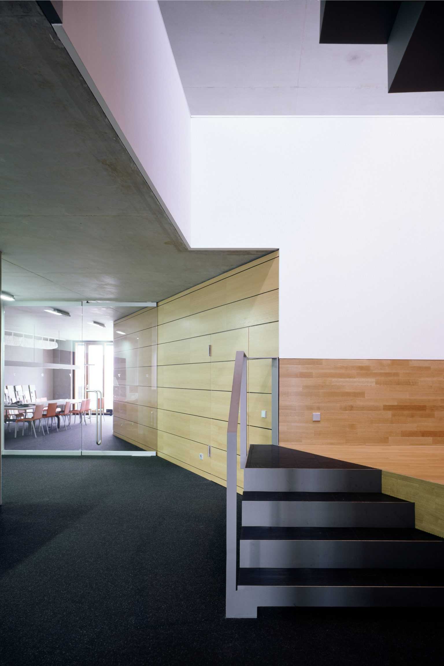
No. 14 and No. 16 like their warehouse predecessors are ambivalent as to exactly what goods or activities they host. Deep (22 m) loft plans facilitate a multitude of layouts. Facades on the other hand are specific, material and character giving.
No. 14, a sharply sculptured orange end building turns out on close inspection to be a stack of bricks close-packed in North-South direction (heads to harbour and street, sides to the end walls), an overt tactility eclipsed by flush mounted sun blinds. Seen from afar the overall volume has photoshop-like graphic quality, a designed lack of depth.
A ballet of sun-louvers also animates the South harbour-facing and predominately glass facade of No. 16. A stepped curtain creating (on sunny days) an intermediate zone between inside and out. Without the obligation of transparency (harbour panorama) or sun protection (North) the street facade of No. 16 conjures a tapestry of muted anodised colour, generous glass squares and 3D projections.
Morse code: The attentive viewer will also discover a 3 cm high ‘dot-dash’ inscription on the lower verge of each balcony, the work of the Dutch artist Milou van Ham. Old Barge Captains and ‘persevering school classes’ will decipher the text:
good day! you are (now) reading a building (2005- ) by BOLLES+WILSON (1980- ). you are (now) reading an artwork (2005- ) by milou van ham (1964- ). you are (now) reading morse-code (1837-2000) by samuel morse (1791-1872). you are (now) in the harbour (1898-2005- ) of muenster (793- ). end








TYPOLOGY: Cultural
COUNTRY: Italy
CITY: Milan
YEAR: (final design 2005)
COMPETITION: Invited Competition 2001, 1st Prize
GFA: 83.000 sqm
CLIENT: Fondazione BEIC, Milan
COLABORATORS: ati BEIC Milan: BOLLES+WILSON with ahw Ingenieure and alterstudio partners
PHOTOS MODEL: © Tomasz Sameck
MEDIA: 900.000 books, 150.000 audio-visual media, 3.500 user seats
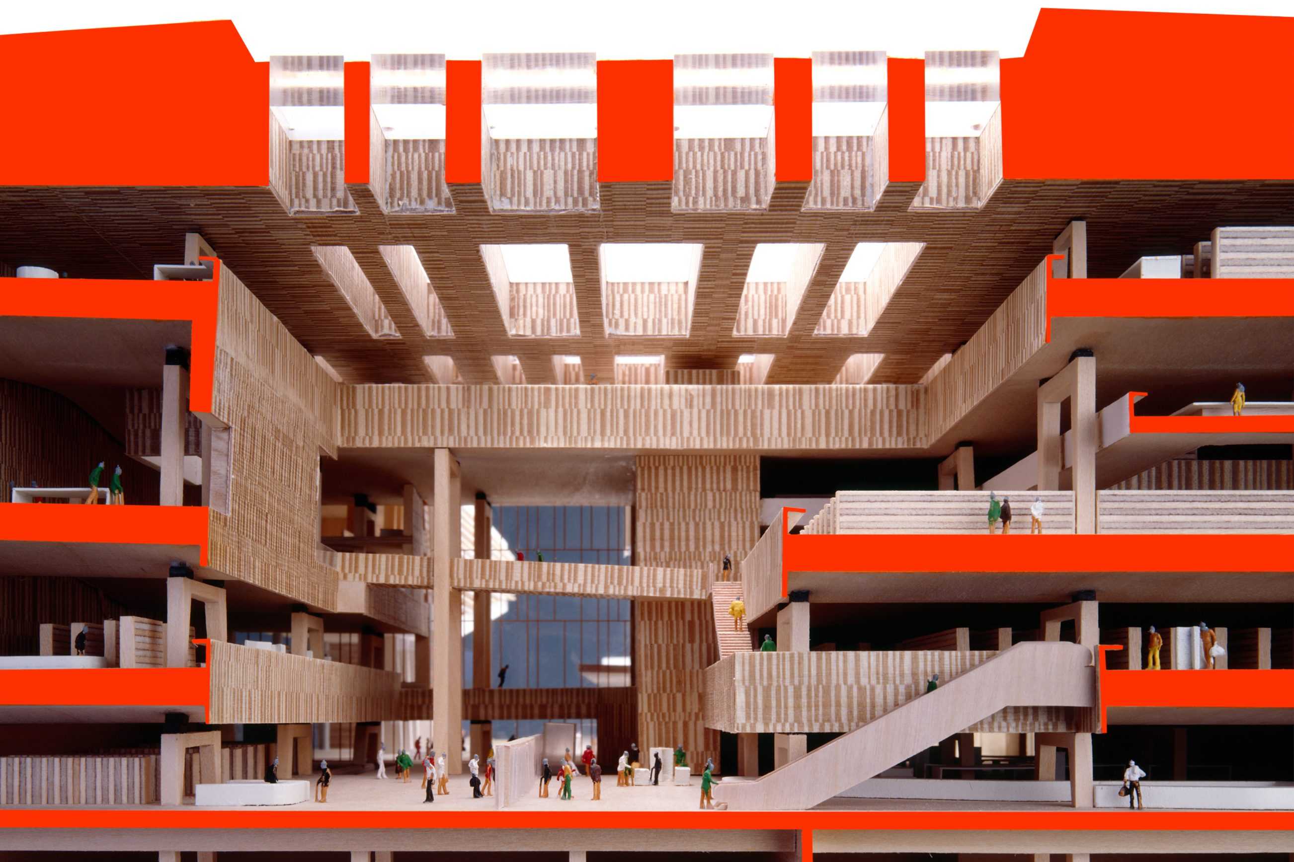
The BEIC is in the state of becoming. It already exists on the agendas of countless participating planners, librarians, expertly shepherding clients, politicians, Milanese and other future users. As the planning steadily marches through preliminare, definitivo and on to esecutivo phases, expectations multiply (optimism is contagious) and the physical character, the individuality, the unique spaces of this exceptional endeavour come ever more sharply into focus. Despite the grand scale the building conjures a certain intimacy for individual users. It invents an entirely new constellation of the ‘house of knowledge’, where digital ephemerality cohabits with our old friend the book. The emerging BEIC remains true to the concept that won the architectural competition. Within this architectural and organizational framework countless refinements have been invented (terracotta facade, the bar-chart-acoustically-absorptive interior panelling) and significant opportunities like the earthquake resistant wave-like ceilings have been identified and integrated.
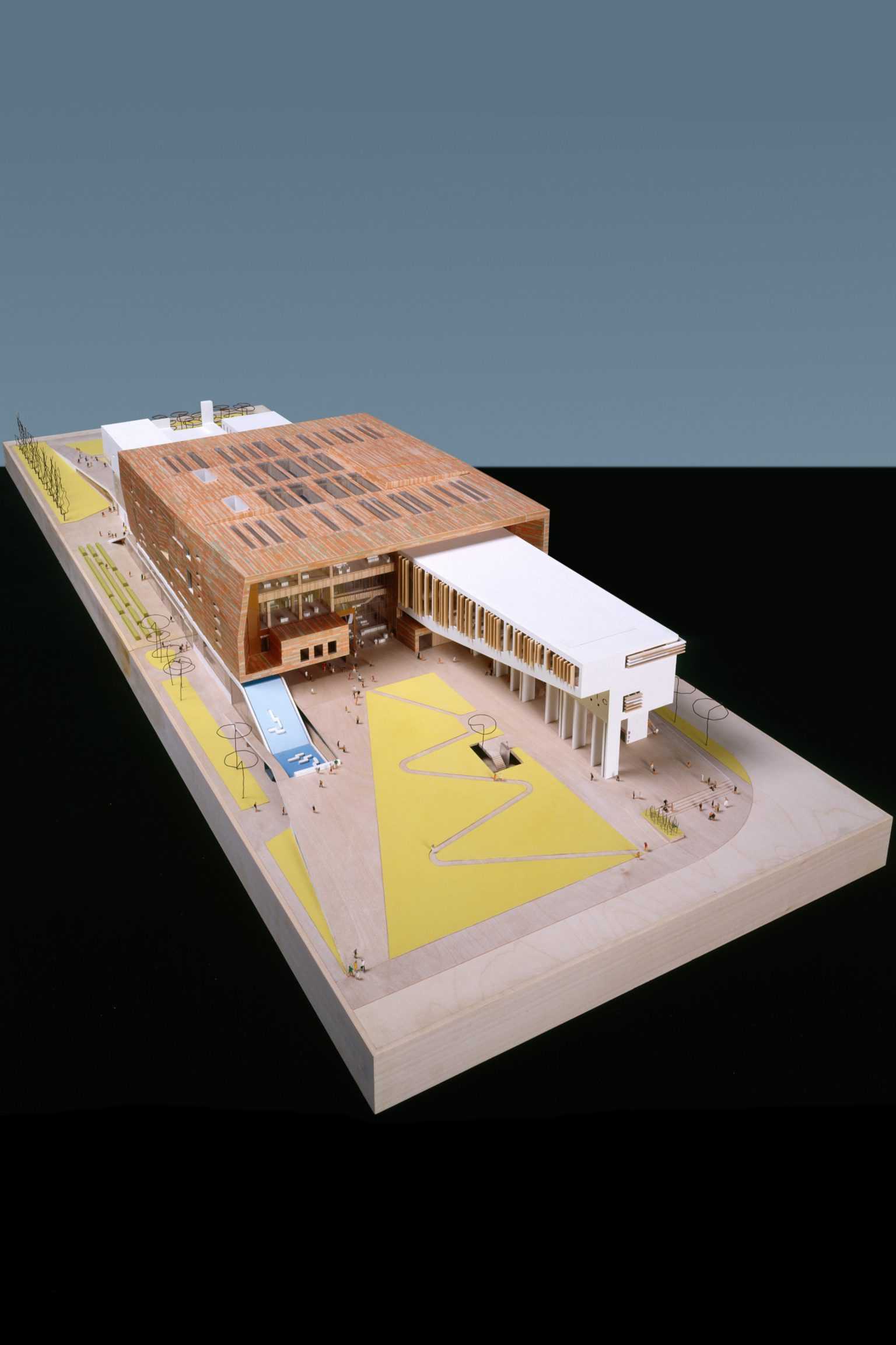
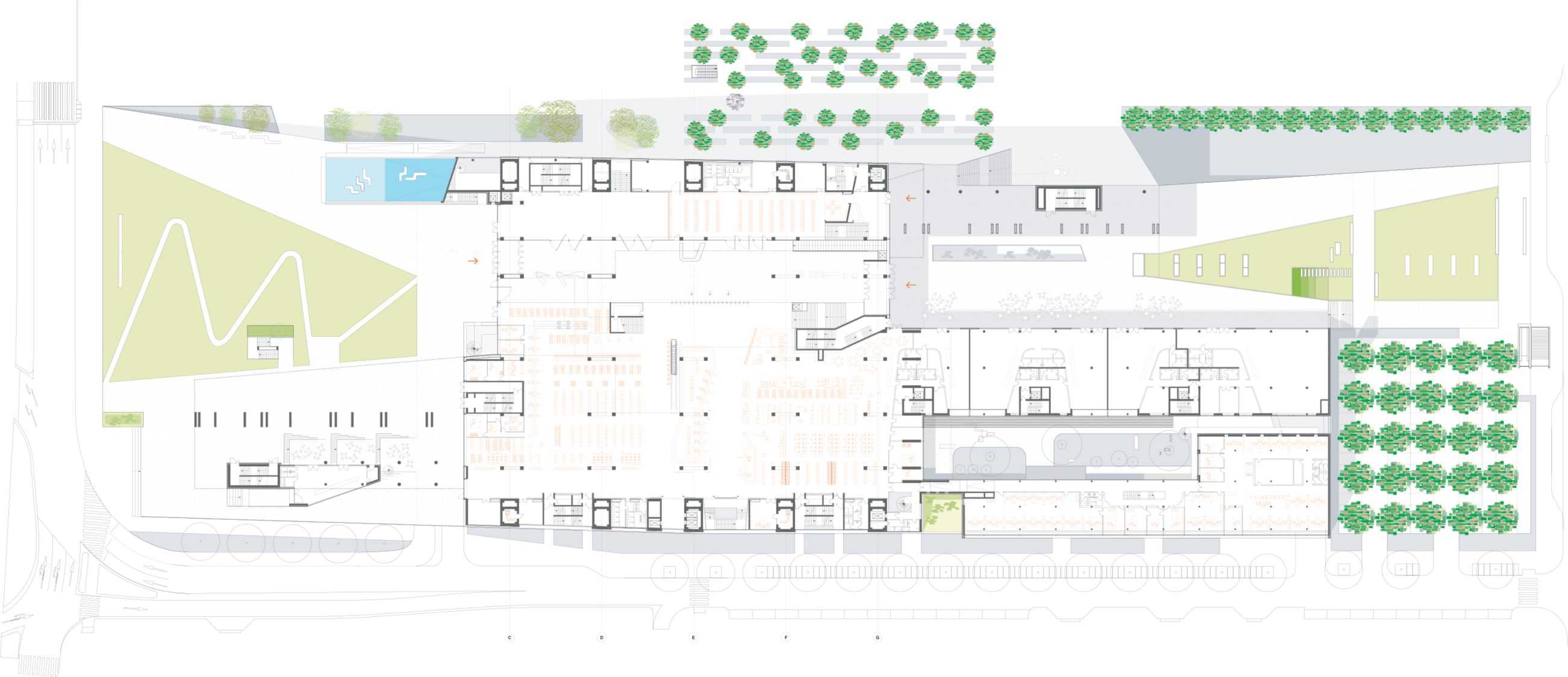
Urban Concept – The site is linear, as is the remembered trajectory of the Stazione Vittoria. The BEIC’s two doors address the east (the centre of Milan, Viale Umbria) and the west (new subway exit, Viale Mugello and the new sport and recreation landscape beyond). An east-west pedestrian walkway runs not parallel to but through the BEIC – urban networking.
A 36 m high Urban Landmark – A vessel of culture and information, invitation, frame and enabler to multiple passages and trajectories. Entrance ramps fold surrounding pavements up to the +5.00 piazza, entrances and lobby. Reading arms extend out from the main volume.
Windows like that to the main elevator lobby on axis with the Via Vertoiba, tie through framed views the interior back into the urban context.
The terraces of the various departments frame a communicative forum, a landscape of knowledge. Reading salons nestled into the sidewalls of the frame or balcony edge desks offer a wide variety of working atmospheres. Warm acoustically absorptive materials provide the required library ambience.
Program – A 5 m high socle contains all functions outside the controlled library – Conference, Teaching Centre, Media Forum, Childrens Library with garden, carparks. The walkthrough Lobby gives a visual orientation to all departments galleried above. It flows into the entrance, general information and reference zones. Reading Rooms are on the north side, Users Own in the east arm, connecting to youth areas. Departments are on three upper balconies, with variable stores and connected via ramps in the reading arms – a flowing together. Workshops, offices and administration are in the 3 storey arm along the Via Monte Ortigara.






TYPOLOGY: Mixed Use
COUNTRY: UK
CITY: London
YEAR: 2008
CLIENT: Brookfield Development (UK) LTD, TESCO Stores Limited
PHOTOS MODEL: © Julian Vogt
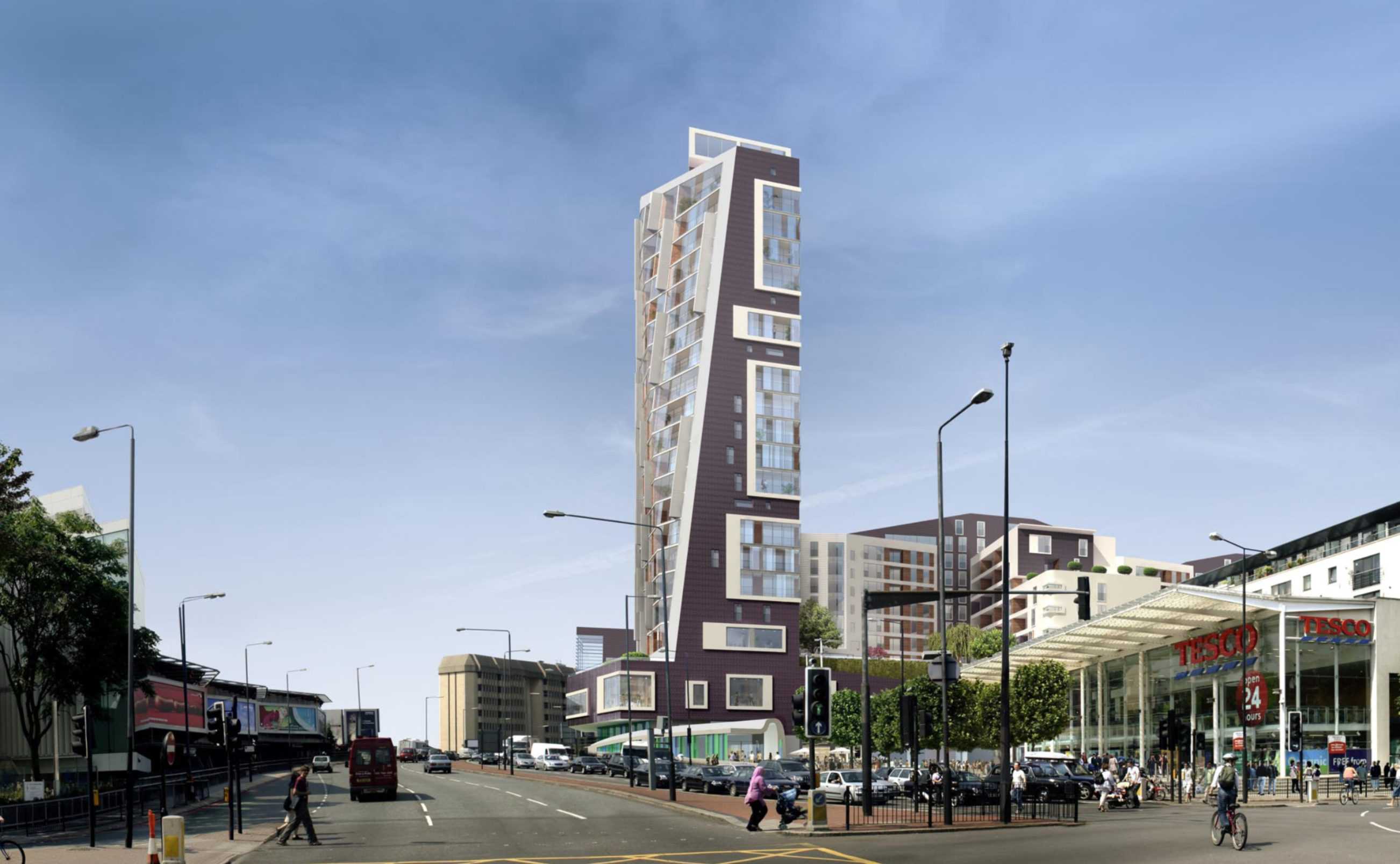
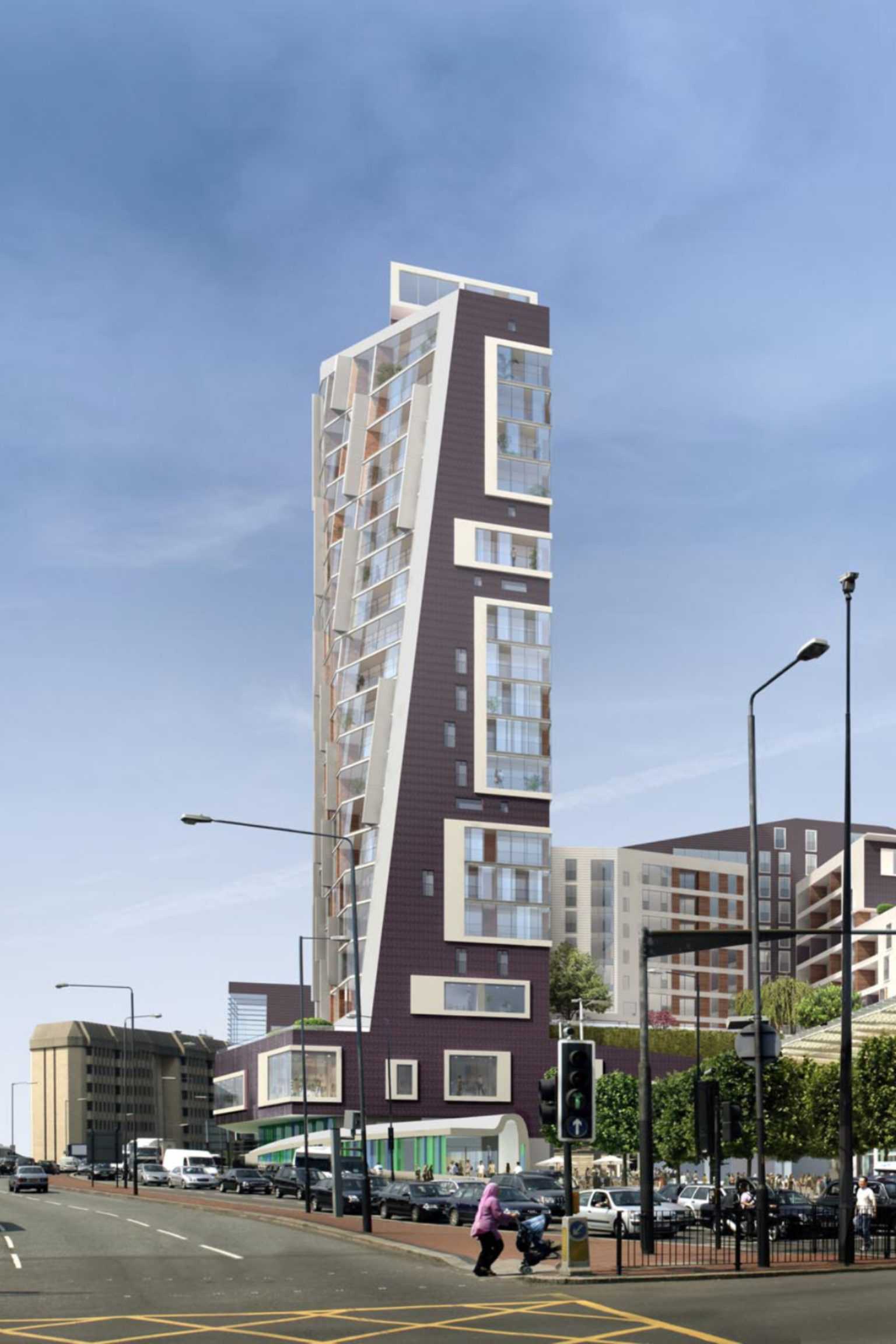
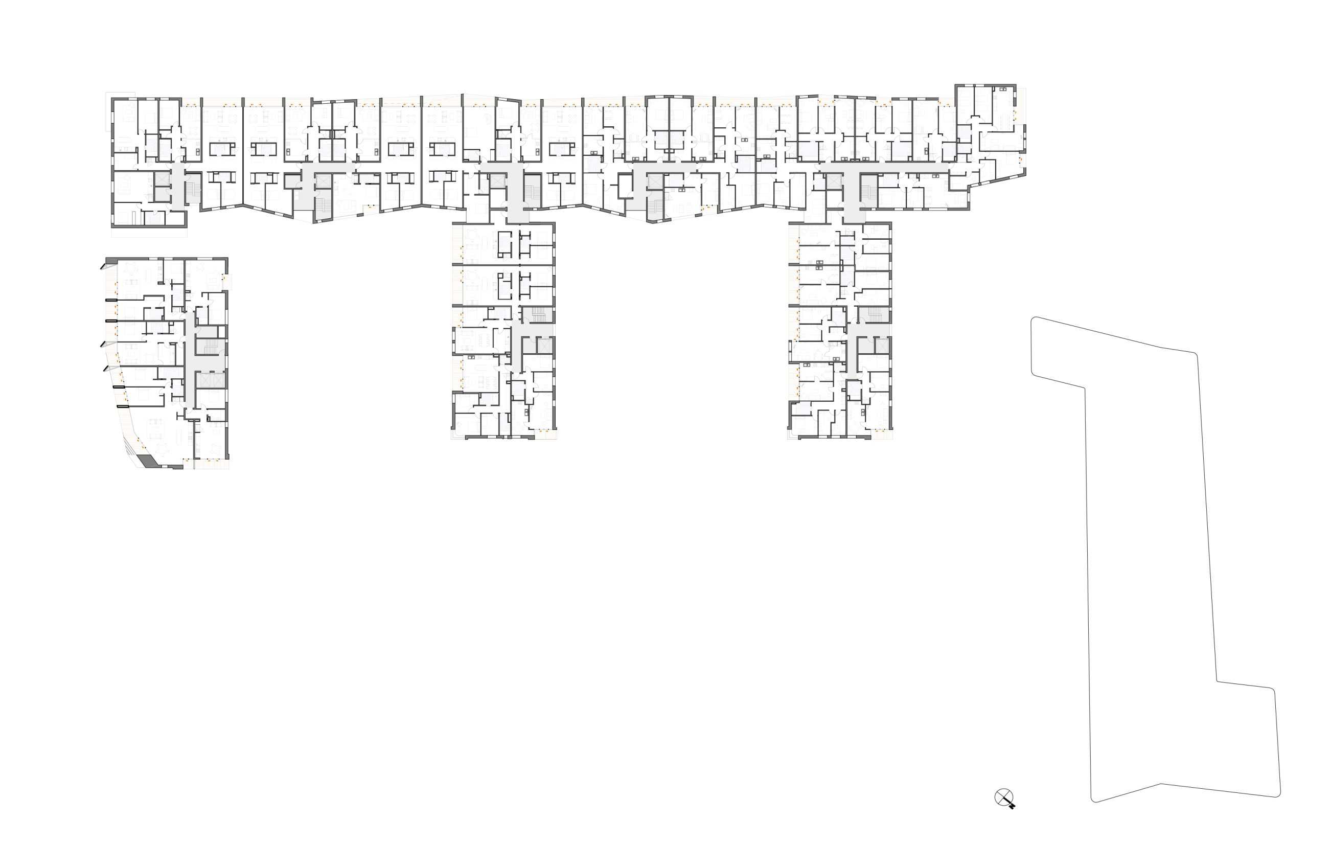
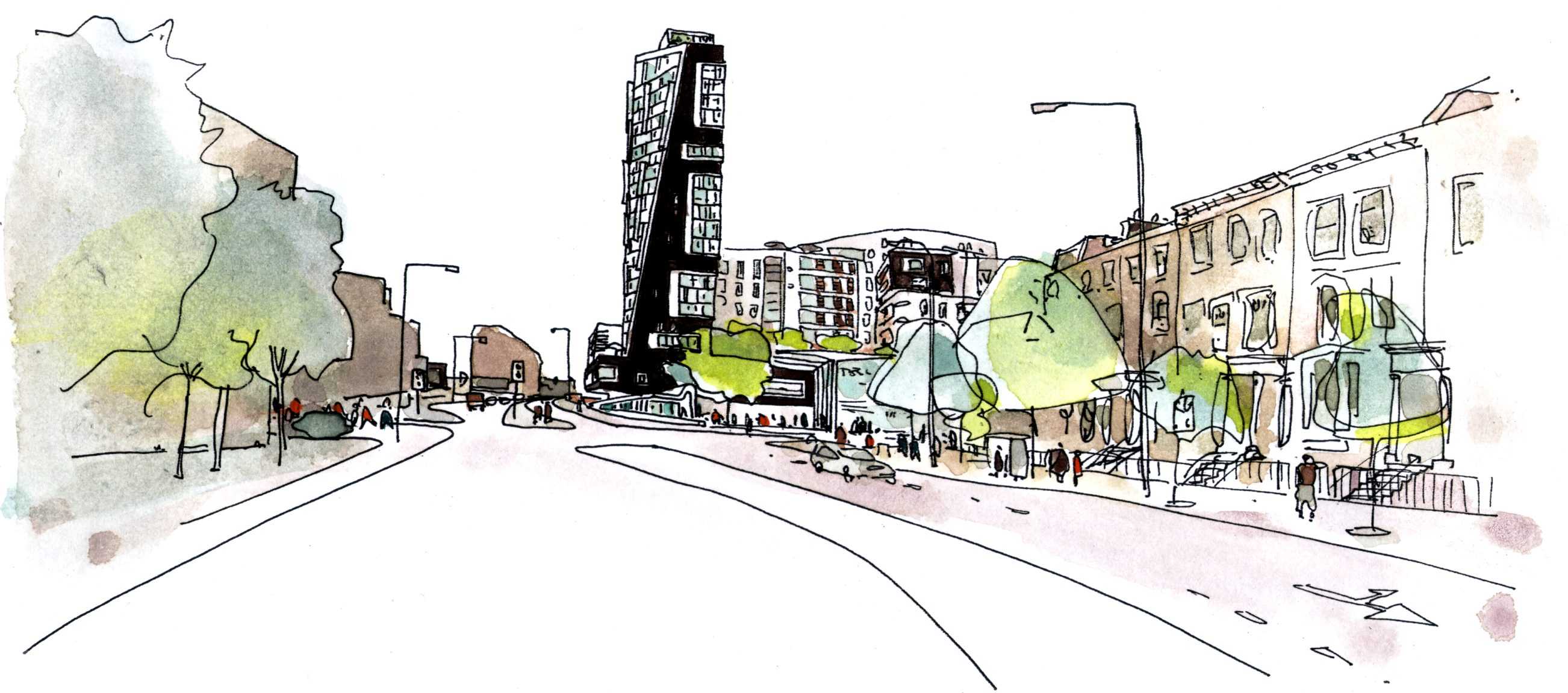
The raked tower silhouette terminates the wide street axis for those exiting London westward. At its base the tower extends horizontally, a Fitness Arm (window to pool) frames the Tesco Plaza. The E Form begins at the third floor concourse, above existing carpark decks. The south elevation is glazed (winter gardens); the east and west are dark rippled ceramic.
Community Use: The inclusion of an additional swimming pool for the sole use of the local community has increased the Gross Internal Area of the community facility by some 30%. A Community Trust will be established to manage the pool and associated facilities.




TYPOLOGY: Office
COUNTRY: Germany
CITY: Ahlen
YEAR: 2007
GFA: 550 sqm
CLIENT: Franz Kaldewei GmbH & Co. KG
PHOTOS: © Rainer Mader, Christian Richters
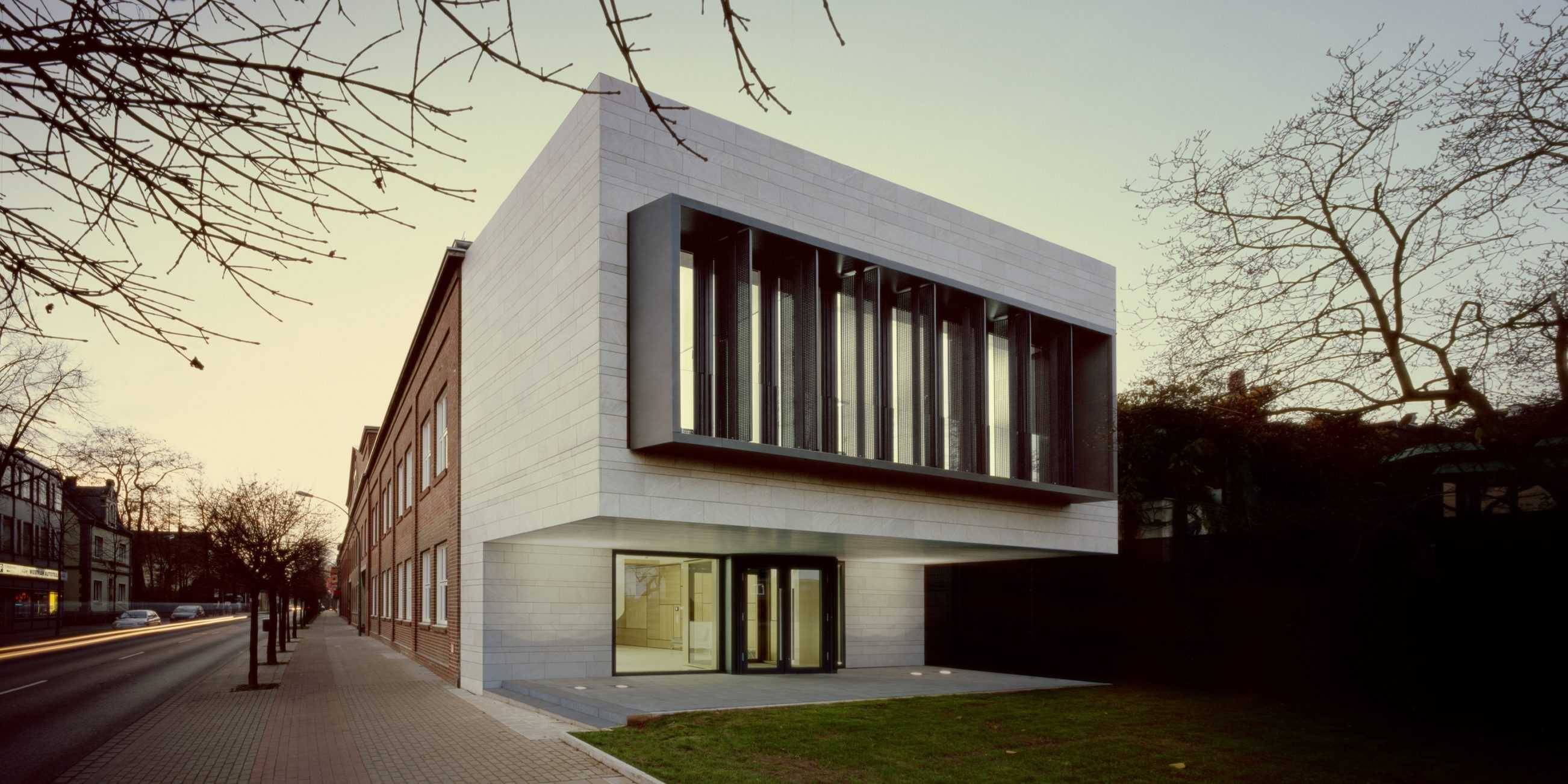
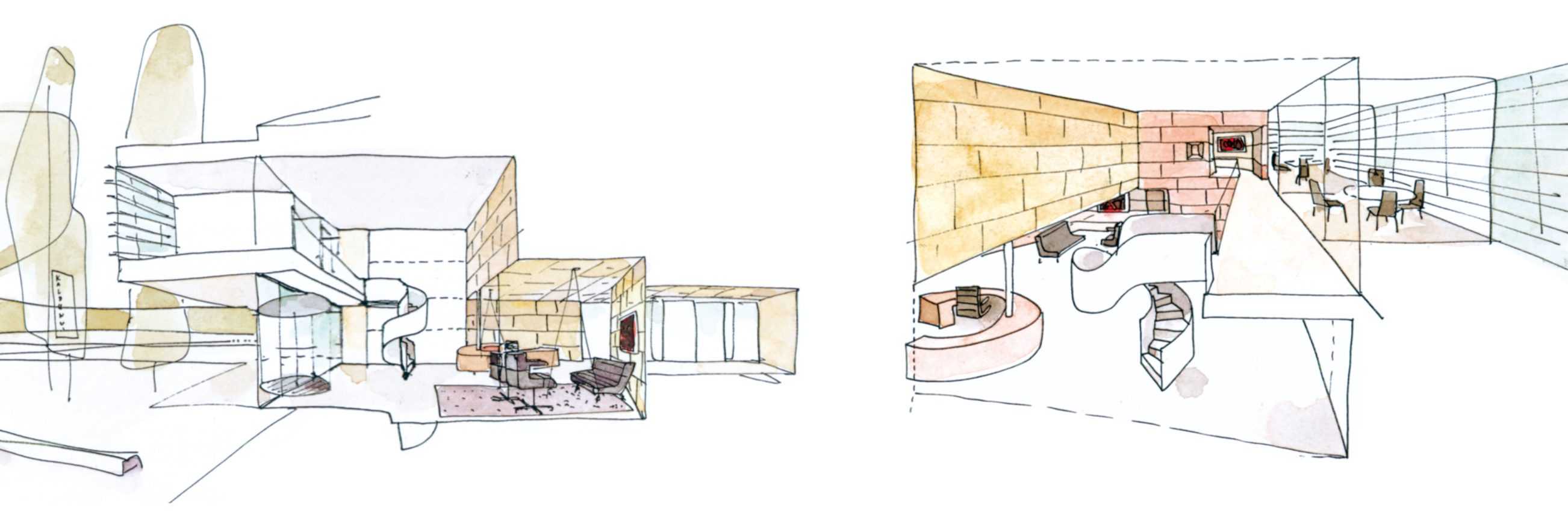
The small ‘signalising’ pavilion re-focuses and re-orients the visitors entrance to the main Kaldewei production plant. The pavilion stands like a bookend in relation to the original 1930s Works Facade of the leading manufacturer of enamel steel bathtubs. It connects to new reception spaces within the existing structure and to a planned administration wing.
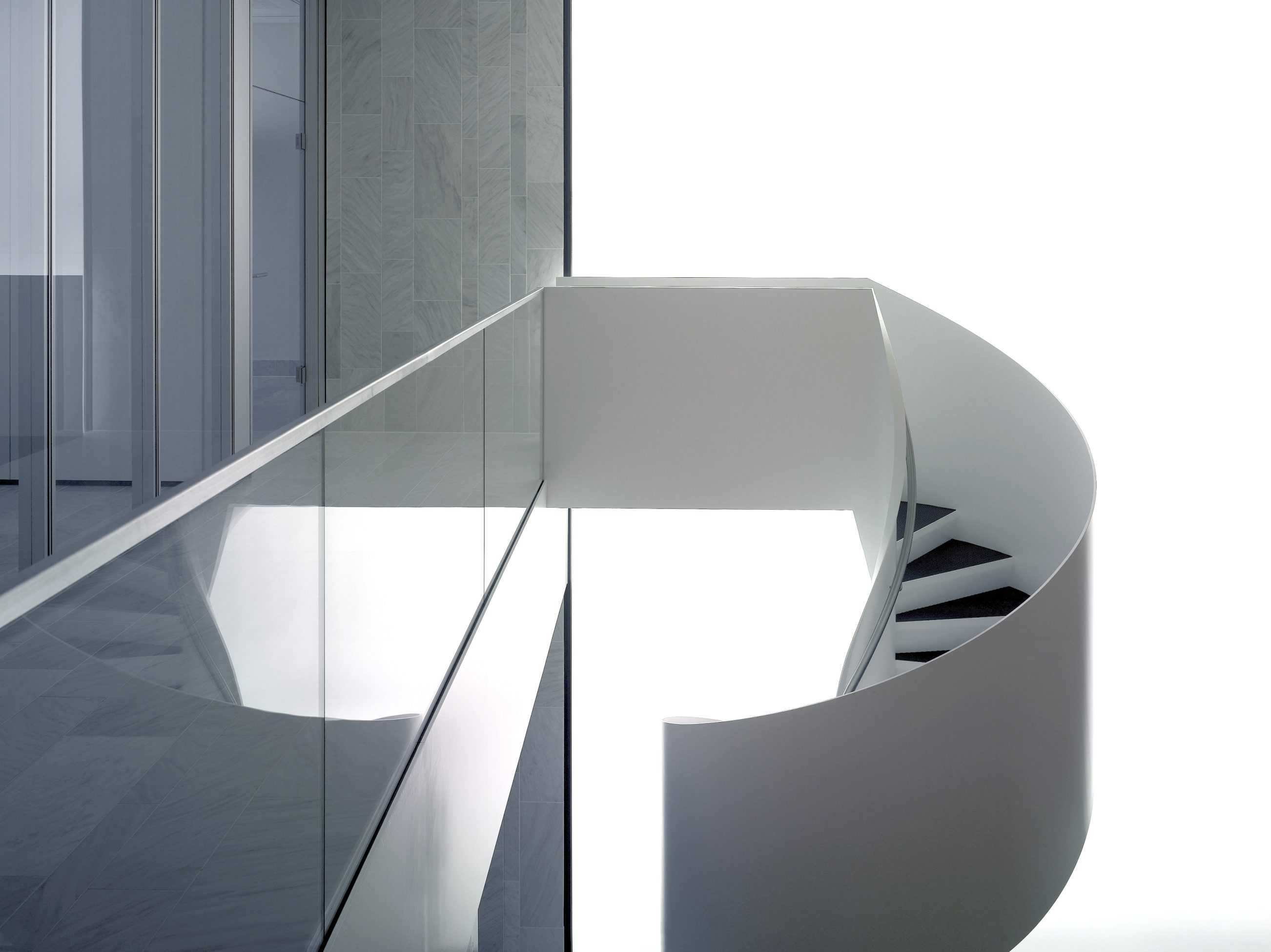
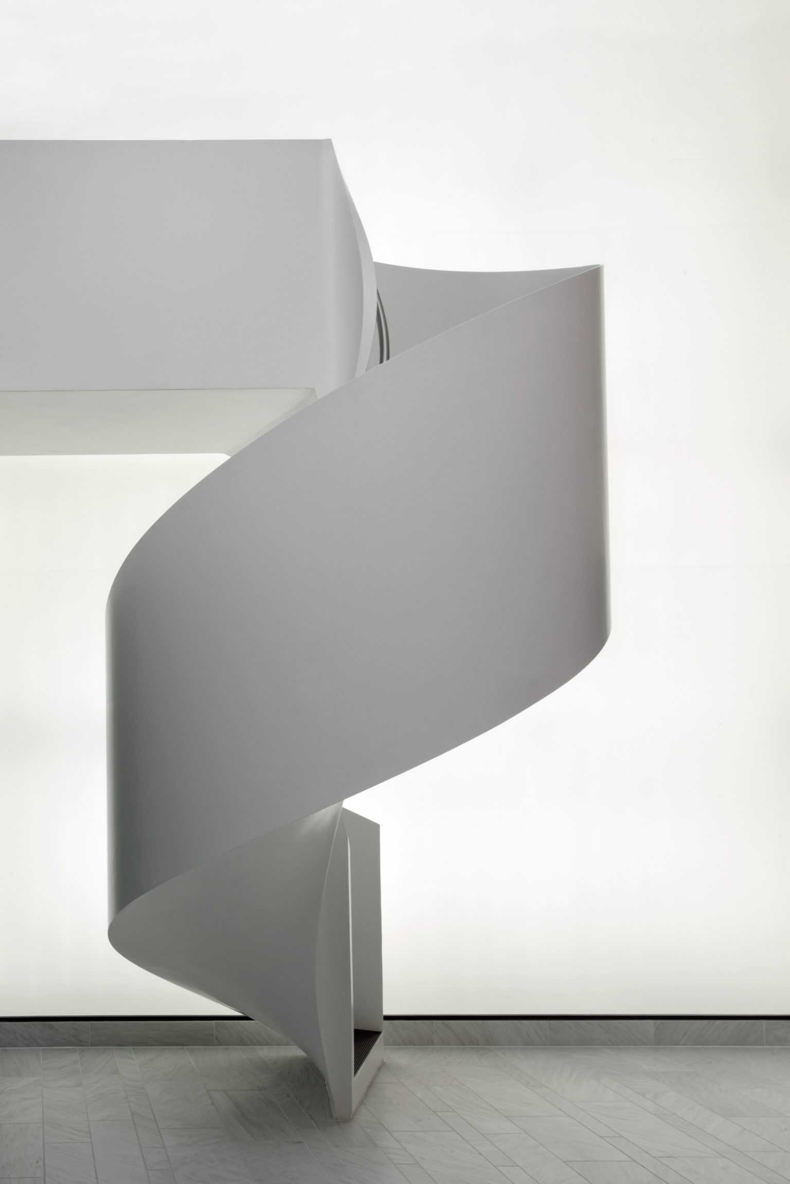
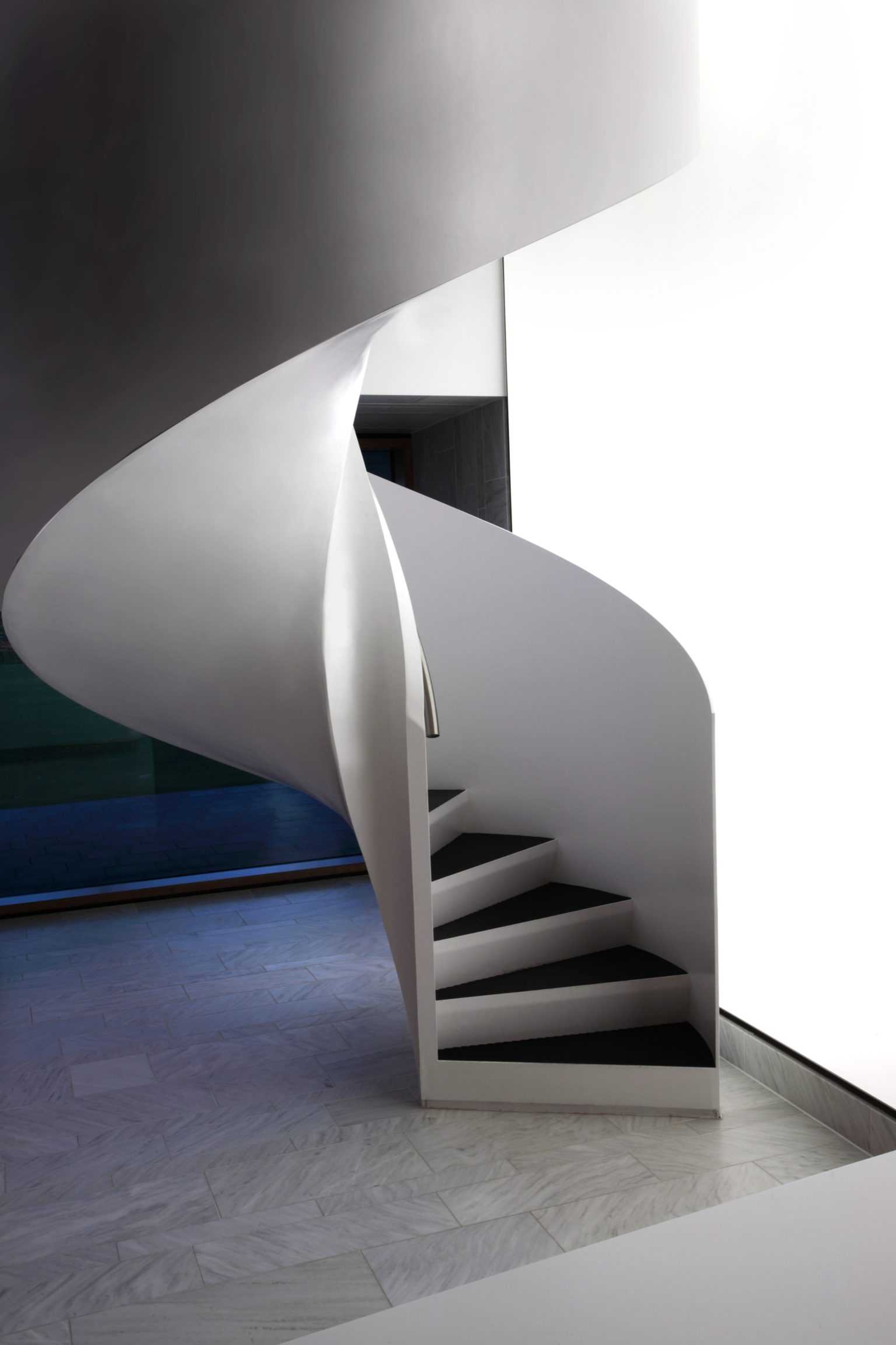
The mass of the stone-clad volume projects acrobatically. Structural dexterity is not the issue, mass is here co-opted as a silent, announcing presence. The lobby behind is carved out of the existing volume. Meeting rooms hover above the entrance, the white stone of the new facade extends inwards as lobby floor and wall material. A steel spiral stair stands centre-stage and backlit by a dematerialised ‘Light Wall’. After the spatial expansion of the lobby, lower ceilings and an emphasized materiality of wood panels introduce a contrasting intimacy. The ‘Actor Stair’ leads the visitor through a short but complex spatial sequence. The spatial and material language here is closely related to that of BOLLES+WILSONs first Kaldewei building. – the nearby KKC (Competence Centre) 2003-2005.


