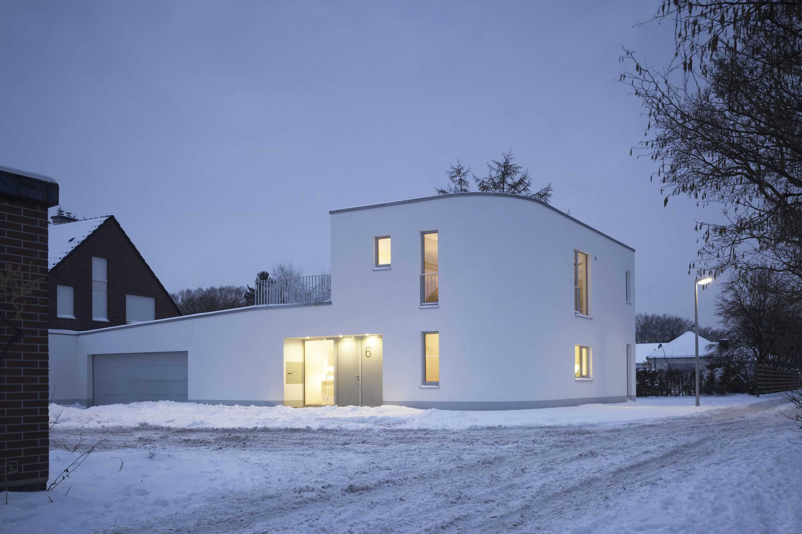
TYPOLOGY: Residential
COUNTRY: Germany
CITY: Münster
YEAR: 2013
GFA: 140 sqm
CLIENT: (private)
PHOTOS: © Christian Richters
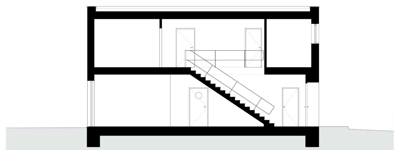
Small is beautiful (+ energy efficient) – compact 140 sqm private house with outstanding ‘sustainability credentials’.
Plastered monolithic insulating ‘Poroton’ brick walls, triple glazing and a deep bore heat exchange pump lead to a non-fossil fuel energy classification (KFW 70) – 30 per cent below the current energy regulation.


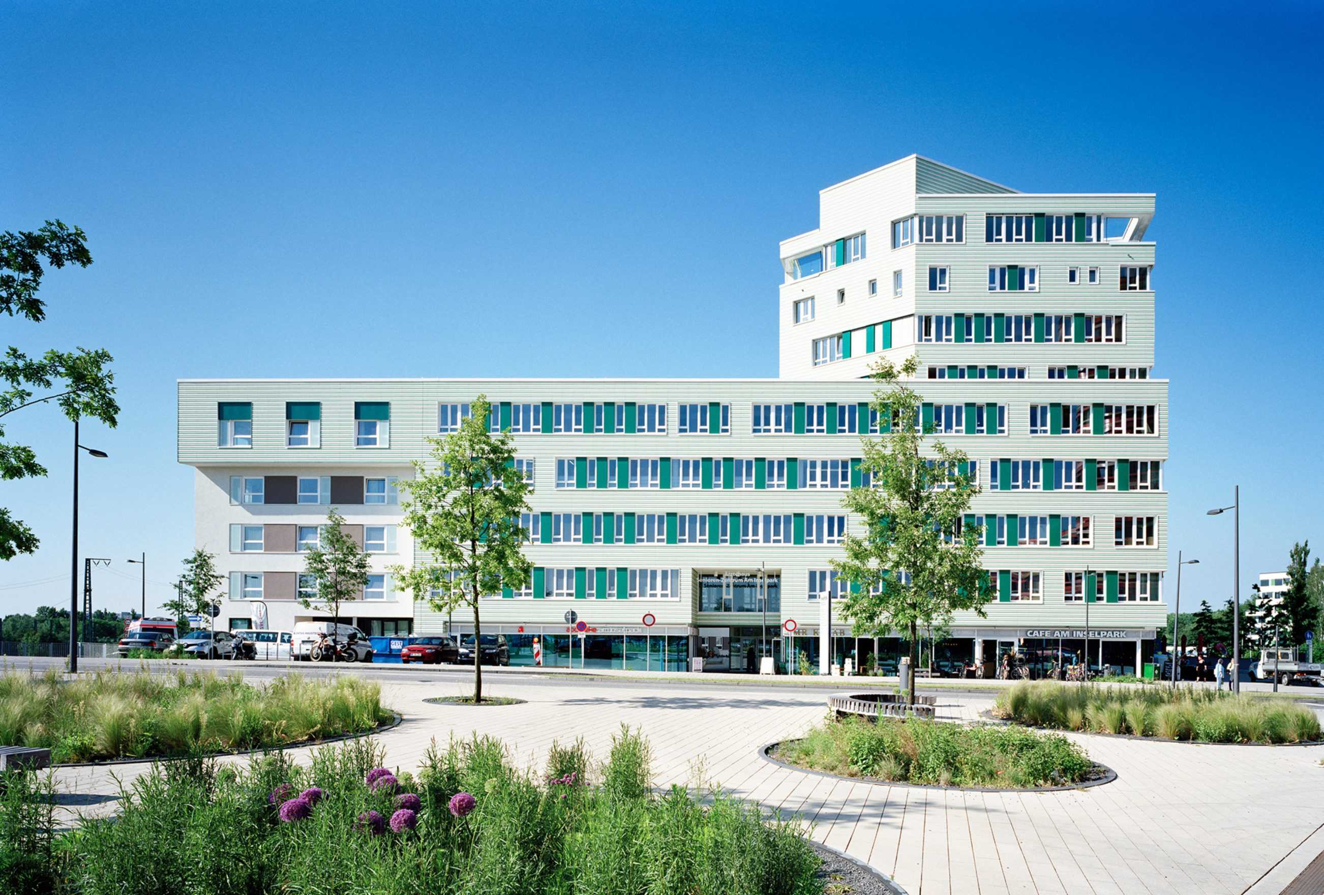
TYPOLOGY: Office, Residential
COUNTRY: Germany
CITY: Hamburg
YEAR: 2013
COMPETITION: Invited Competition 2011, First Prize
PHOTOS: © Markus Dorfmüller, Johanna Klier
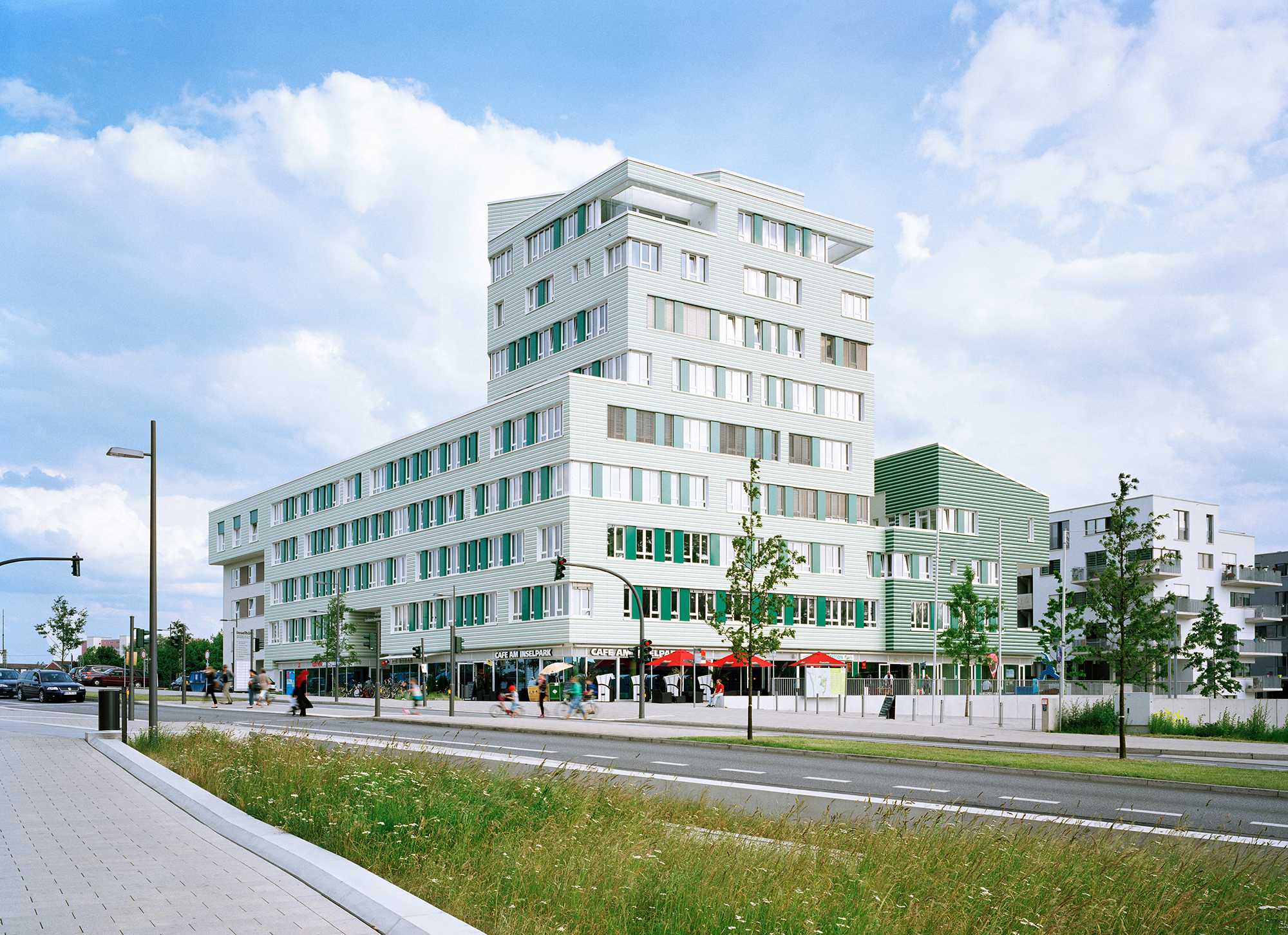
The masterplan required two towers to mark the entrance to the Garden Show and Building exhibition. The big-brother of the pair, the giant, striped (Jacobs-coat) Sauerbruch and Hutton building, a new hive for Hamburg’s Planning Department (BSU) was not, according to the competition brief, to be upstaged by its neighbour. Already at the outset the bumpy road forward was in evidence when the black facade (no competition for polychromy) of the premiated BOLLES+WILSON entry was rejected by the developers of the railway-track side of the same block – not the right statement for their housing for the elderly. The facade mutated to green. “No green”, said the same developer, green is the colour of their chairman’s football team’s archrivals. The architects insisted that football allegiances is not a credible basis for urban planning decisions, and supported by the ubiquitous director of planning, the corner tower remained green. To get planning approval the developers were caused to sign a commitment that the green ceramic façade, a thematicised official entry to the Garden Show, would not be compromised during planning and construction. A wise requirement as fast track planning was necessitated by delays due to wobbly project financing around 2011. Further down the track a rapid rethink of the green facade was again necessitated by ‘just-in-time’ scheduling. The planed gluing of the rippled ceramic tile stripes would have to happen in winter (sub zero temperatures render glues impotent). A dry system of hung ceramic panels was at the last minute chosen and the respectfully stepping facade arrived as the IBA building exhibition opened.
The 9-floor tower is a medical centre, highly installed individual doctors rooms. Apartments and duplex penthouses with sculptural cut-out balconies occupy the top three floors. A darkening of the green ceramic facade signals a separate function for the four-floor wing to the south. This is the InselAkademie promoting sport for teenagers – not only from the surrounding Wilhelmsburg dockland district, characterised by social housing, immigration and unemployment. The upper floors of the InselAkadamie are group apartments for sporting youth and the lower two floors seminar and the temporary administration rooms of the IBA (International Building Exhibition). This building is in fact the hub of the IBA and also post IBA activities.




TYPOLOGY Masterplan
COUNTRY: Germany
CITY: Cologne
YEAR: 2013 – (2015)
COMPETITION: 2013, dialogic planning process
‘Werkstattverfahren Mülheim Süd Inkl. Hafen’
CLIENT: Stadt Köln
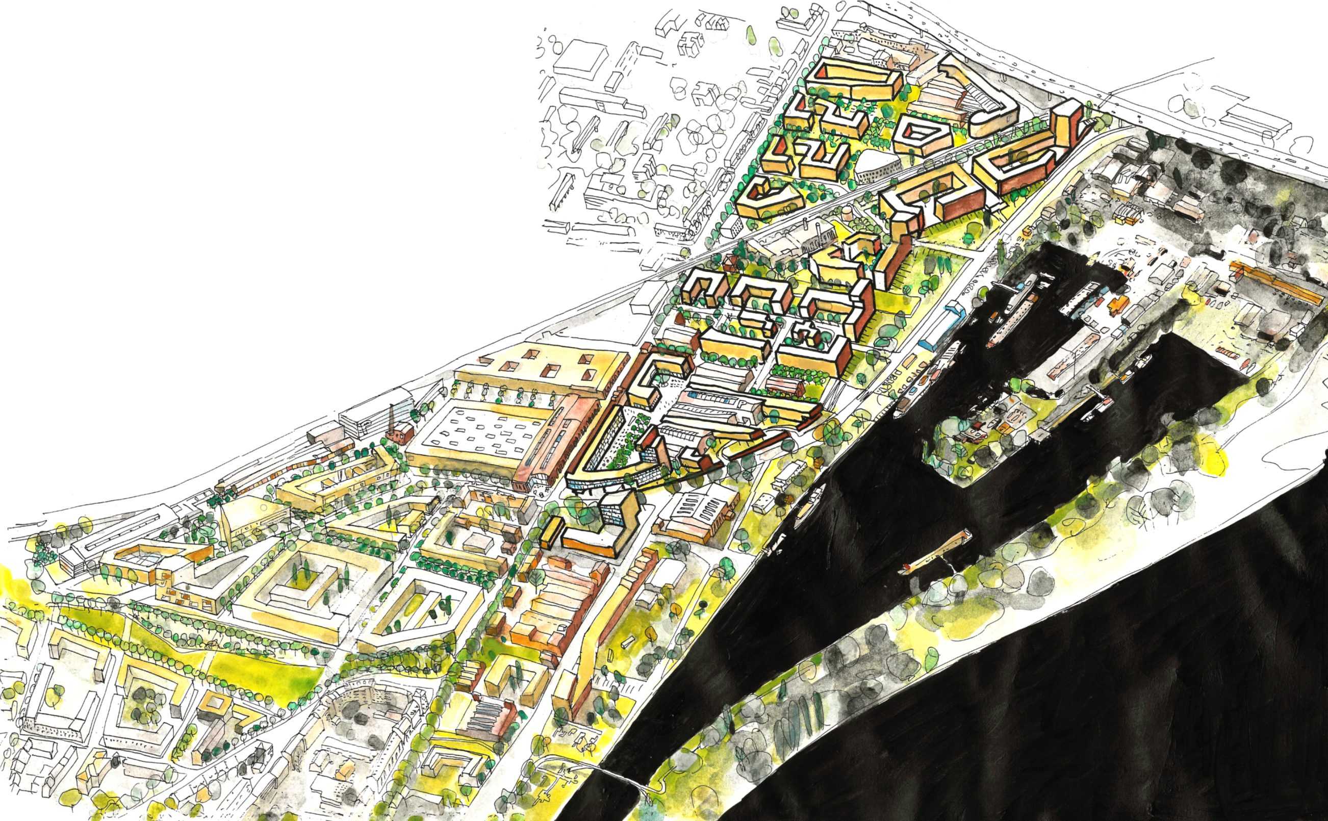
After a dialogic planning process in 2013, the two competing planning teams around kister scheithauser gross (Cologne) and BOLLES+WILSON have teamed up for the next planning stage. The development of Mülheim’s harbour district is still an on-going process integrating various interests and disciplines. The masterplan for this 52 ha harbour area preserves various grand industrial spaces to create a new district with a unique character and atmosphere.


TYPOLOGY: Educational
COUNTRY: Germany
CITY: Frankfurt
YEAR: 1992 / 2014
CLIENT: Stadt Frankfurt
AWARDS: German Architecture Award 1993, Commendation
PHOTOS: © Waltraud Krase (1992), Rainer Mader (2014)
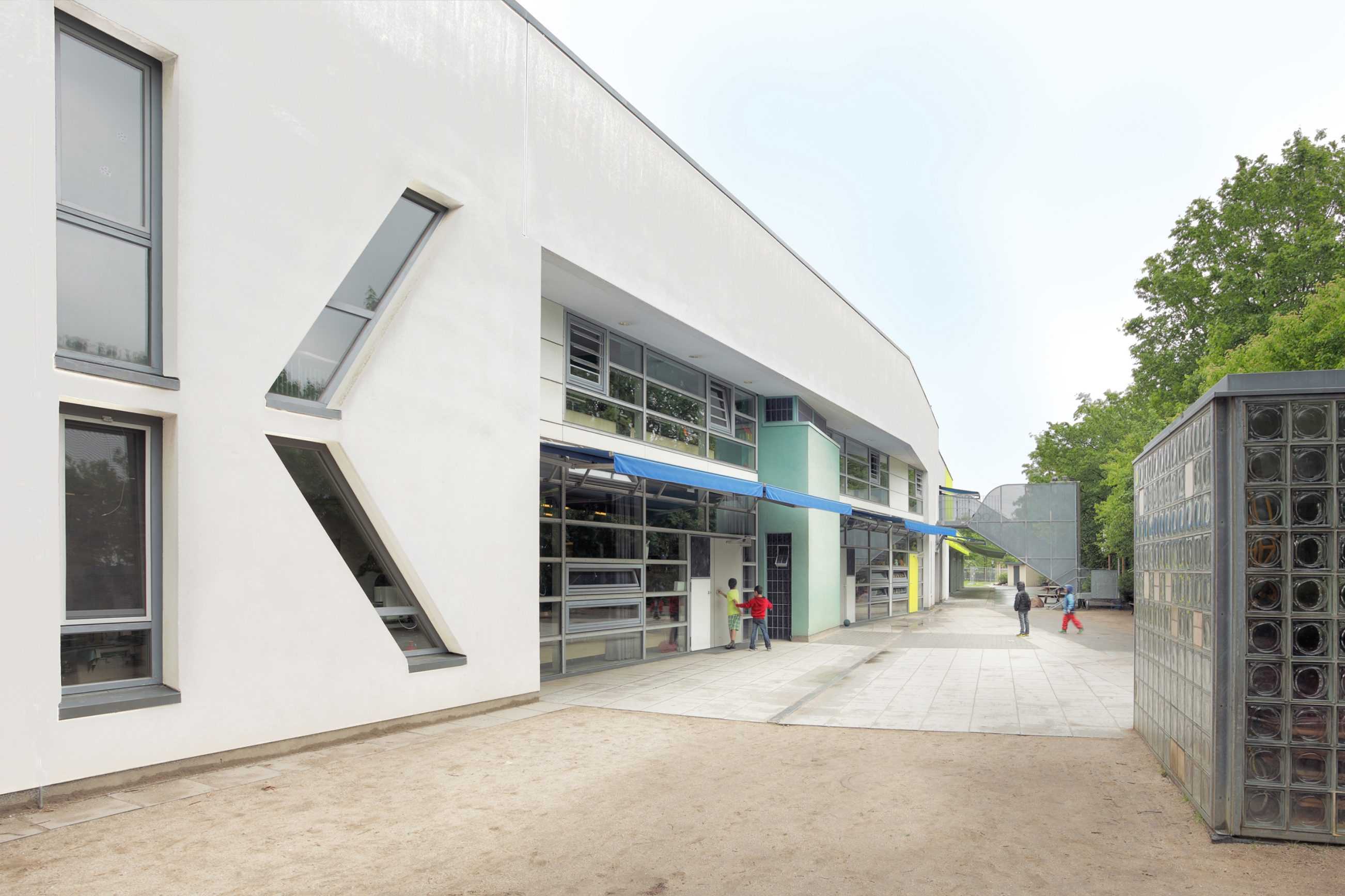
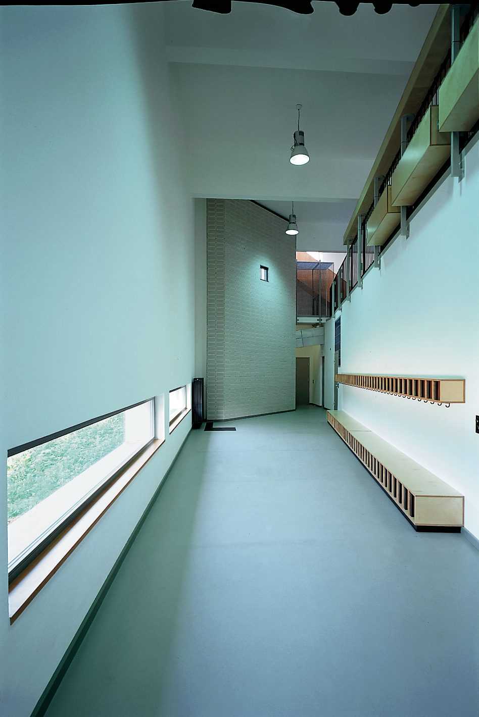
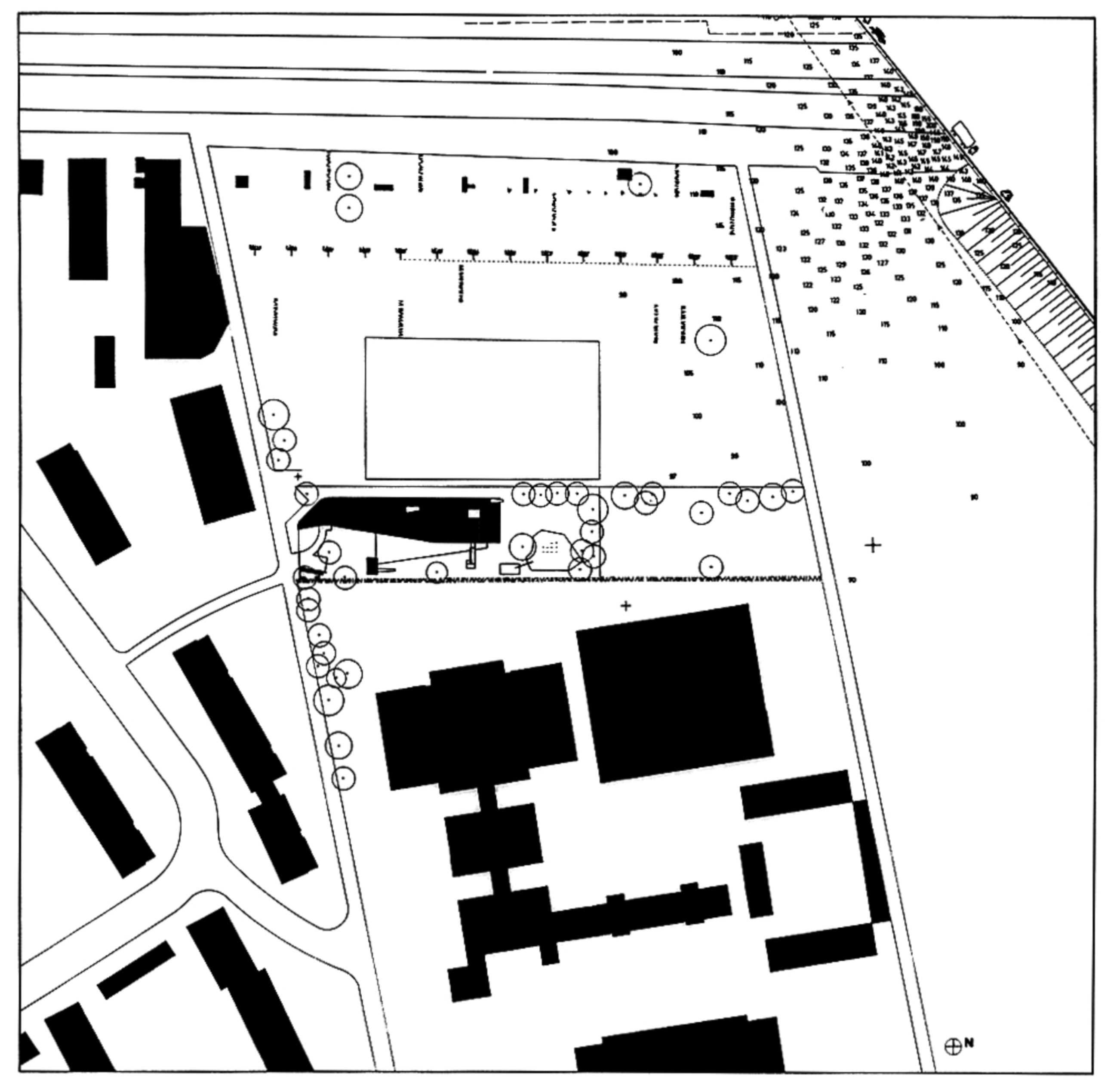
The 1992 Kita 102 in Frankfurt – Griesheim was one of BOLLES+WILSON’s first buildings in Germany. 22 years later it has been extended. What does it mean to revisit an early work? To measure if it has stood the test of time? Or even if the architectural themes of that time are still pertinent today?
What is immediately obvious is that a generous two floor, curvaceous and somewhat expressive sculpted volume is no longer feasible under today’s stringent budget restrictions (the political promise to deliver a kindergarten place for every child). The new extension is single storey, docking on to and sloping down from, an original 7 m high sport and sleeping hall.
The 3 original ground floor classrooms were for conventional pre-school kindergarten use, and the upper 2 rooms after-school homework facilities for older kids. The 3 new ground level classrooms extend kindergarten functions, kids can run out directly from group to garden.
The original building expands in width and height, a conical volume explained at the time as a metaphor for growing – spaces expand and contract as kids run from one end to another. A narrative scenario that extended to details like 2.10m high doors for teachers beside 1.50 m doors only for kids. Draconian budgets preclude such whimsical game playing in the new extension, perhaps it is also no longer the time for architecture to reflect on its syntactical potential. In the original Kita four windows conspired to inscribe a giant letter K across the facade. A readable building for children who are learning to read. Today it is left to colour to signify. A thematized May-Green has been here co-opted (as in almost every second contemporary Kindergarten) to signal a fresh, playful optimism. It is the only internal colour. Also a green horizontal beam/gutter above a south facing glass facade benevolently grows extended sun-blinds (also May green) to wrap the sunny side in a Mediterranean-like slab of shade. Window articulation is no longer expressive, a tough neighbourhood requires defensive measures if night cooling is to be activated.
What was in 1993 described, as an east-west slab turning its back to the noise of a nearby autobahn is now a very long east west slab, still turning its back and opening southward to an extended linear play-ground.





TYPOLOGY: Public
COUNTRY: Albania
CITY: Korça
YEAR: 2014
CLIENT: Municipality of Korça
PHOTOS: © Andronira Burda, Daniel Dervishi, Nico Peleshi, Roman Mensing
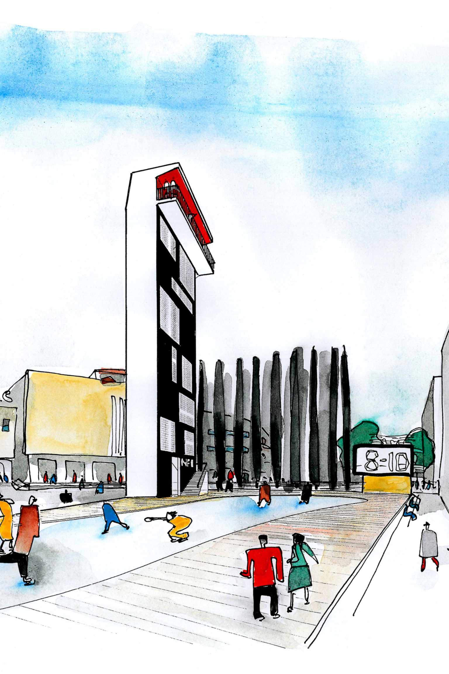
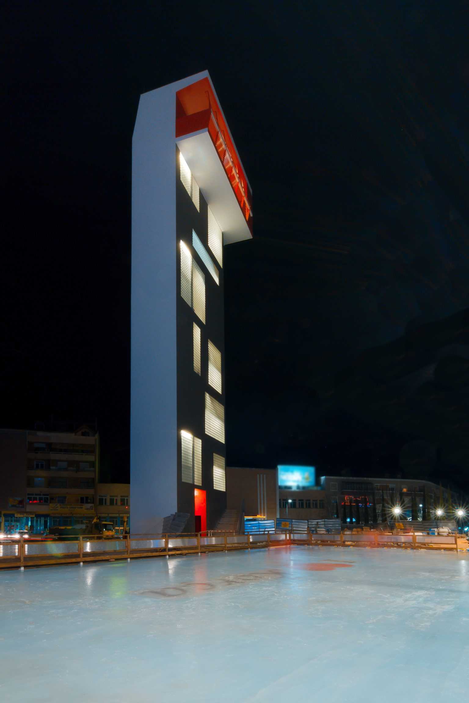
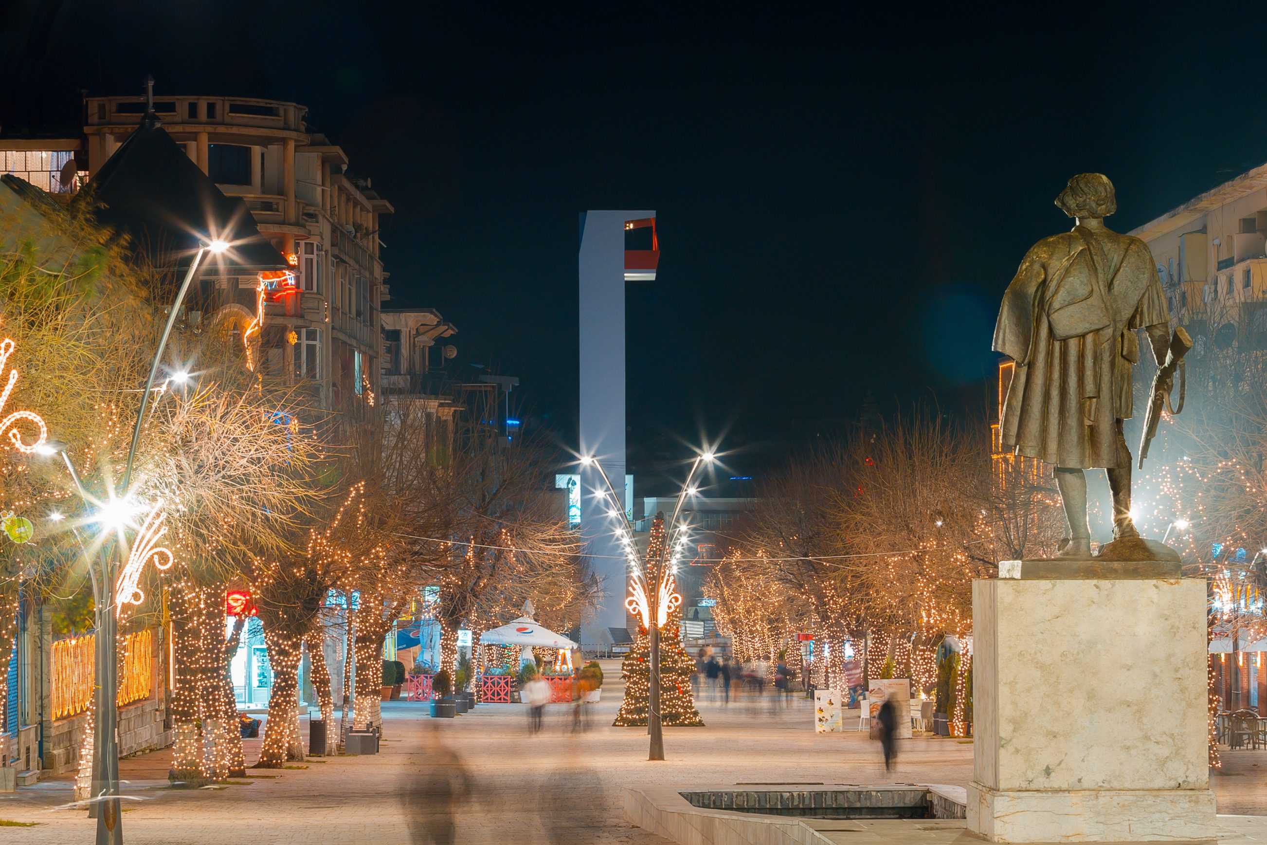
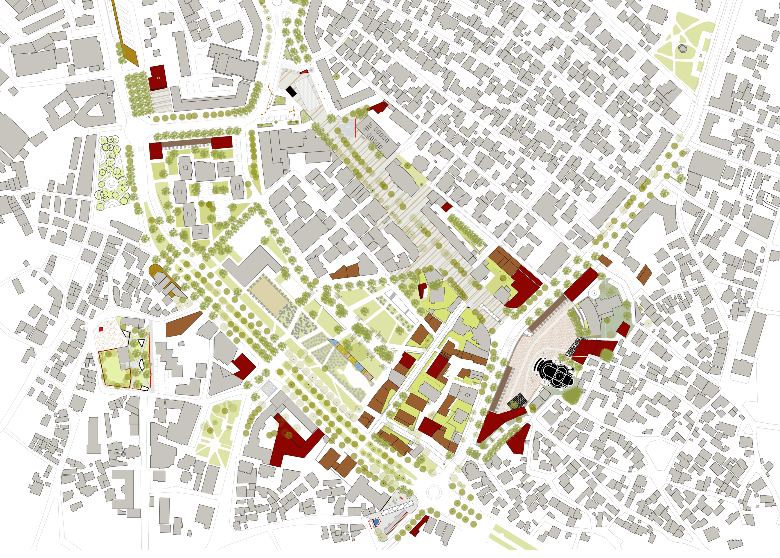
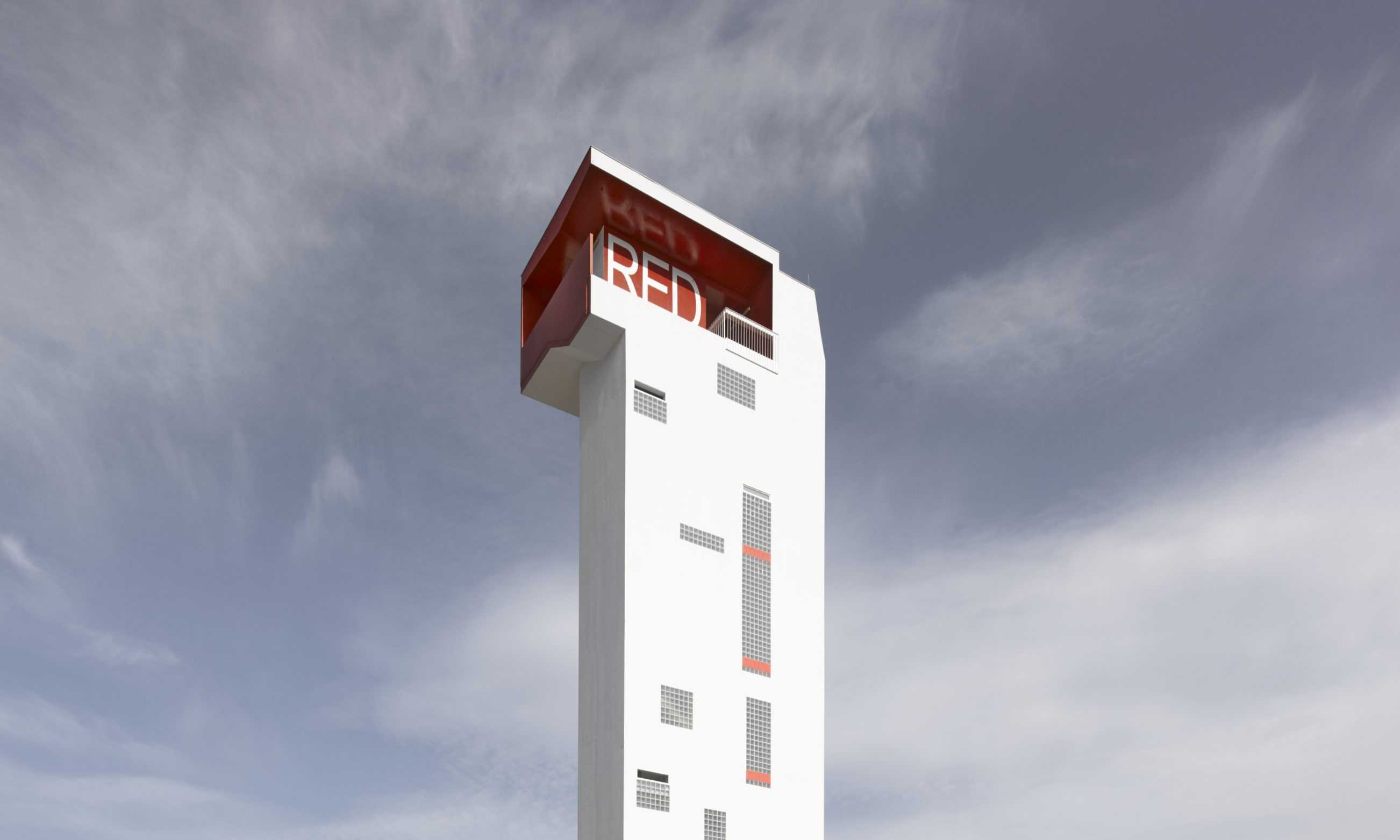
In time for Christmas 2014 the city of Korça in Albania realized BOLLES+WILSON’s design for a campanile – the Red Bar in the Sky. It focuses the Theatre Square, the concluding phase of the B+W 2009 masterplan (International Competition 1st prize). The campanile which functions as a lookout tower for Korcians to appreciate the delicate grain of their city is located at the end of the central pedestrian boulevard ‘Shën Gjergji’ (landscaping by B+W). Opened in winter the Red Bar in the Sky was accompanied by an ice skating rink installed by Greek skating specialists.
–
Related project:
Masterplan Korça City Centre, 2009, 1st prize

